Background
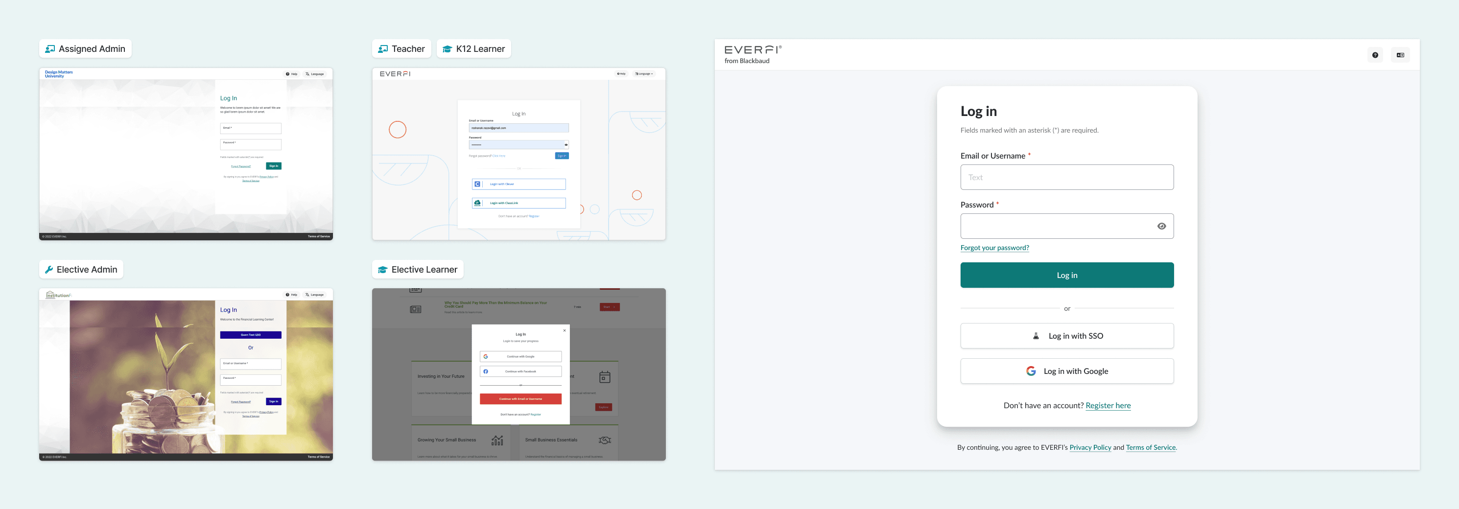
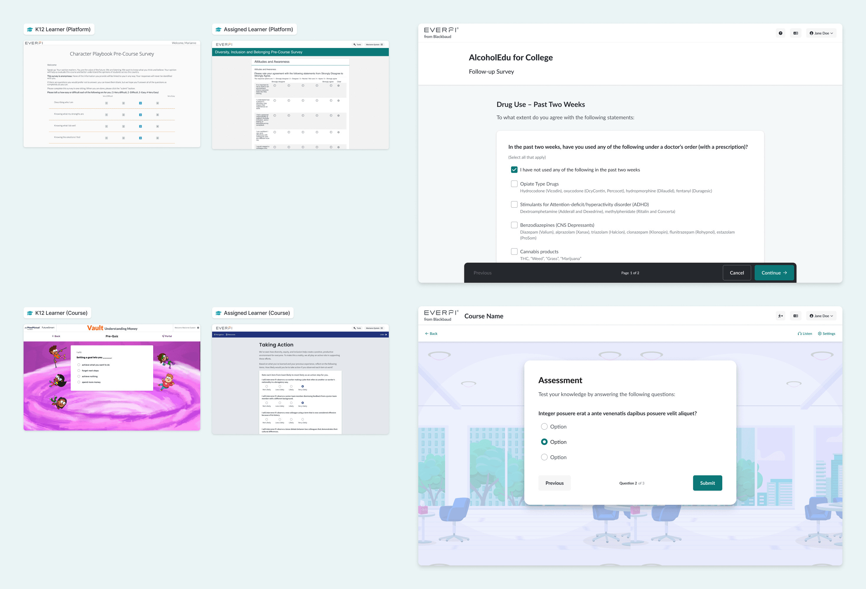
In late 2021, it became clear that Everfi's products lacked a cohesive identity and experience; they looked like (and were) built by different teams.
The journey from website → platform → product ping-ponged users from one interface to another, undermining the experience for admins, teachers, and learners. So we set out to define a singular point of view re: how an Everfi product should look, feel, and behave, and to codify it in a new shared design language.
We kicked it off with our own definition:
A design language consists of an agreed-upon visual and interaction design foundation upheld in both code and design workflows to foster consistency, intentionality, and predictability within and across products.
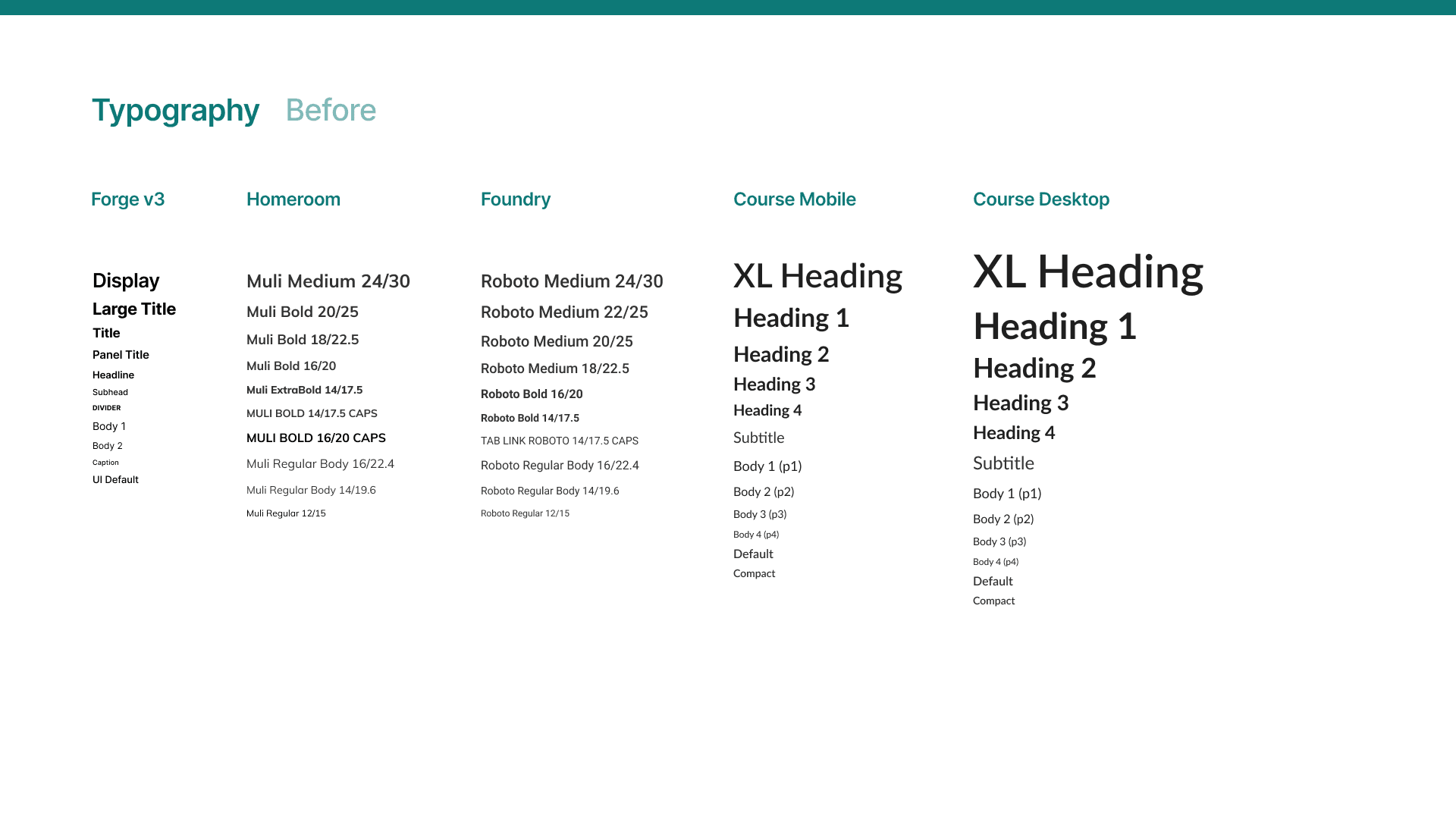
The question "What does an Everfi button look like?" has a different answer depending on which of its products you're using.
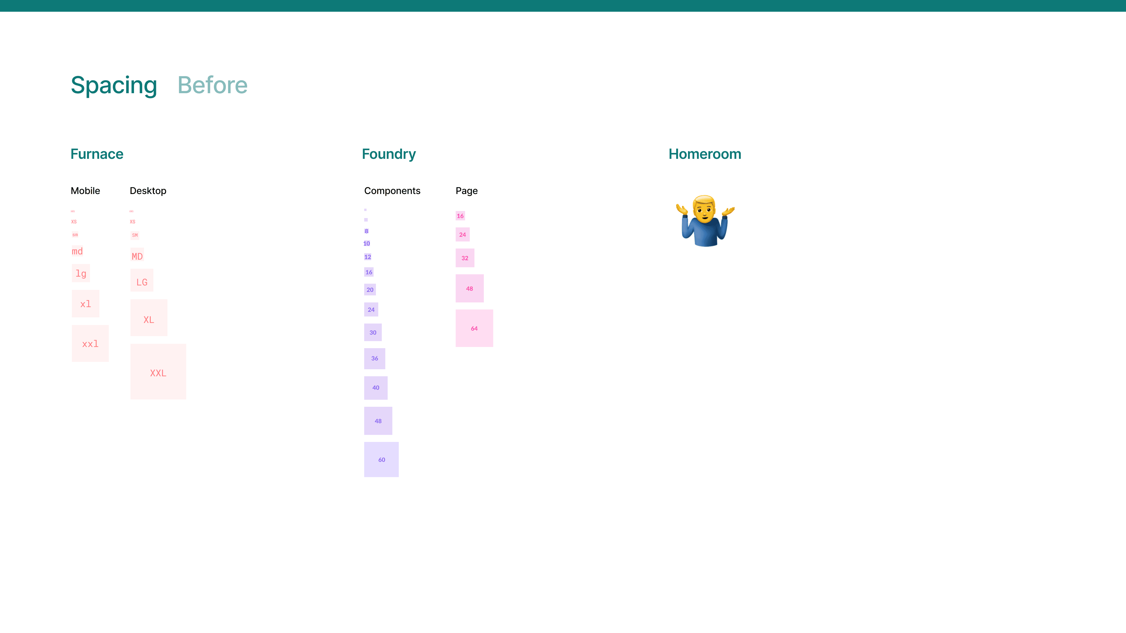
Multiply this kind of variation across multiple style guides and component sets, sprinkle in course theming, platform branding, and customer whitelabeling, and it was inevtiable that we'd find ourselves with disjointed experiences.
Discovery
The next step was to establish an opinion — to coalesce around a general visual style that reflected our brands, best practices, and, to an extent, our taste as a group of designers.
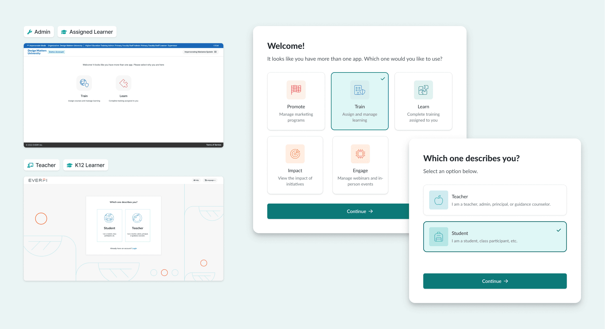
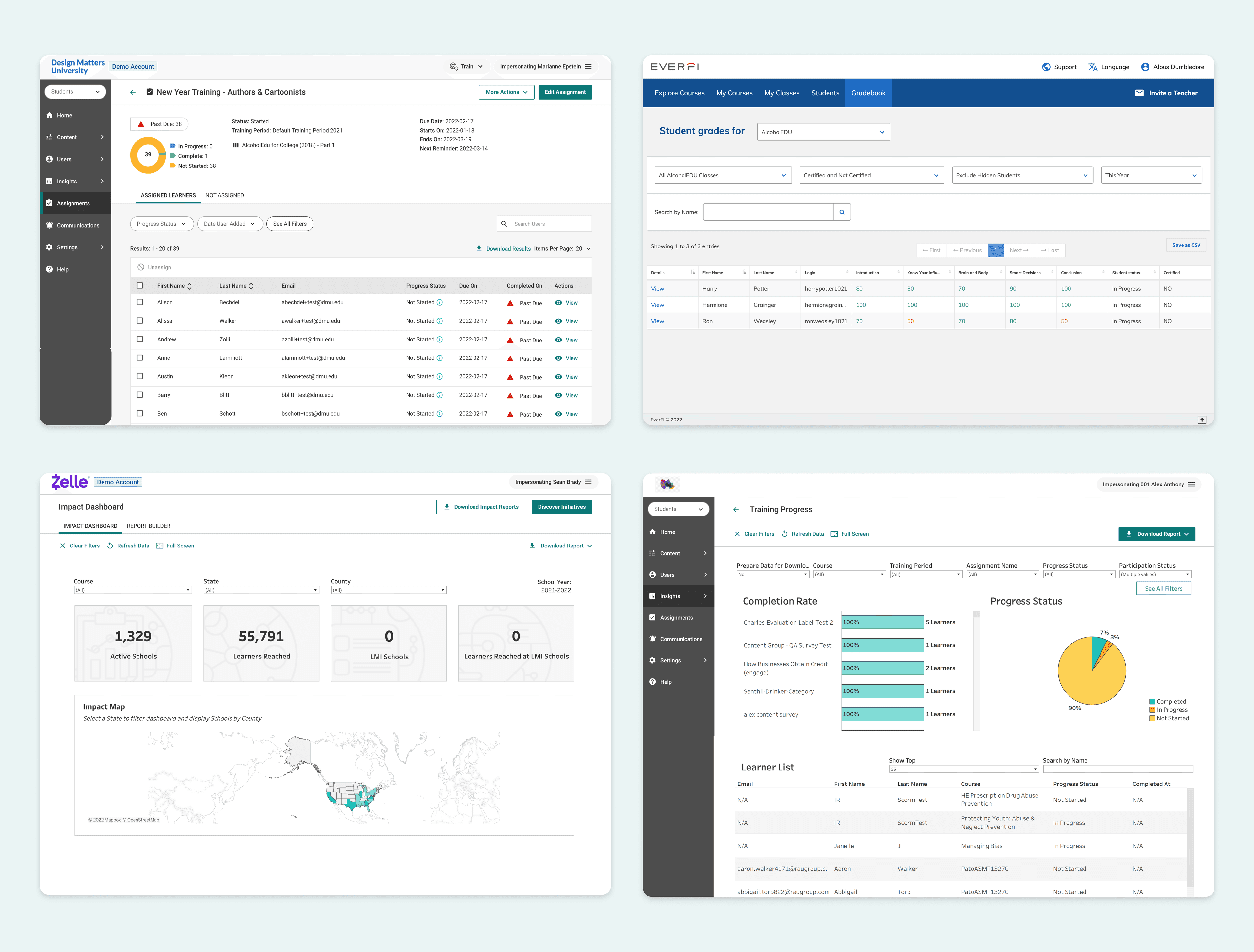
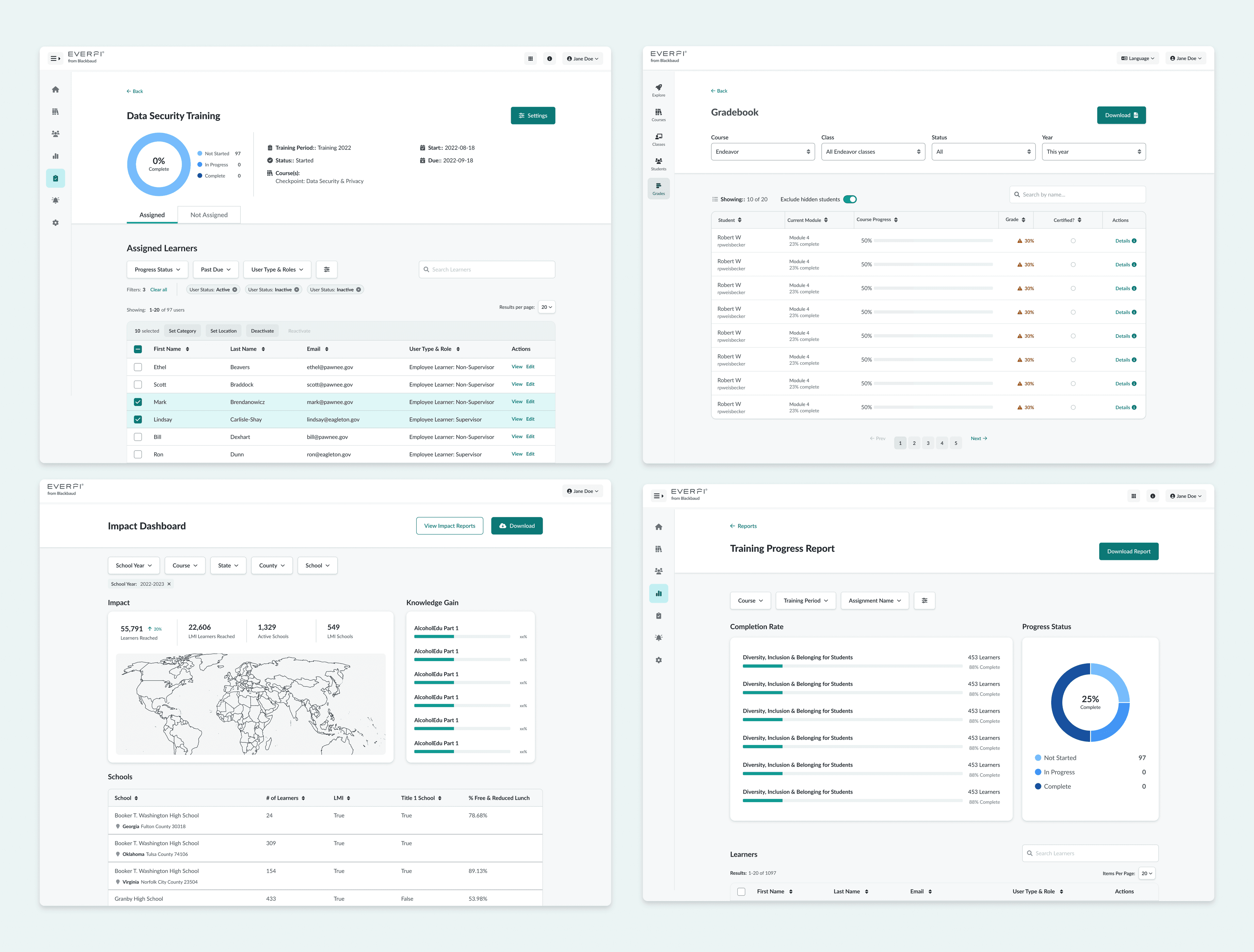
Many of the same components are used across platforms and in courses. These became opportunities to unify UI/UX.
Abstract components based on underlying structure, behaviors, and common props. To what extent can they share styling or properties?
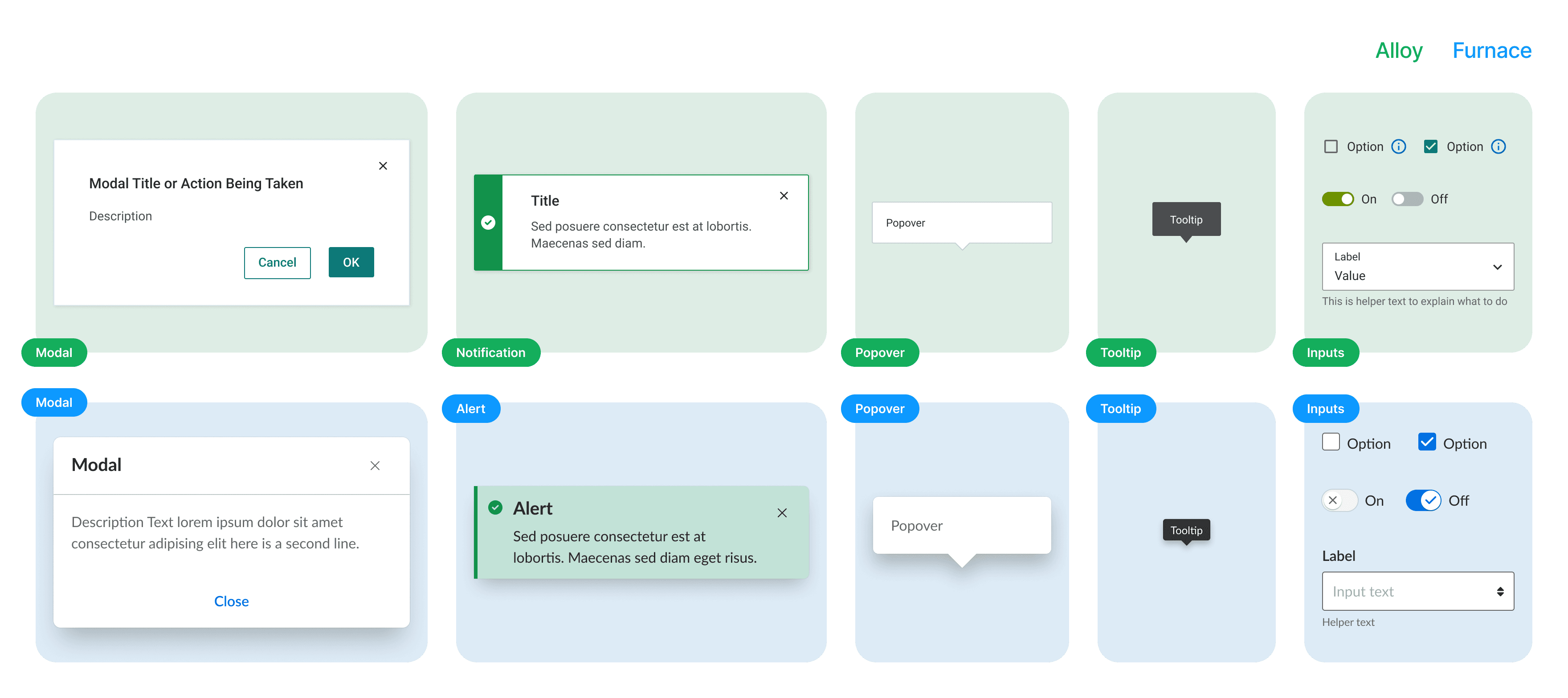
Consolidation
That spurred the first (and hopefully last) Great Everfi Component-Off™: we pitted competing components from platforms and products against one another, holding working sessions to dissect their behavior, style, and utility.
- Establish an “Everfi” opinion on how things should look and behave by comparing styles & components side-by-side
- Choose the best parts of each & coalesce around a shared visual and interaction design foundation
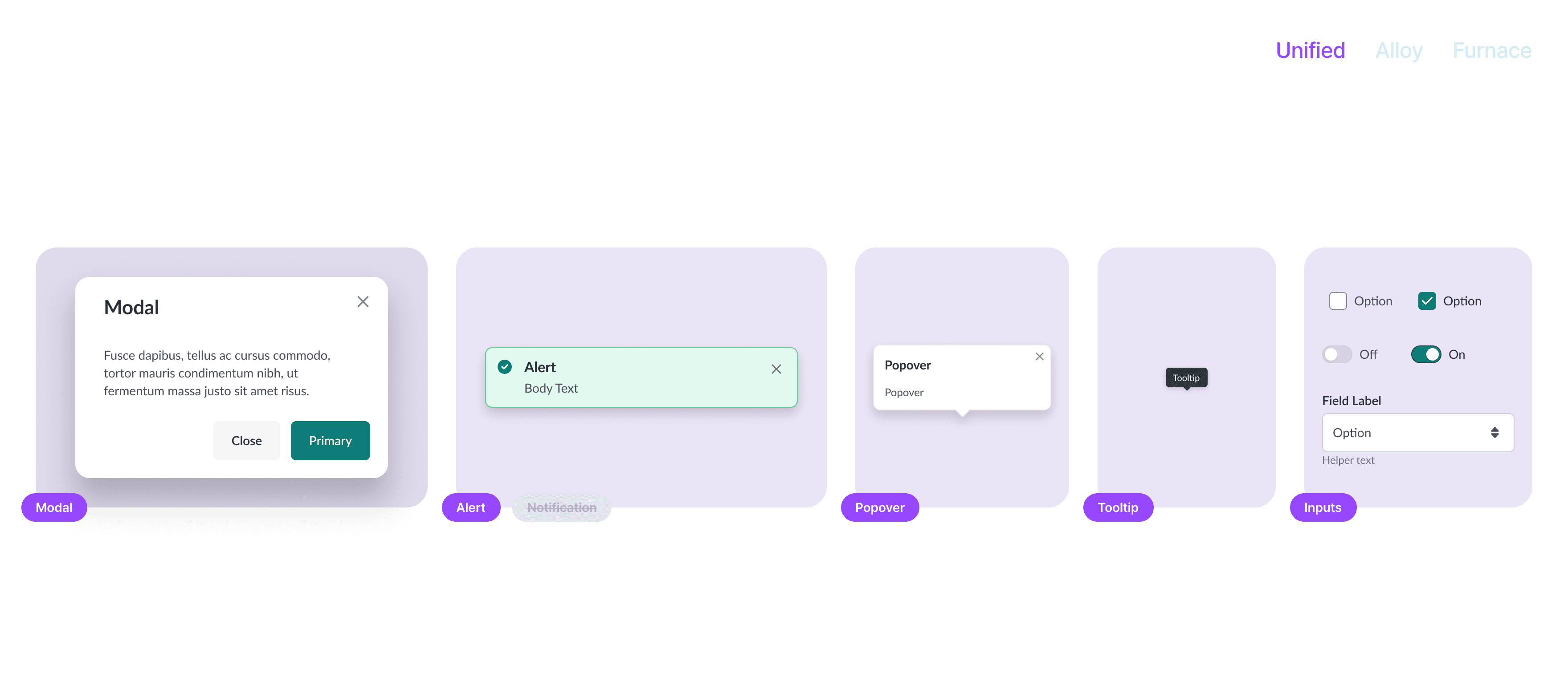
Concept
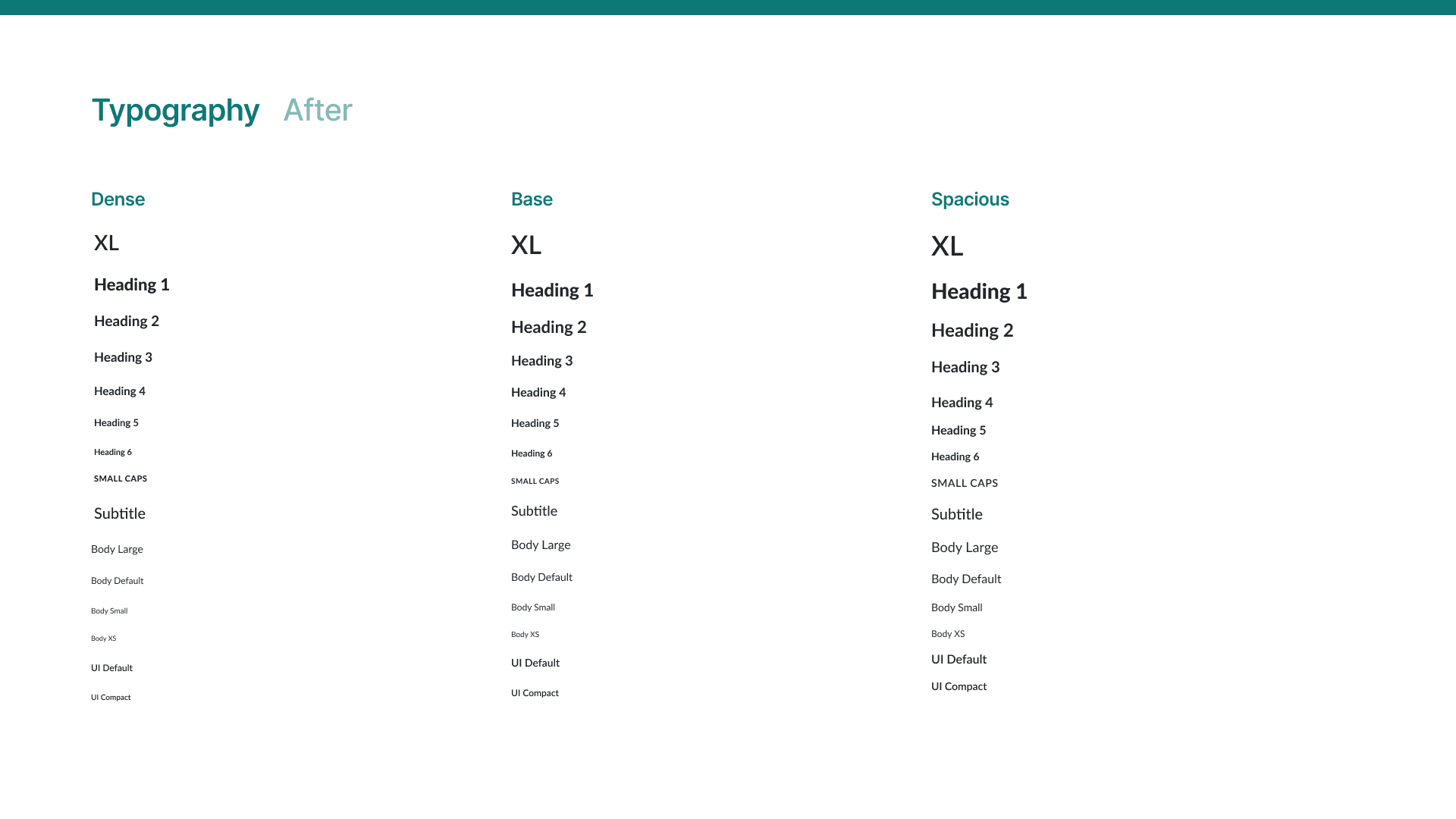
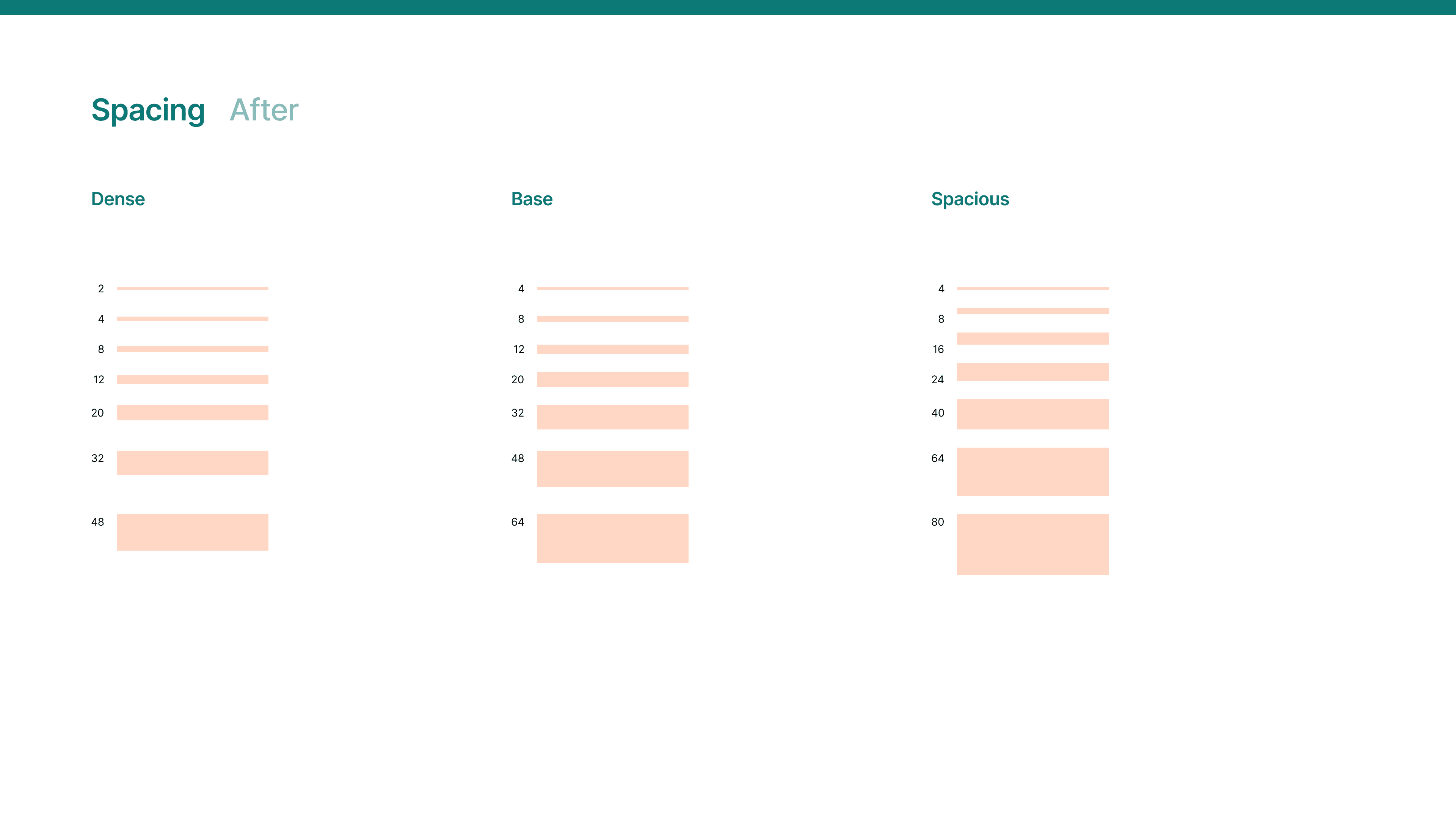
One system that supports three information density schemes to meet the varying and overlapping needs of our product ecosystem.
Foundations
The proof of concept helped to crystallize our new foundations. Key decisions included:
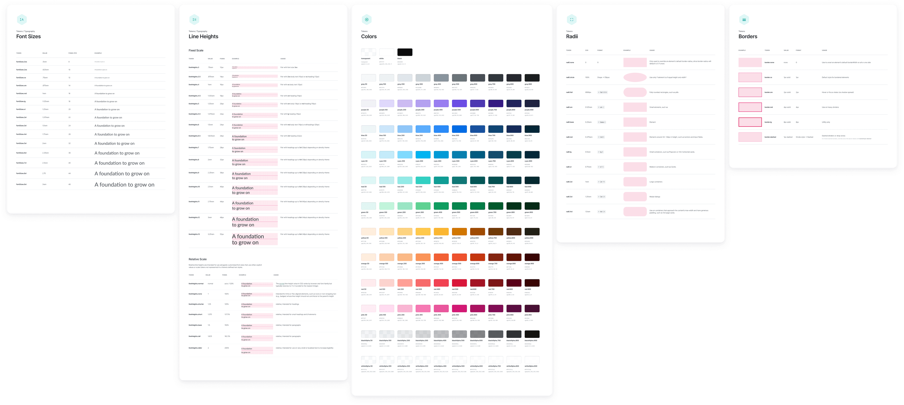
- Aligning on the use of Lato, our brand typeface, across products
- Replacing mixed and inconsistent iconography with a single icon library
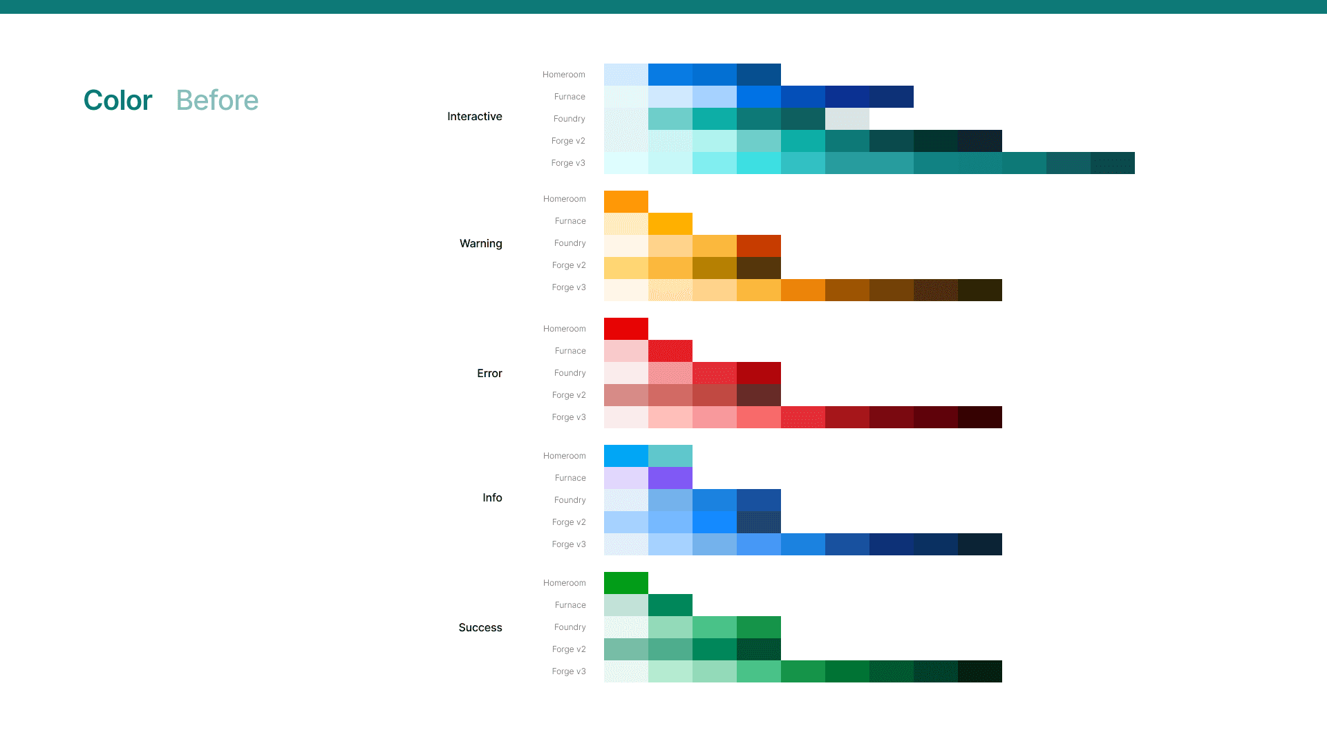
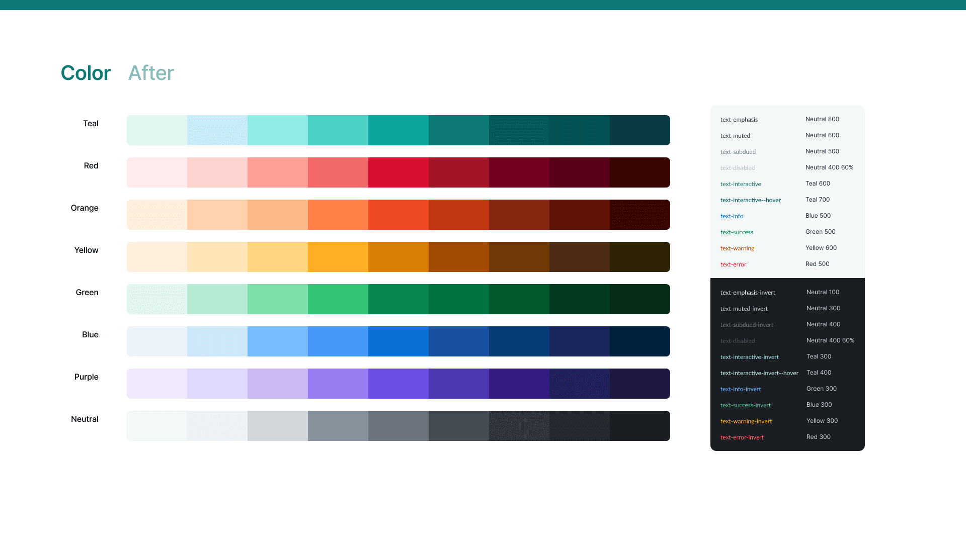
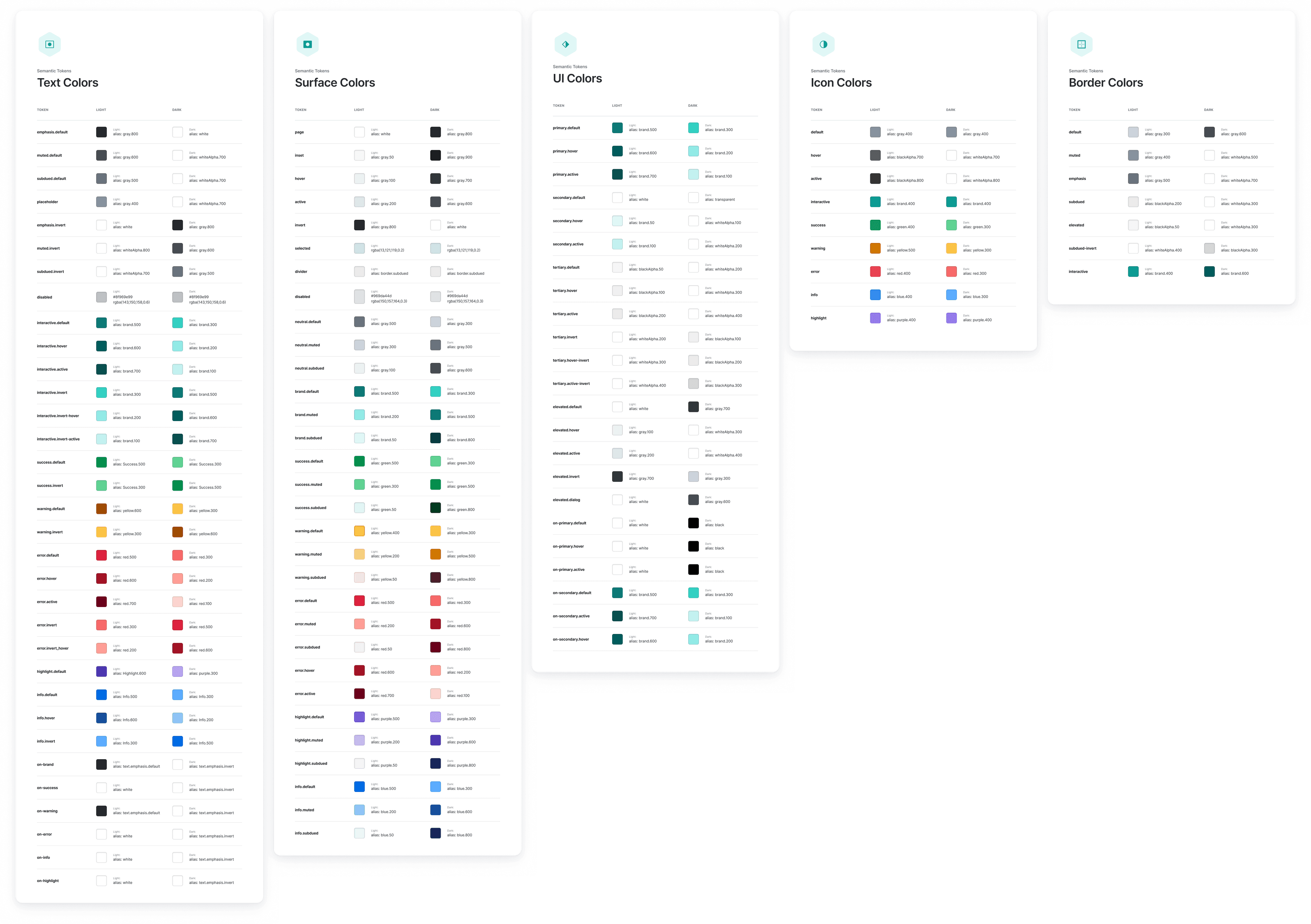
- Shifting from bespoke color palettes per theme to a curated collection of accessible palettes extrapolated from our brand colors
- Introducing a layer of density theming, reflected in typography and spacing, to support varied tasks and content types across products and platforms
Implementation
We were given the green light to implement the new design language — and to rebuild Furnace in React, so that it could be integrated with Alloy into a new design system monorepo powering all of Everfi's front end. A tall task but a huge win.
We continued iterating on our foundations, arriving at a family of comprehensive design tokens that supported all our needs.
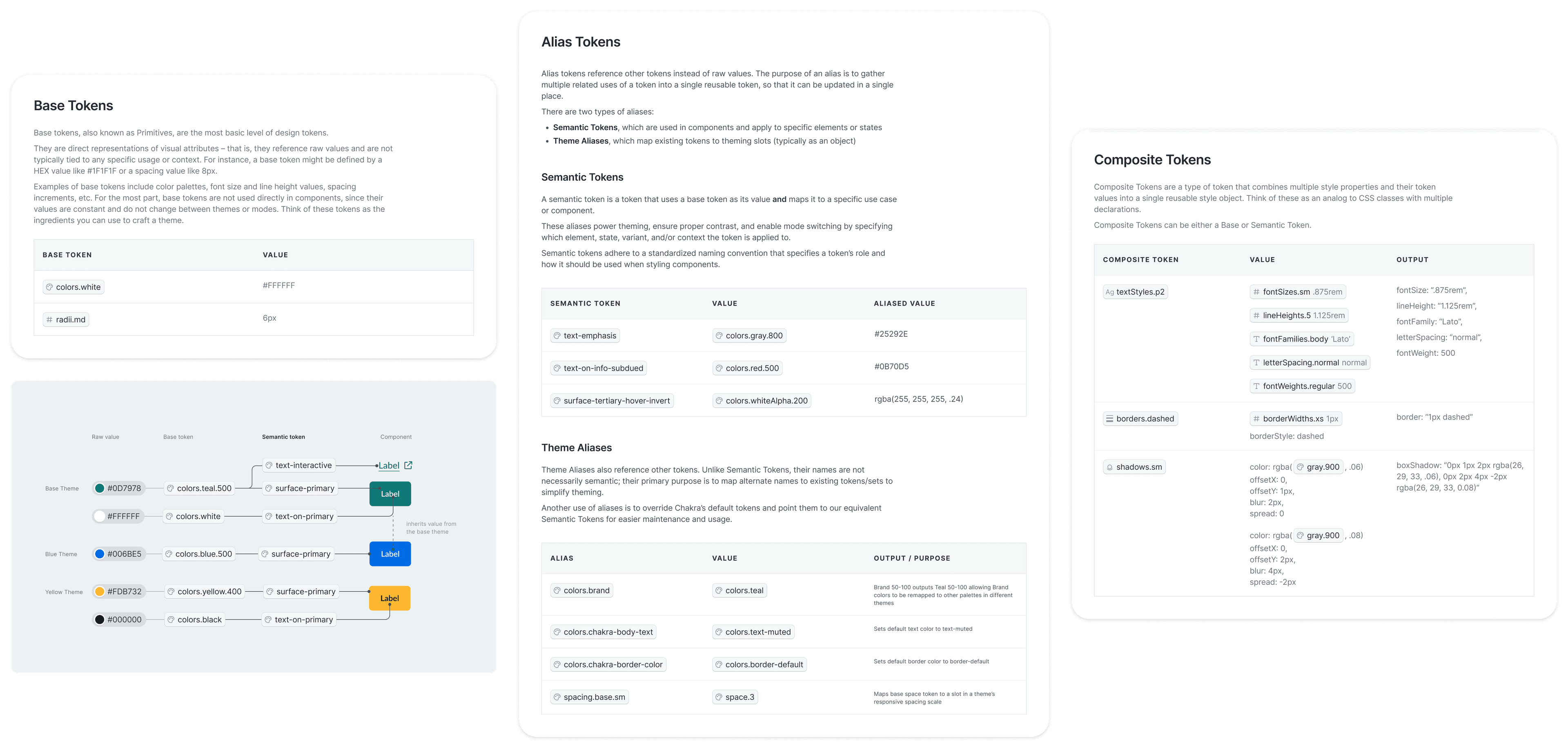
To ensure that tokens served as a single source of truth, I migrated our Figma styles to use Tokens Studio to enable syncing with GitHub. Once imported, tokens were converted from JSON to TypeScript via Amazon Style Dictionary for consumption by the new React components.
For products that weren't quite ready for React migration (like Homeroom, the K12 platform), we also generated SCSS variables so that we could refresh their styles to match their updated siblings.