Furnace Design System
An accessible, themeable, and scalable design system for e-learning products

Background
Everfi has a large portfolio of e-learning courses, ranging in subject from Early Literacy to Workplace Inclusivity to the crowd favorite, Bloodborne Pathogen Training. Historically, courses were one-offs designed by individual teams using building blocks provided by our SDK, styling and composing them in unique ways. However, there was no feedback loop to collate these stylesheets, templates, and interactions for later reuse, so each new course build started from scratch.
Around 2018, as the company began to scale, there was a well-intentioned effort to do just that. Components were gathered from existing courses, their styles turned into variables, and custom stylesheets became themes that could be reused across product families. In theory.
But the components were hyper-specific and inflexible. Styles were incomplete and context-dependent: font sizes were often hard-coded, a padding variable was available on one button but not another; somehow, accordion chevrons were always pink.
For the next year, we tried to make do, but without a style or UX foundation in place, designers and writers struggled to make square pegs designed for a past course fit into round holes posed by a new audience or topic.
It became difficult to maintain, impossible to fully document, and risky to make even minor changes to. We'd have to break everything in order to fix it, so, in early 2019, I began working on a proposal to rethink it from the ground up. By the end of the year, we'd built it.
Goals
- A centralized style system that supported widespread theming. No more one-off component variables or CSS seeping in from other courses.
- A fully-styled base theme with smart defaults. Documentation and QA were nearly impossible because we had no underlying styles for the components.
- Responsive layout and type with additional flexibility. We had 13 different layout components…none of which were a grid.
- Standardized iconography. Designers had to export recolored SVGs for each new theme.
- Greater emphasis on utilities. It shouldn't require a feature request to override a text color or make something italic.
- Improved naming conventions. The lack of a consistent naming convention made it difficult to predict the effect of a given class and impossible to align our Figma library styles with themeable properties.
Primitives
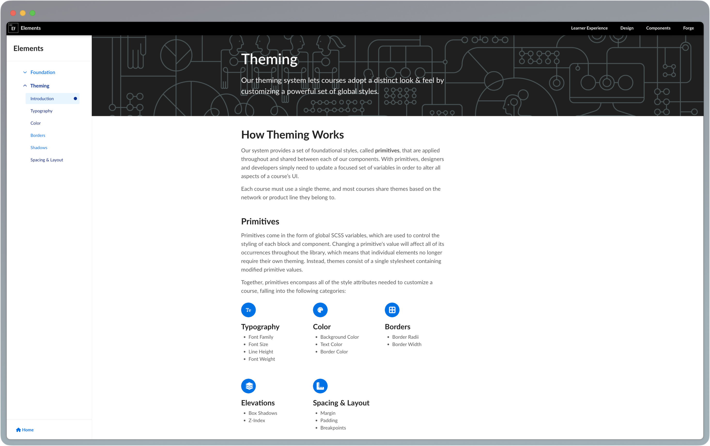
I worked to distill all styling needed for a theme into seven categories that would power the system. These were Primitives, a constrained set of foundational design properties that are applied to each element in the design system.
Changing one value affects all of its instances throughout the system, allowing for a consistent application of visual style in a scalable and maintainable way. Each component was refactored to use only global variables from the following families:
- Color
- Typography
- Spacing
- Border Radius
- Border Width
- Shadows
- Layout
Color
The challenge of creating a theme-friendly color system comes in threading the needle between customizability and simplicity. Too few options frustrate designers, too many adds to maintenance and risks slippage.
Baking smart defaults into the system simplifies configuration; a designer needs only to define their handful of primitives, and trust the system to put them in the right place.
Each theme's color system is constructed using four color palettes, limited in scope. These colors are then assigned to specific roles to ensure sufficient contrast.
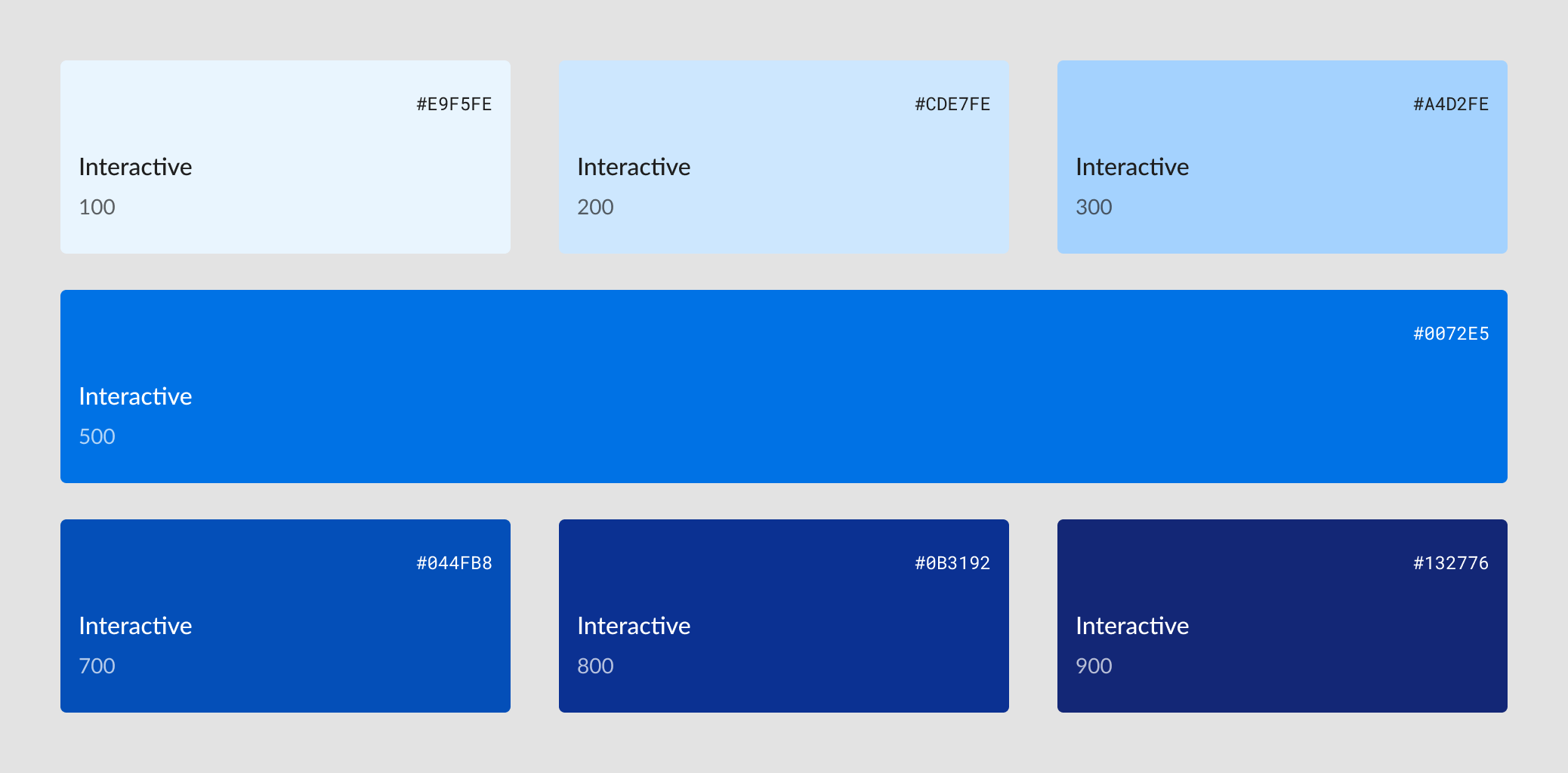
- Interactive Palette: To reduce complexity and help focus learner attention, a single primary color scale is used to indicate interactivity in a theme. These are ordered from lightest (100) to darkest (900), skipping 400 and 600 to enforce visual separation between primary and secondary elements.
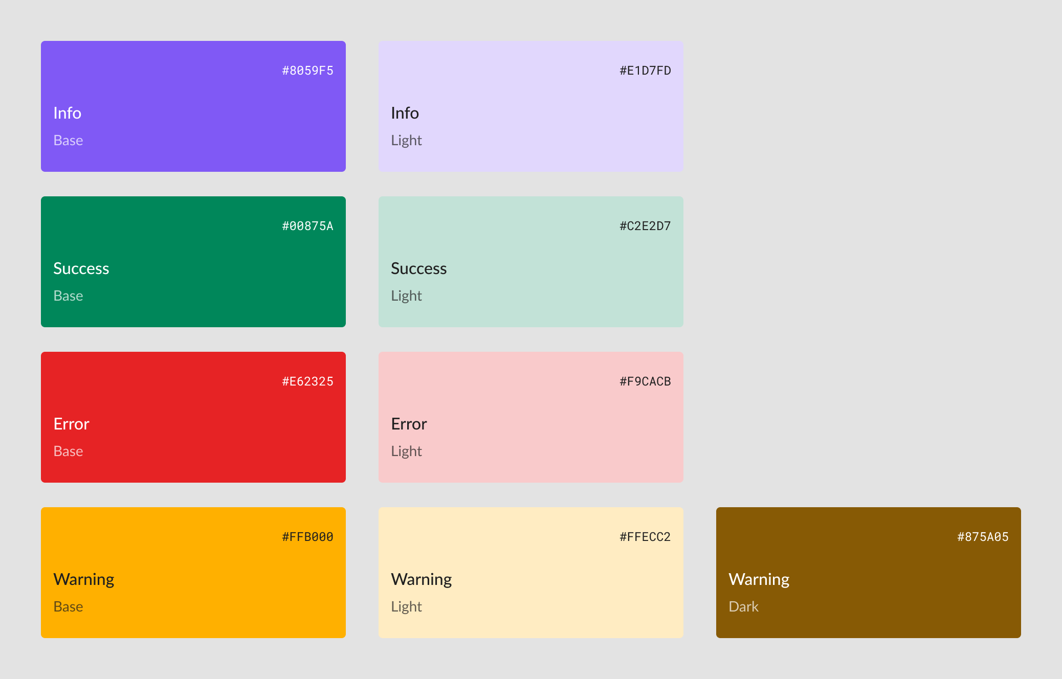
- Status Palette: Semantic status colors convey meaning through convention or repeated use outside the primary interactive color. Two colors for each status (foreground and background), plus an extra for tricky yellow warning text.
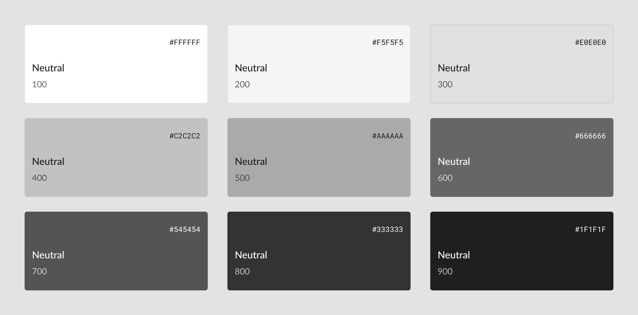
- Neutral Palette: Neutrals for text, borders, and states ranging from near-white (100) to near-black (900). Non-linear to avoid muddy middle greys with poor contrast vs. either pole. In the base theme, neutrals have a 4.5:1 contrast ratio with those five slots away; e.g., Neutral 100 and 600 have a 5.74 contrast ratio.
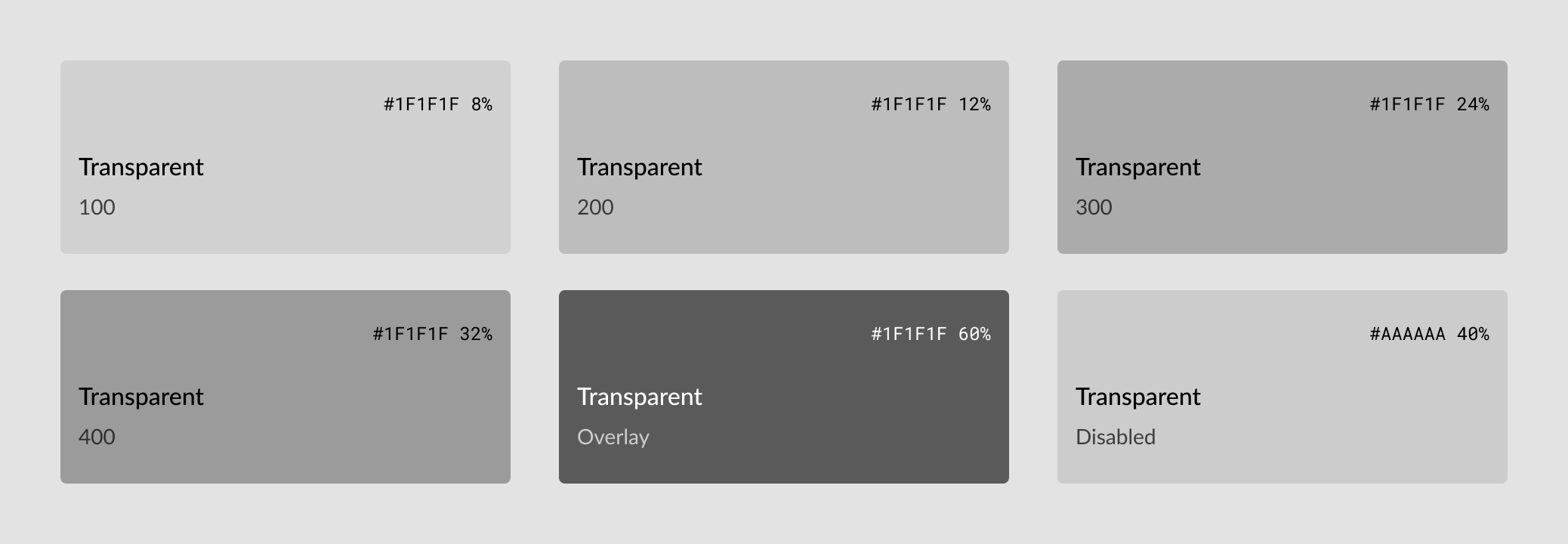
- Transparent Palette: A transparent subset of neutrals designed for subtle or disabled UI elements, dividers, or overlays. Defined separately (rather than consuming) from the neutral palette to allow designers to use handpicked colors for overlays. Also ensures that disabled colors use a semi-transparent midtone for visibility against light or dark surfaces.
Color Roles
Palette colors are almost never used directly inside components. Instead, they're paired as foreground-background combinations in a second layer of role variables.
For each $bg-[role] in the SCSS, we have a corresponding $text-on-[role] mate. This is common practice now with design tokens, but we had to learn this the hard way.
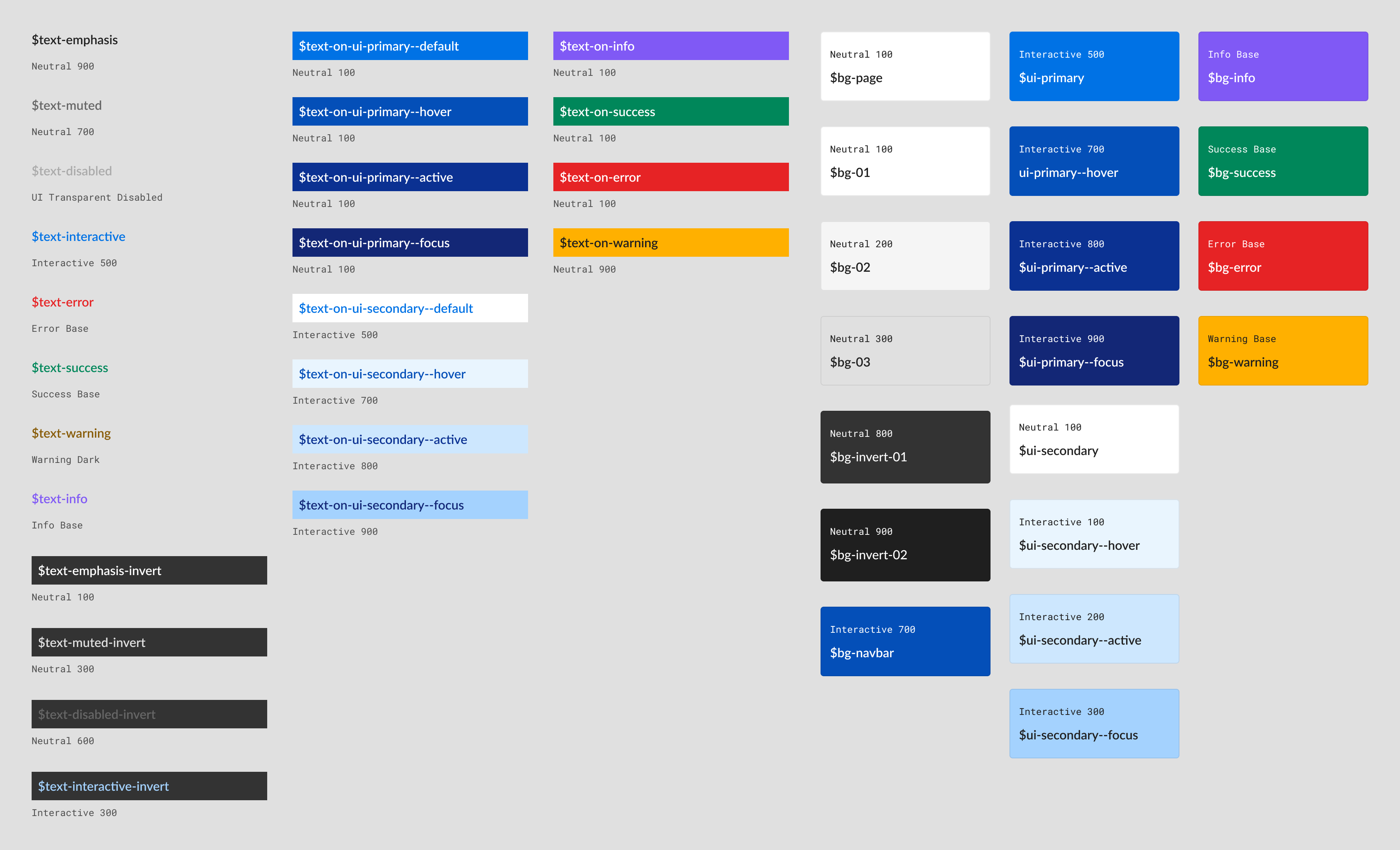
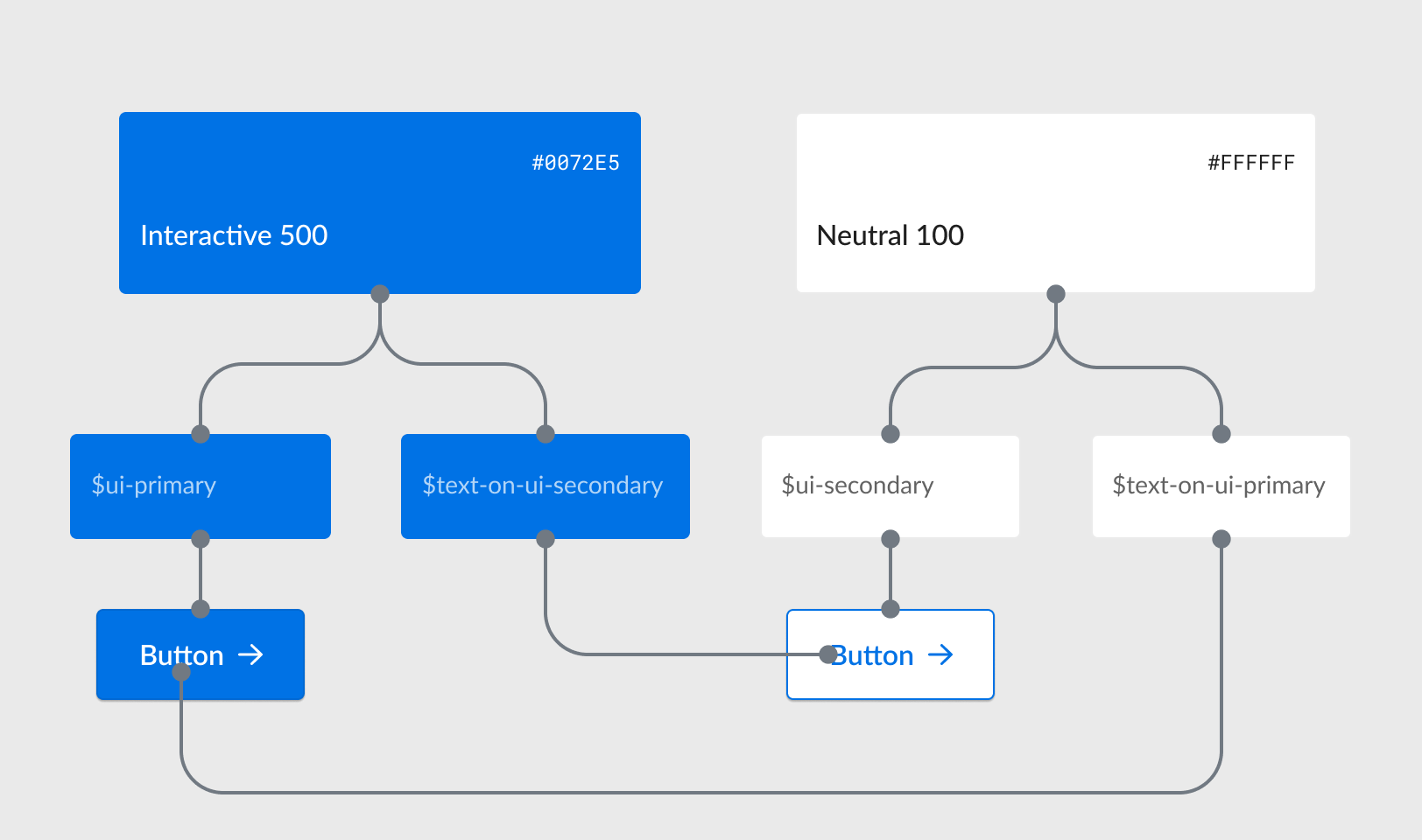
For example:
Although $text-on-ui-secondary and $text-interactive share the same color in the default theme, they are separate variables.
This distinction is essential because $text-on-ui-secondary always pairs with $ui-secondary backgrounds, while $text-interactive is used for links that may appear on various background colors.
By defining the two colors separately, themes can flexibly change button colors without compromising the accessibility of links within a course.
Spacing
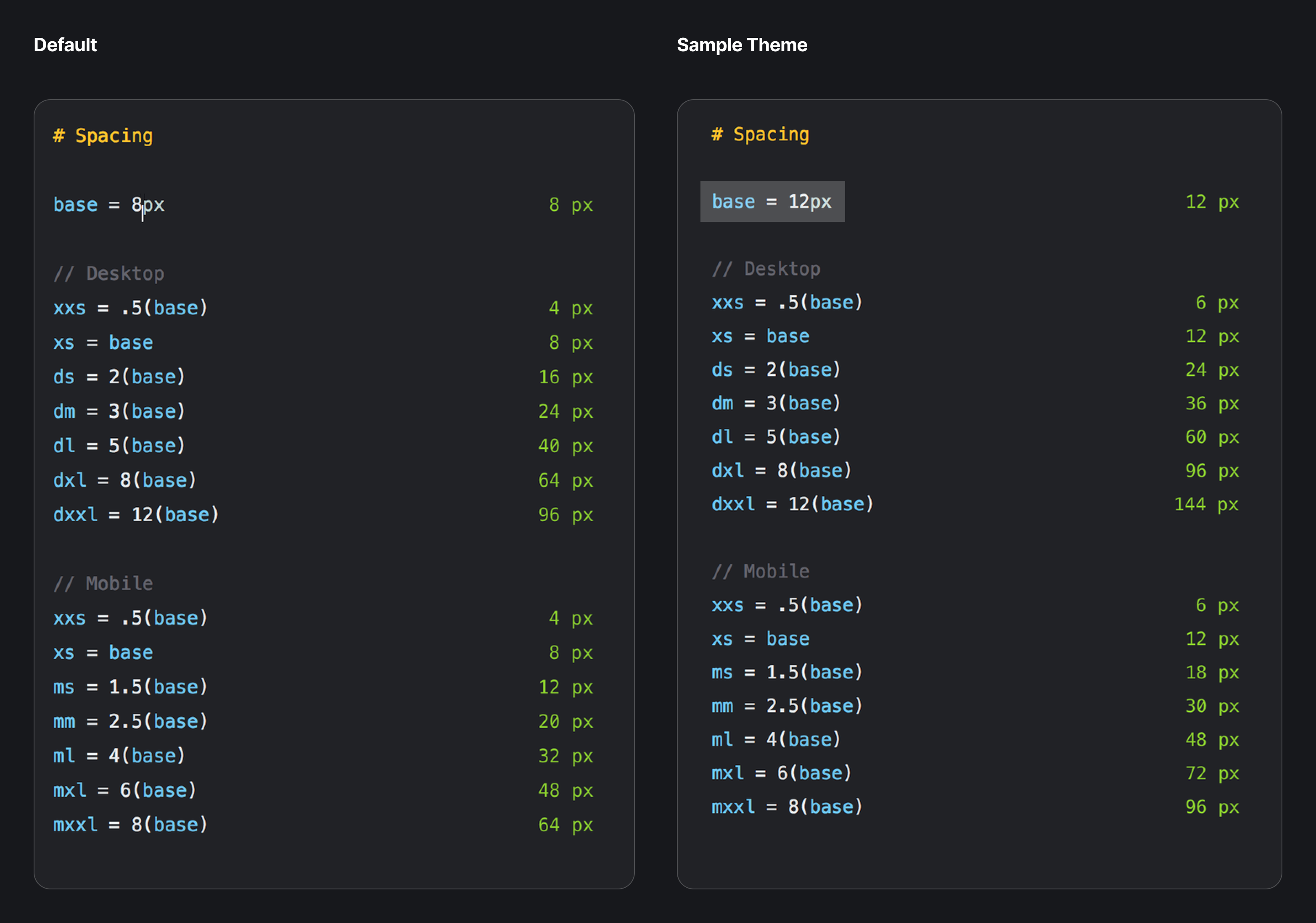
Spacing is calculated using a base unit $spacing-xs / 4px multiplied by different scales on mobile and desktop breakpoints.
Themes actually don't have the ability to override a single component's spacing. Instead, we baked responsive margin and padding into components, causing them to scale automatically if / when the base unit is updated.
Typography
Responsive typography was a priority for any new type system we implemented.
This ended up only applying to headings, though. We found that since course pages aren't particularly dense, there was really no need to adjust the prose sizing. Might as well keep things legible.
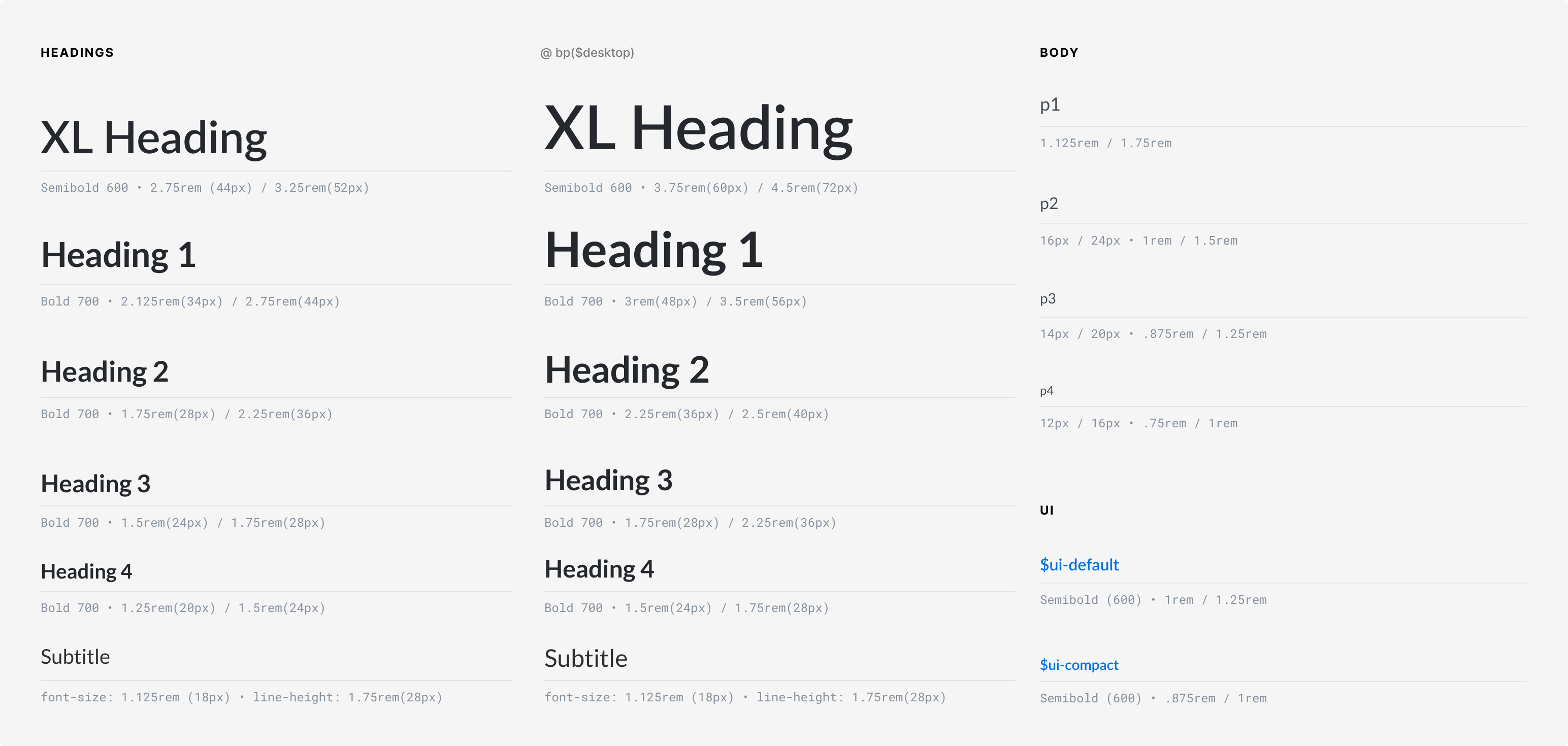
Resize the pen below to see how responsive type and spacing work together:
Shadows
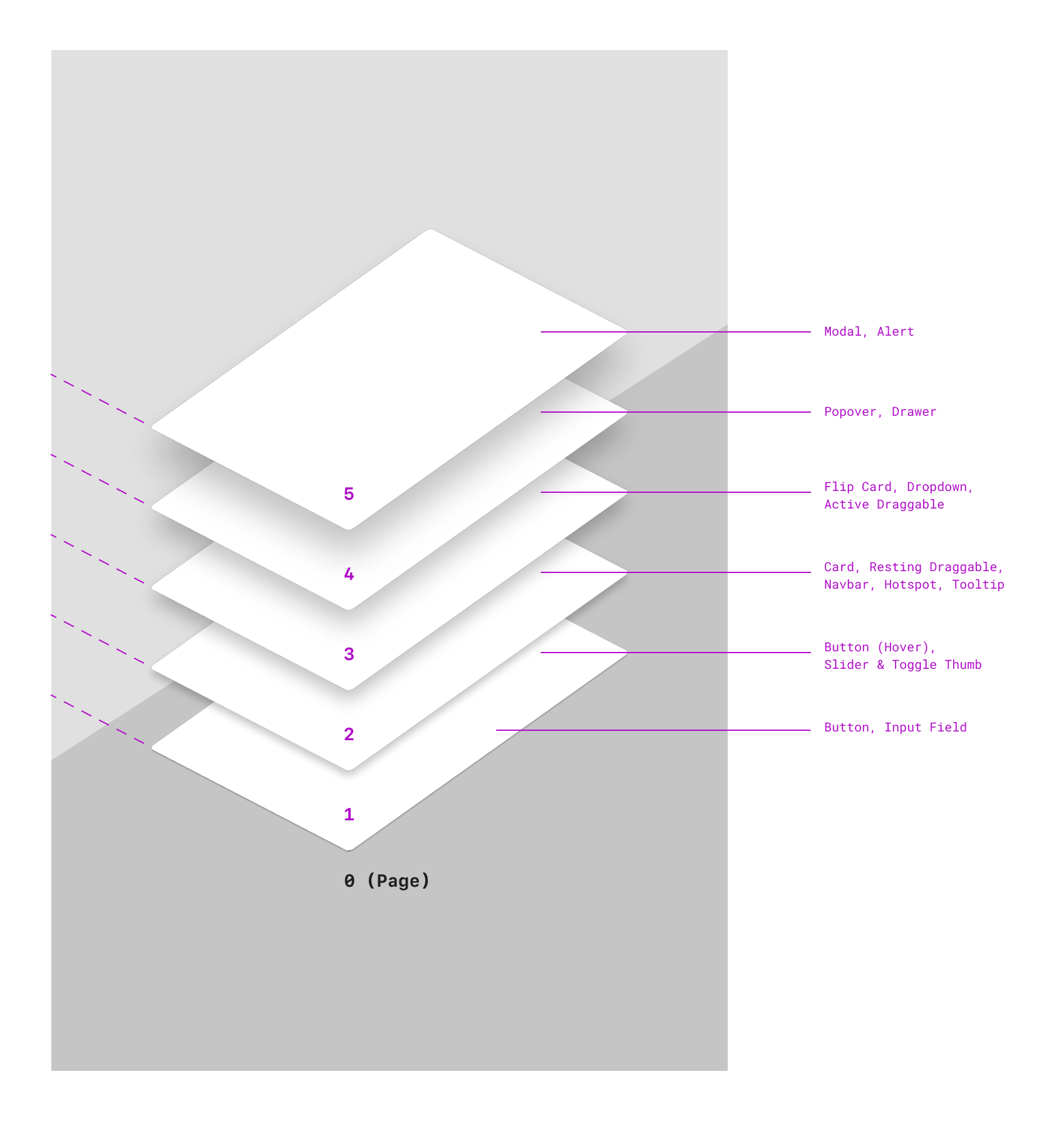
Shadows are defined as five gradually increasing elevations, corresponding to perceived z-index, or an elements relative distance "above" others.
Themes can customize these elevations, such as using none for a flat theme or tinting shadows with a color from their palette.
2
3
4
5
Borders
Primitive variables also included border-width and border-radius values. Border colors were applied using color palette variables and generated classes.


Layout
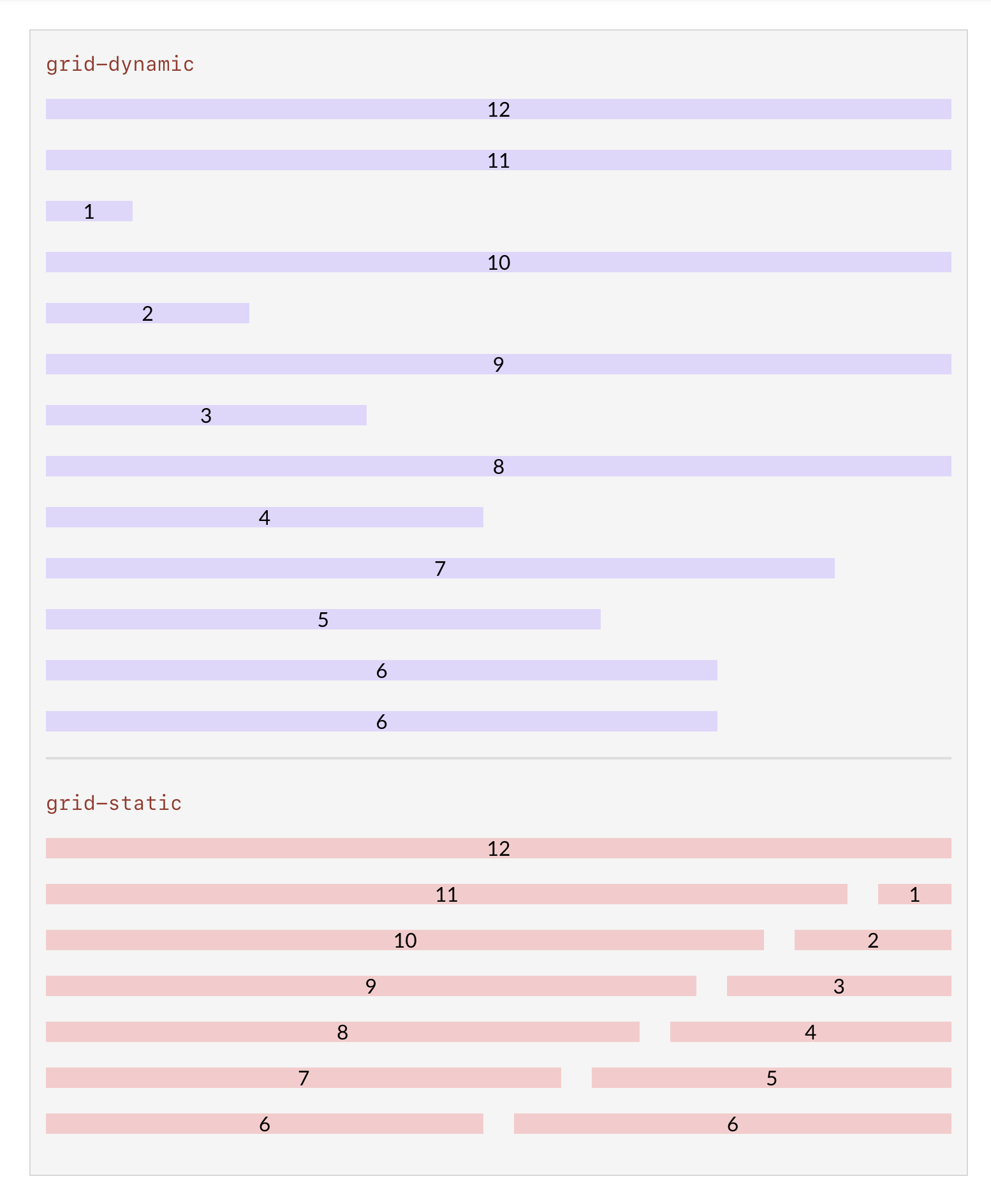
One of the biggest pain points in our SDK was the lack of a flexible grid. While there were a number of layout components (13!), they were all variations of two-, three-, and four-column grids, and each of them simply stacked their children below the desktop breakpoint.
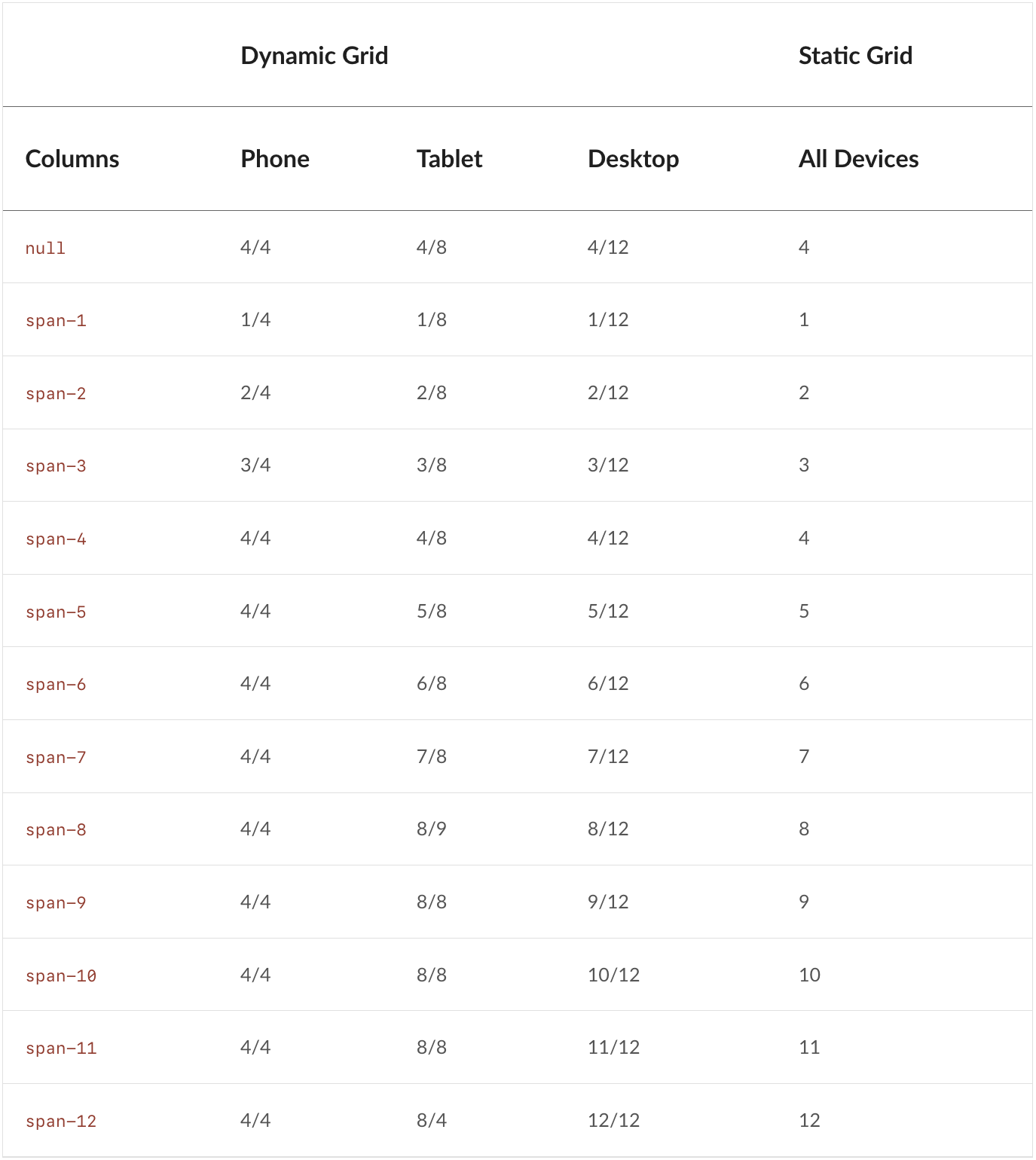
To replace them, we created two CSS Grid layouts: a classic Bootstrap-style 12-column grid for full flexibility, and another inspired by Material 2 that dynamically renders different columns per breakpoint (4 on mobile, 8 on tablet, and 12 on desktop).
Impact
Overall, we drastically simplified theming, while also elevating our visual design. Old themes contained 1,595 variables spread across 58 files — with Primitives in place, themes became a single file containing just 63 variables, while providing more comprehensive styling than we'd ever had.
For the first time, we had a fully styled base theme, Core, that aligned 1:1 with our once-aspirational Figma component library.
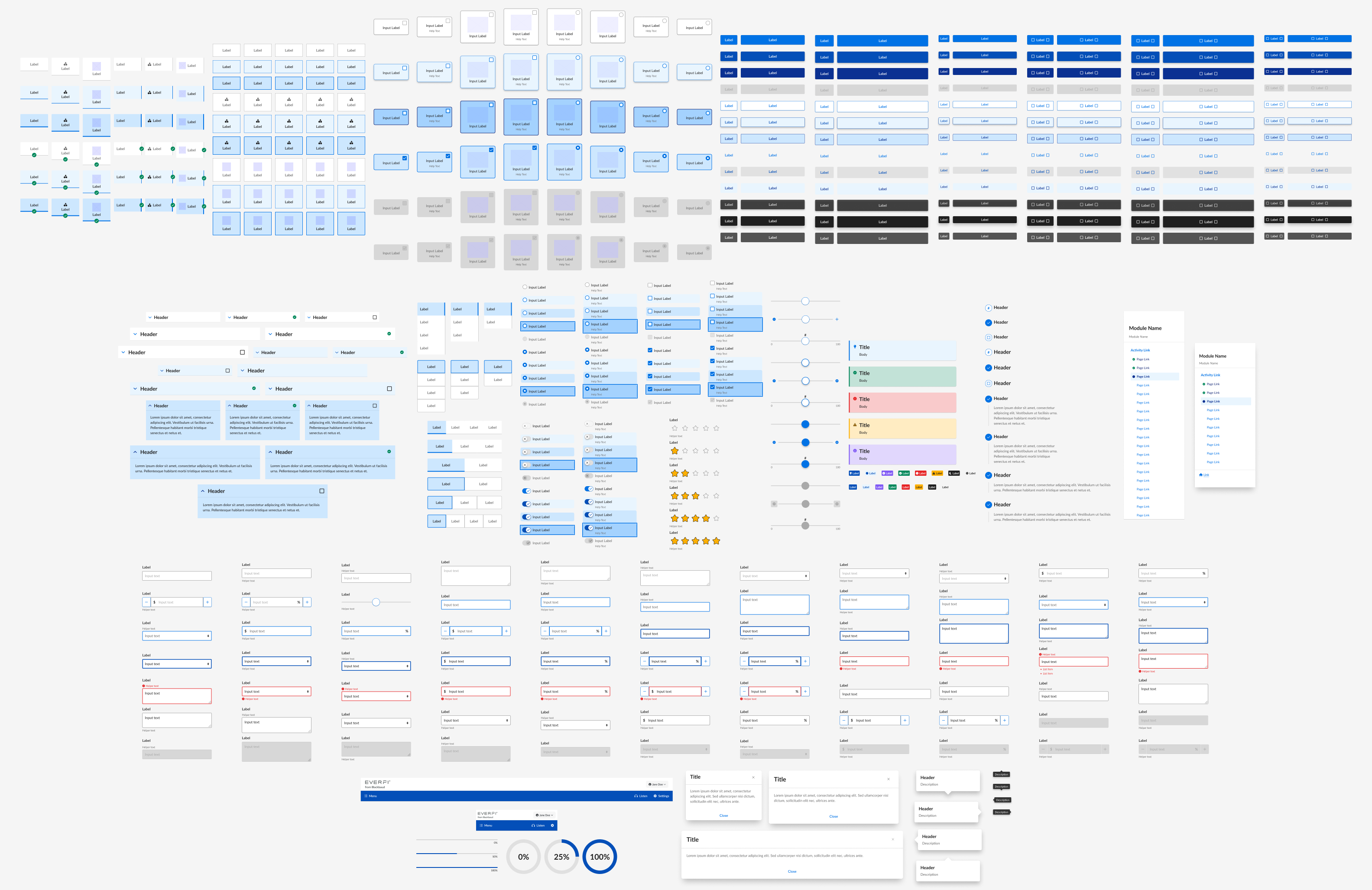
This provided smart defaults for other designers and streamlined the creation of new themes, both in Figma and in code. With styles in Figma aligned to our primitive variable names, designers were empowered to plug those values into an SCSS theme template and ship it off to a developer to push.
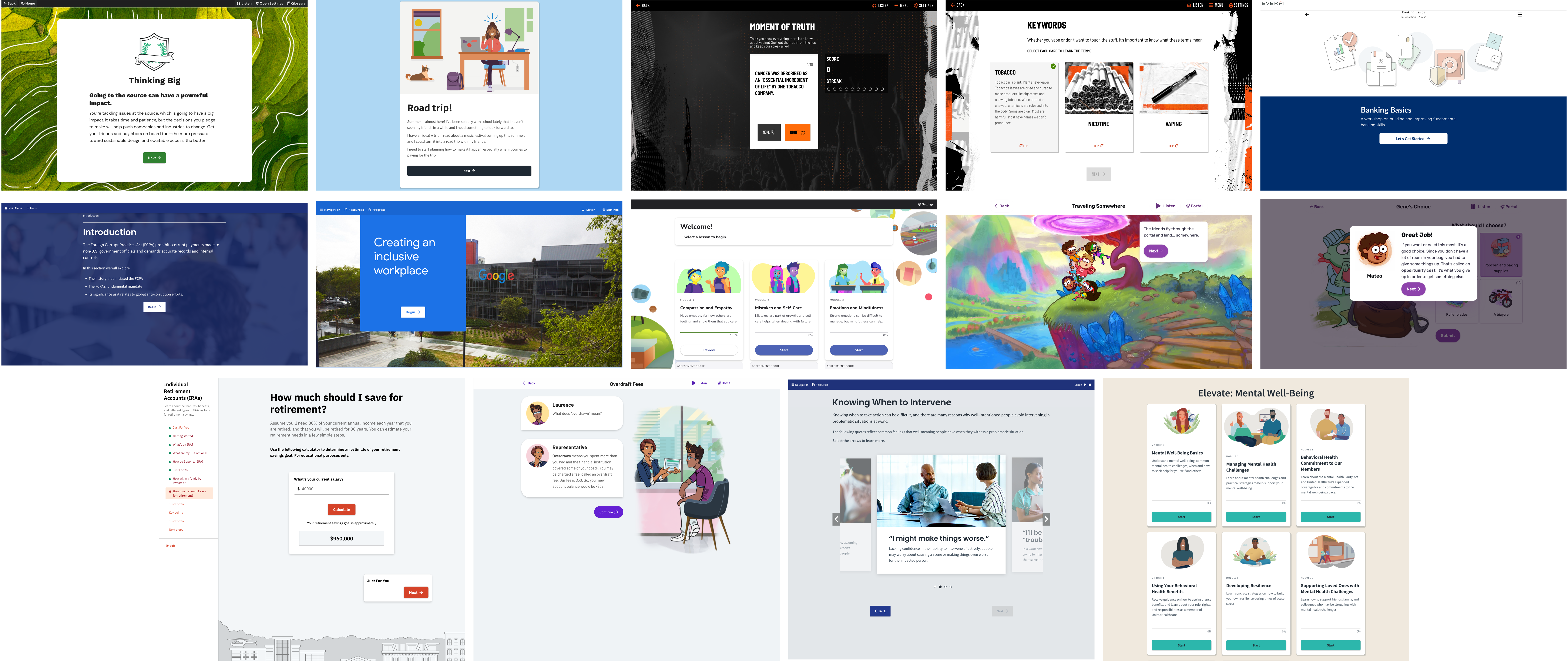
Development
Consistent theming with variables provided a baseline for regular visual, functional, and accessibility QA on each of our components prior to a release.
For a sense of the difference this made, compare the two images below from our pre- and post-primitives QA environments:
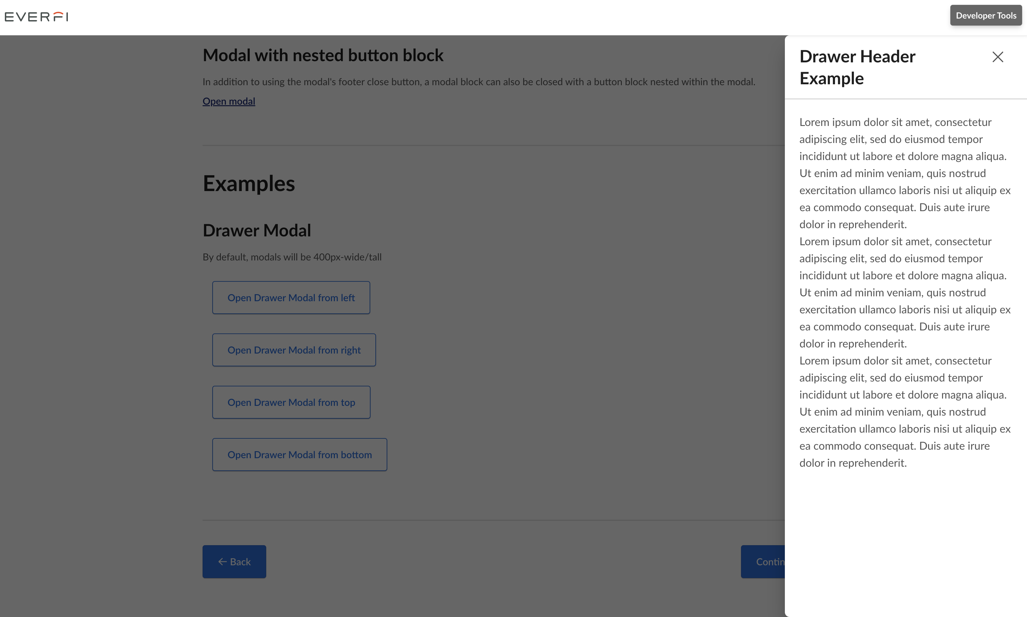
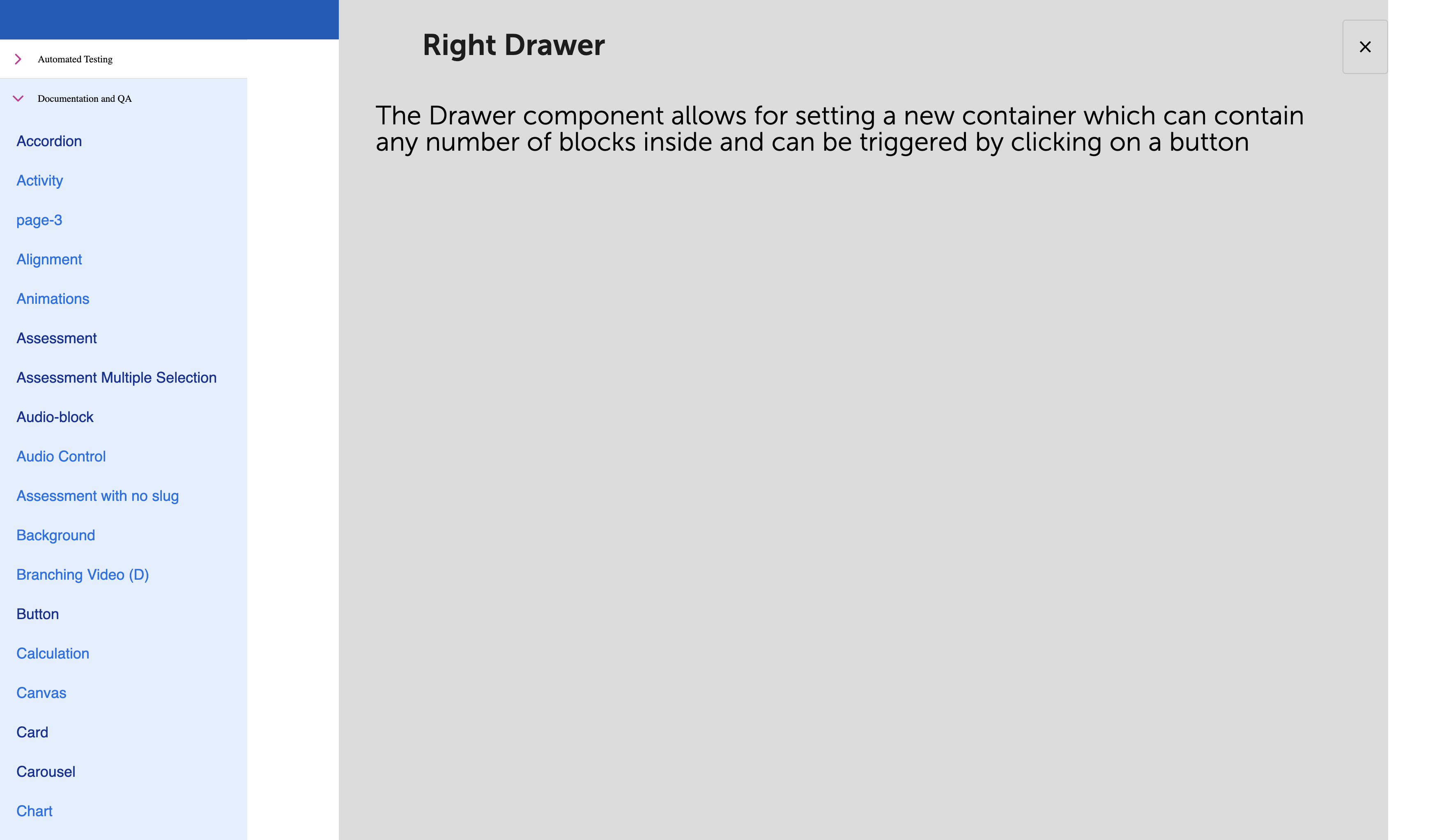
Previously, if a course wanted to use a new component, they would manually add and update its unique SCSS variables to their theme, push it to the components repo, then wait for a release and bump just to get it styled.
With global variables in place, implementers could drop a component on a page and have it inherit theming instantaneously.
Behind the scenes, we instituted BEM naming conventions throughout the SCSS and refactored component templates with proper semantic markup. We deprecated 20+ components in favor of more flexible, general-purpose ones. We also upgraded our dependencies with an eye toward easier maintenance and scalability moving forward.
Internationalization
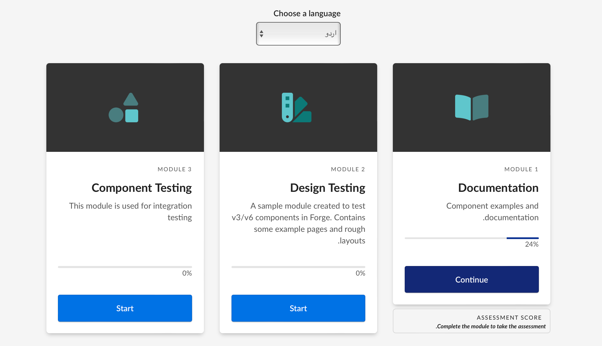
With new grid, typography, and spacing systems, internationalization of courses came relatively easily.
We'd removed any hard-coded dimensions or spacing, so heights would always be determined solely by the sum of font-size, line-height, and padding. Translated content wrapped predictably and wouldn't be truncated prematurely.
We also added RTL support to our grid, allowing it to flip based on the locale. Horizontal margin/padding also reverse in RTL, along with directional icons. Non-English languages swap the theme typeface to its Noto Sans counterpart, too.
Accessibility
Prior to the launch of Furnace in January 2020, 0 course products were fully compliant with WCAG Level A or AA criteria, and only 6 components could pass Level A on their own.
By the end of 2020, we had five new courses fully-built on Furnace meet WCAG AA, and 21 more joined them the next year. Since we'd limited our breaking changes, many courses were able to reach compliance just by upgrading.
To illustrate this: 352 new accessibility tickets in products had been attributed to components in 2019, averaging 88 per quarter...just about one per day.
In the quarter following our release, only 14 issues were reported across all courses using Furnace. That dropped to only 2 in the same quarter in 2021.
Editor's note: This was written in 2022, so I went back and quadruple-checked these stats, since I thought my past self was exaggerating. Turns out there's receipts.
A 2021 accessibility audit revealed that 87% of Furnace components were fully Level AA-compliant. The remaining 13% met Level A, and were either little-used, slated for deprecation, or had planned fixes.
If you're interested in how we got there, check out my colleague Annie Alvarado's presentation for Fable Accessibility.
By the numbers
| Metric | Before | After | Change | % |
|---|---|---|---|---|
| Variables per theme | 62 | -1,533 | -96% | |
| Layout components | 2 | -10 | -83% | |
| Spacing values | 6 | -136 | -96% | |
| Color combinations | 44 | -109 | -71% | |
| Responsive courses | 74 | +65 | 720% | |
| AA-compliant components | 59 | +53 | 2580% |