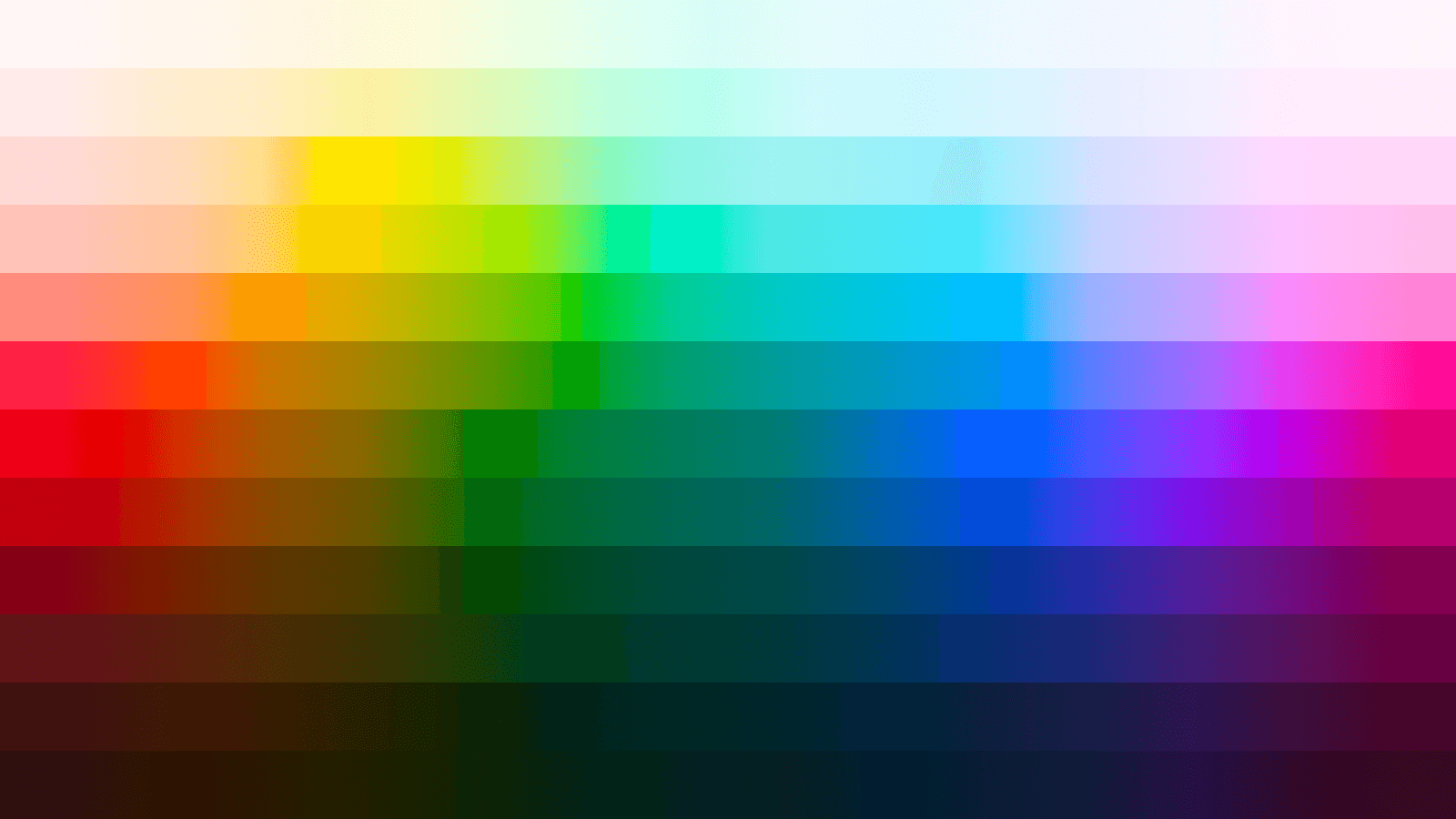
Context
As the Unified Design Language evolved, we needed an extended color system with underlying logic to make palettes plug and play for the dozen-plus themes we had to support.
This led me to the okLCH color space and the idea of re-balancing our colors into perceptually uniform palettes. What started as a side-of-desk project ended with 28 new color ramps, 365 colors, and a visual evolution of the brand.
Overview
The primary goal was to expand the system's color palettes so that we could drop theme support for bespoke colors, and derive all theming from the new system instead.
To do so, we needed to a. have coverage across the color spectrum for backwards-compatibility, and b. ensure predictable contrast.
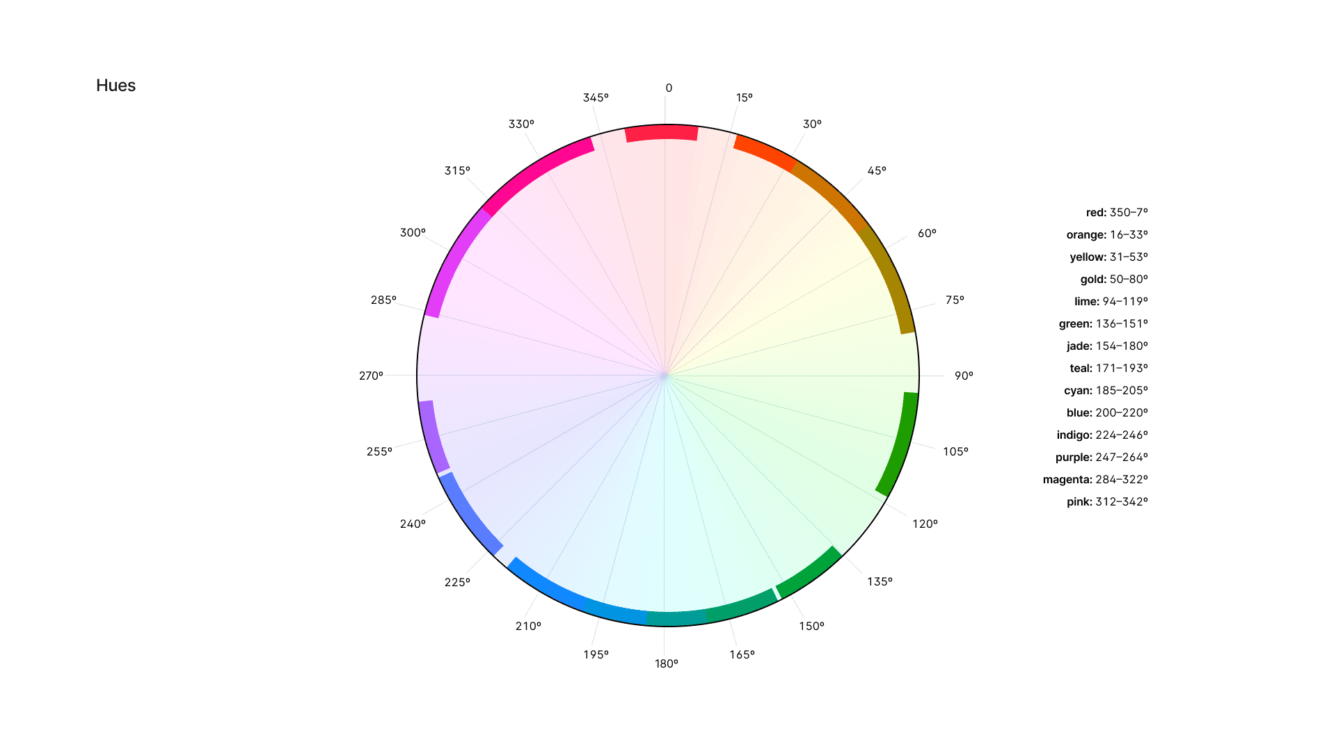
To the first goal, the resulting ramps each represent a specific hue range:
As for contrast, the recalibrated steps are aligned to luminance. Step 0 is pure white , and 1000 is near-black . Colors in each of the ramps occupy steps 25 to 975 .
Caveat: There's a little fluctuation in luminance per hue to account for WCAG's quirks. The actual lightness of an individual color corresponds to a target contrast ratio, rather than luminance alone.
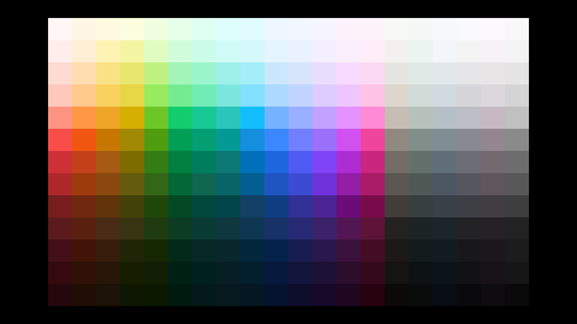
Colors are divided into three categories: spectrum hues (ROYGBIV & friends), neutral hues, and transparent colors, or alphas.
Hues
16 chromatic ramps for primary and status slots in a theme, these represent saturated hues covering the majority of the color spectrum.
For these color ramps, the 500 step has minimum 5:1 contrast vs. white, a target derived from the brand teal . Each multiple of 100 has minimum AA contrast with steps five spots away in either direction, and 3:1 contrast vs. those four spots away.
Neutrals
Neutrals are for icons, text, borders, and other relatively monochromatic elements. Here we have two informal subsets: basic grays and… spicy grays.
Black is a pure gray scale from white to black. The next three have a subtle color temperature: gray is cool, zinc is warmer, and ash is a blend of the two. There's a natural teal-to-purple bias to harmonize with the default brand colors.
The latter four are more opinionated in terms of chroma: tinted with red (plum), yellow (sand), green (sage), and blue (steel). You're making a bit of a statement choosing these, but they're available to designers who want to lean into their primary hue or illustration palette, something we see regularly in more immersive K-12 products.
A key feature of the neutral ramps is their more dramatic luminance curve relative to the ROYGBIV ramps. This gives the middle steps a greater range of accessible pairing options. For example, the 500 step has 3:1 contrast with 200, instead of 100, so workhorse foreground colors remain legible on more surfaces.
Ramps also include an extra 75 step that matches the 50 step in the saturated palettes, so that neutral component backgrounds can match their spectrum counterparts. You can maaaaaybe spot this in the chart above. This also helps balance the scale, nudging the tail lower for a more nuanced dark mode.
Alphas
Black and white alphas take the luminance curve of the black ramp and apply it to their respective alpha values.
black; middle: blackAlpha on white; bottom: whiteAlpha on blackThe system also currently supports an alpha ramp for the default gray, which visually mimics the opaque version.
grayAlpha on white; bottom: grayPalettes
Hues
In the following palettes, a single step has min. 3:1 contrast with colors four spots away in any palette, and 4.5:1 at five steps.
Neutrals
Within neutral palettes, colors follow the same contrast pattern as hues. But between neutral and hue palettes, the contrast is more pronounced: 3.0 vs. ± 3 steps; 4.5 vs. ± 4 steps.
Alphas
Usage
Themes include slots for brand, neutral, info, success, warning, error, and highlight palettes. Semantic tokens like bg-primary point to aliases like colors.brand.500 so you only need to define which primitive ramp you want to use for each slot to get up and running. It looks something like this:
You can override individual tokens for specific needs but must make sure contrast is maintained, since the system assigns foreground and background tokens based on expected step values by default (the step being a proxy for luminance).
It sounds manual, but it can just be a matter of shifting a few tokens up or down the scale.
Theming
With 16 hues and 8 neutrals, we can map colors to semantic slots without having to worry about conflicts with brand colors.
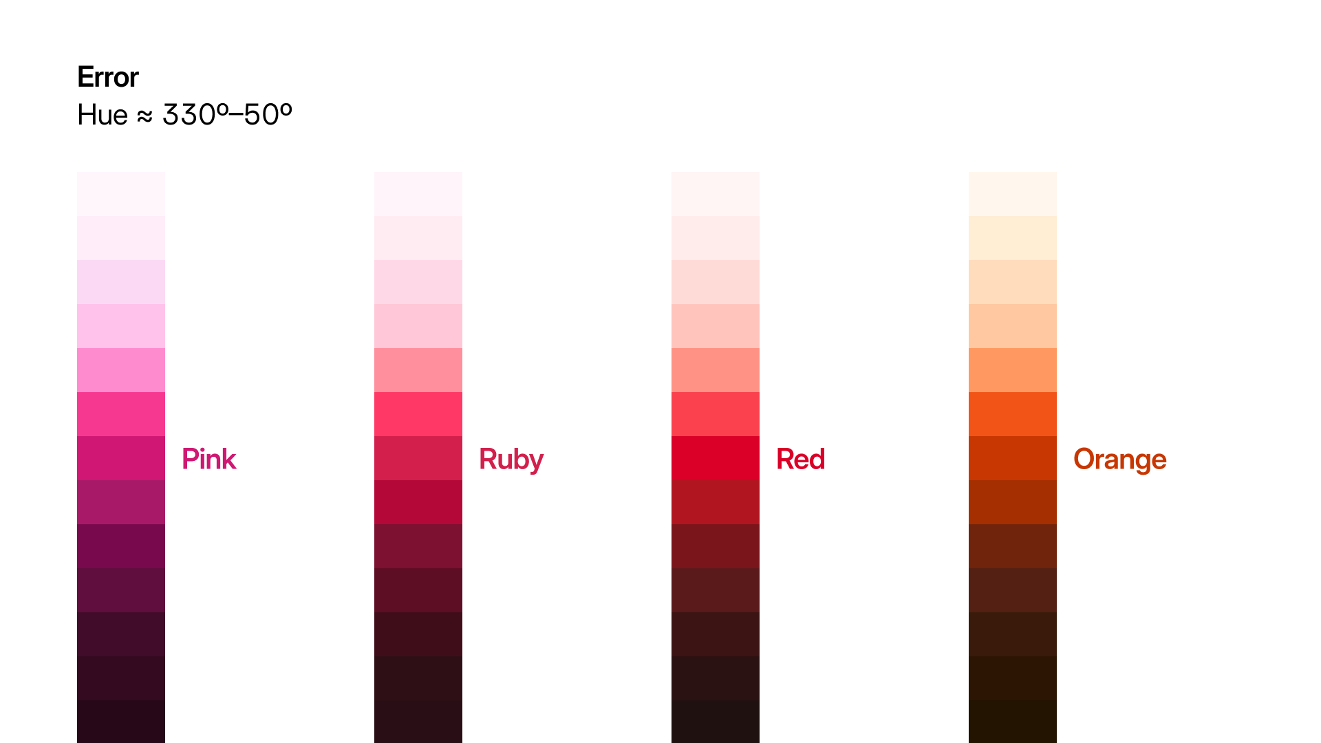
Need your primary color to be red? Cool, your error colors can be pink or magenta. Or ruby or orange. Going for something more muted? Try navy for info and gold for warnings.
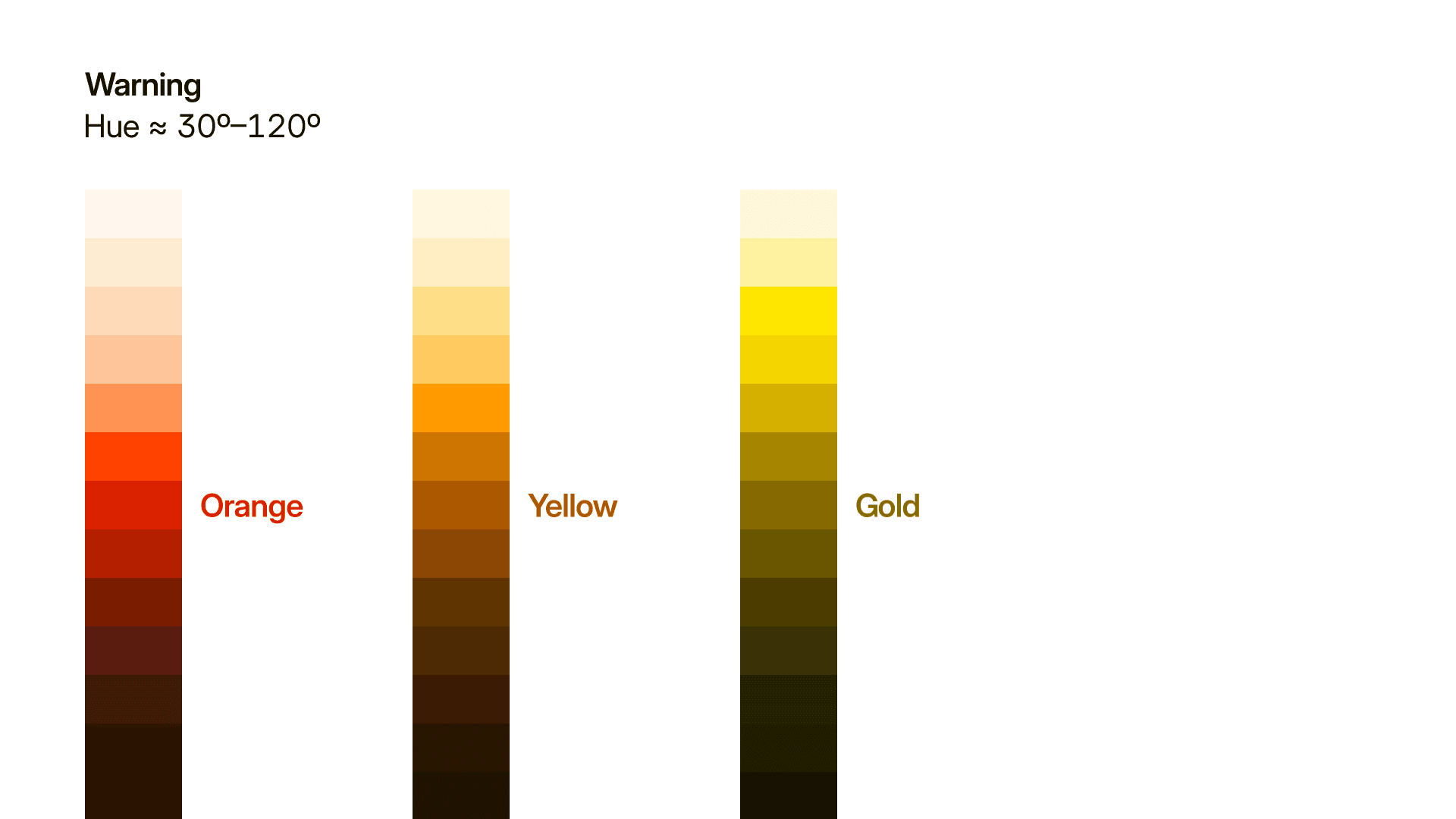
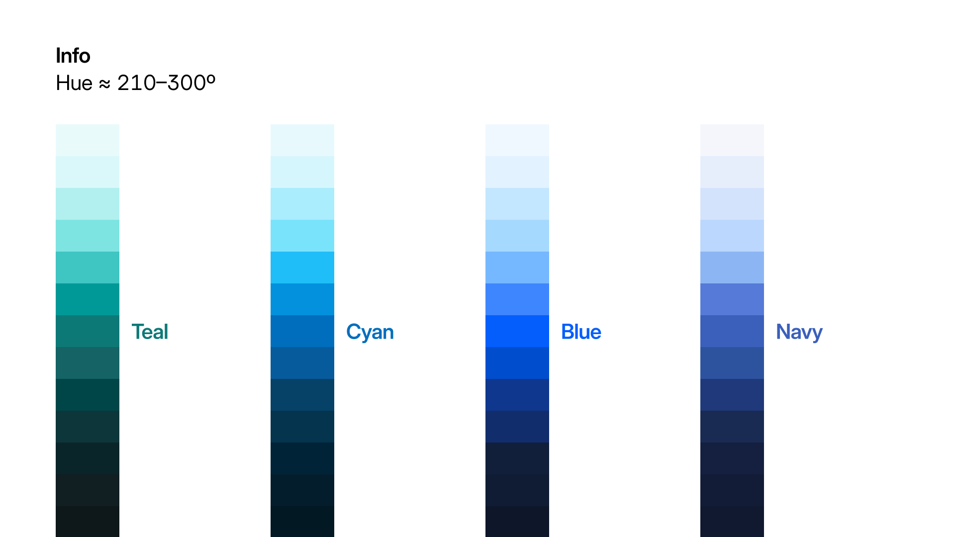
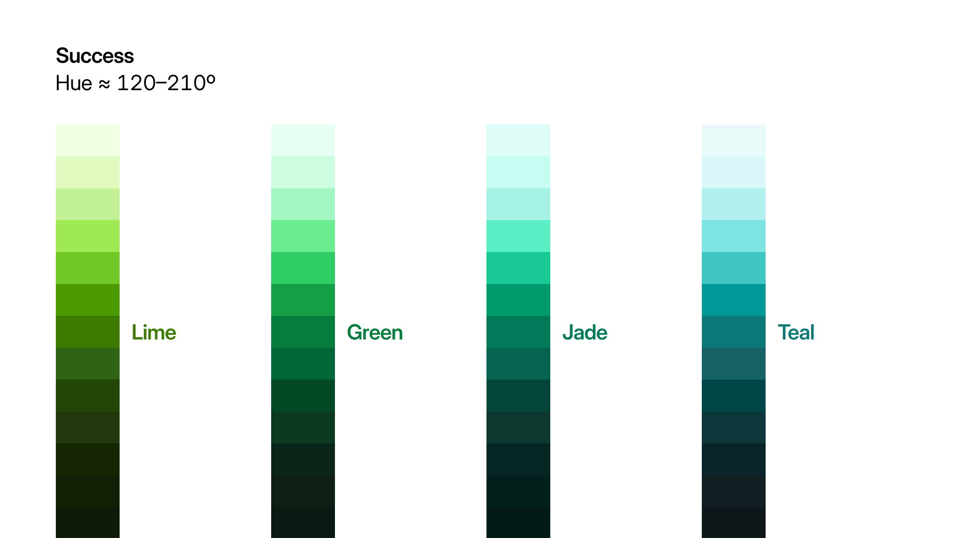
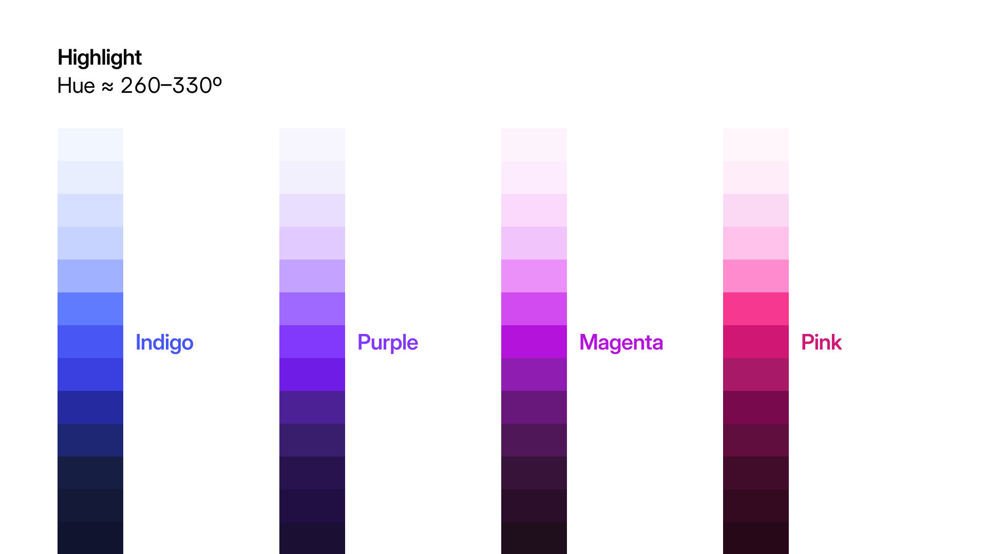
To visualize how different color overrides might look with the new system, I made a theme builder tool for Storybook (with a little help from Opus):
Dataviz
The final piece of the puzzle is a dataviz palette designed with contrast and visual differences in mind. The range of colors now available allowed us to replace one-off or hardcoded colors with intentional choices.
Here's a little tool I made to test and ship our dataviz palettes:
Demo
For a simulated demo of the color system in action, check out the Theming Demo, or fiddle around with the theme settings in the header. I've used the same color palettes on this site, and though the components are different, it might give you a sense of how the colors work together.
Resources
If this kind of thing interests you, here are some resources I found useful when building out the color system:
Tools
- Huetone - A tool to create and visualize okLCH palettes from Alexey Ardov
- OkColor - an okLCH color picker for Figma
- Accessible Palette from Euguene Fedorenko
- Adobe Leonardo by Nate Baldwin for Adobe
Articles
- OKLCH in CSS: why we moved from RGB and HSL - a great primer on okLCH by Evil Martians
- How to generate color palettes for design systems by Matt Ström-Awn
- Reinventing Adobe Spectrum's Colors by Nate Baldwin
- How we redesigned the Linear UI (part II) - specifically the Appearance section
- Accessible Color Systems from Stripe