Forge
Building (and re-building) the builderIn early 2022, I was asked to assess the current state of Forge, EVERFI's course builder app, and apply lessons learned from Furnace to propose a more scalable and user-friendly design framework. I was trying to avoid typing the phrase "mini design system", but that's pretty much the gist.
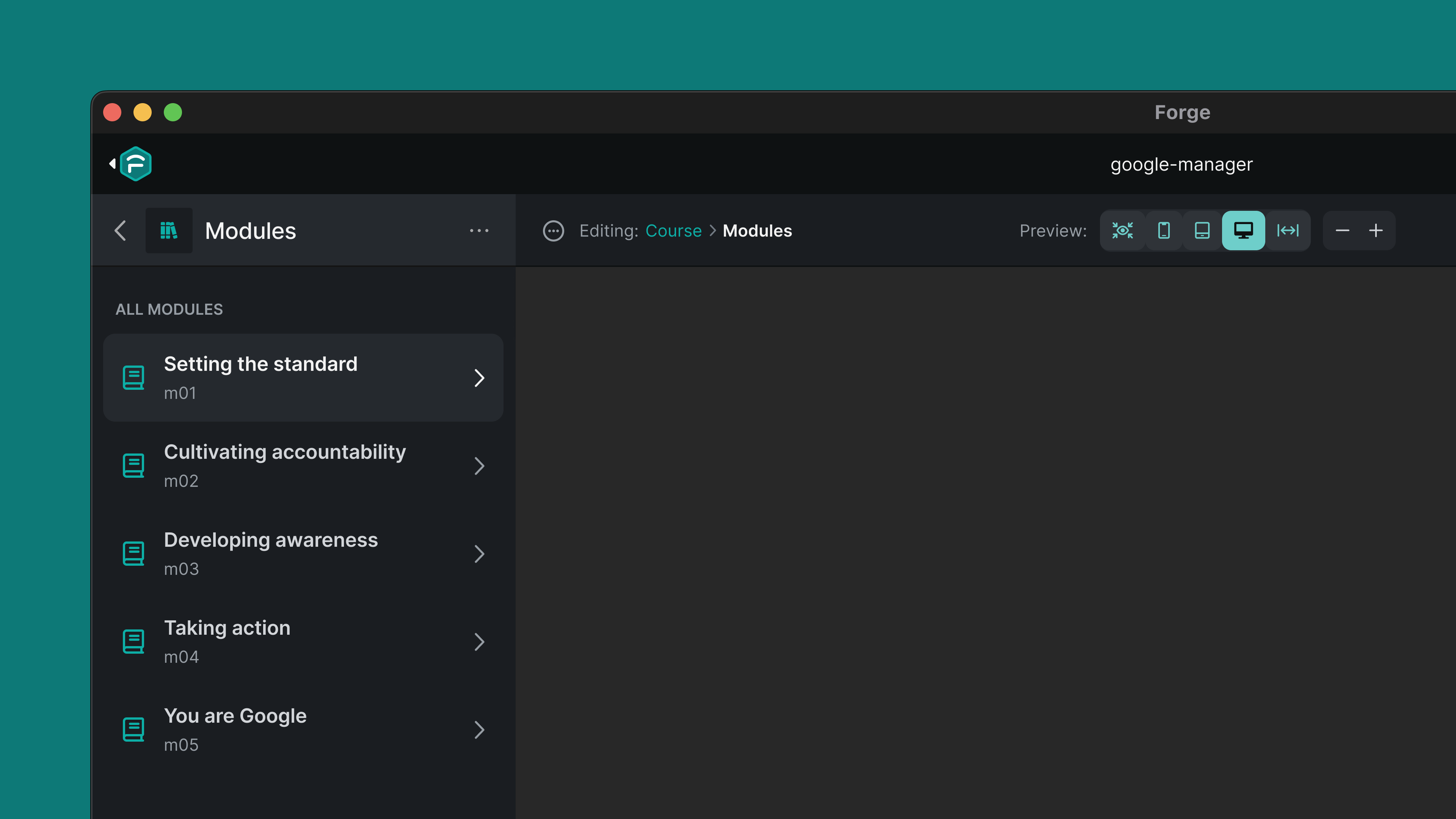
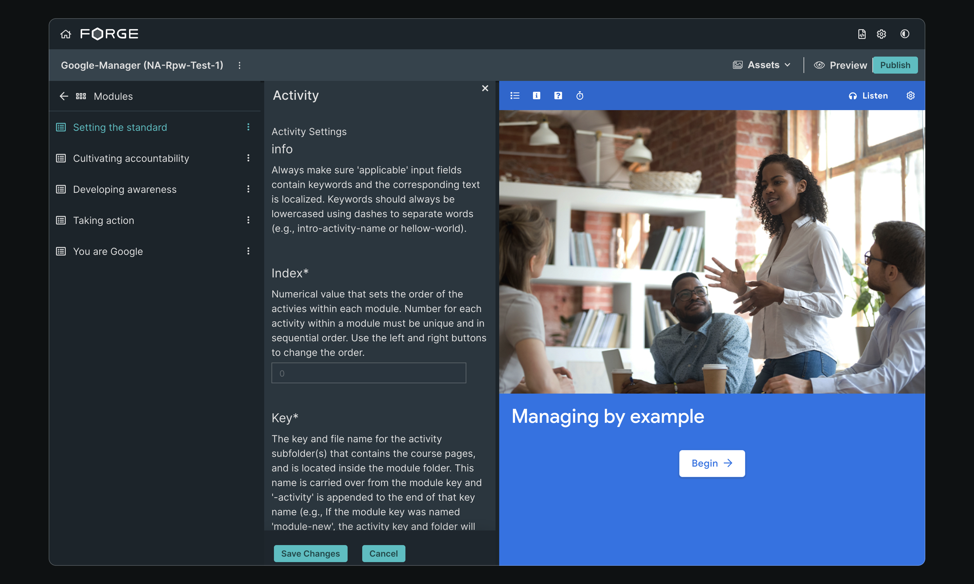
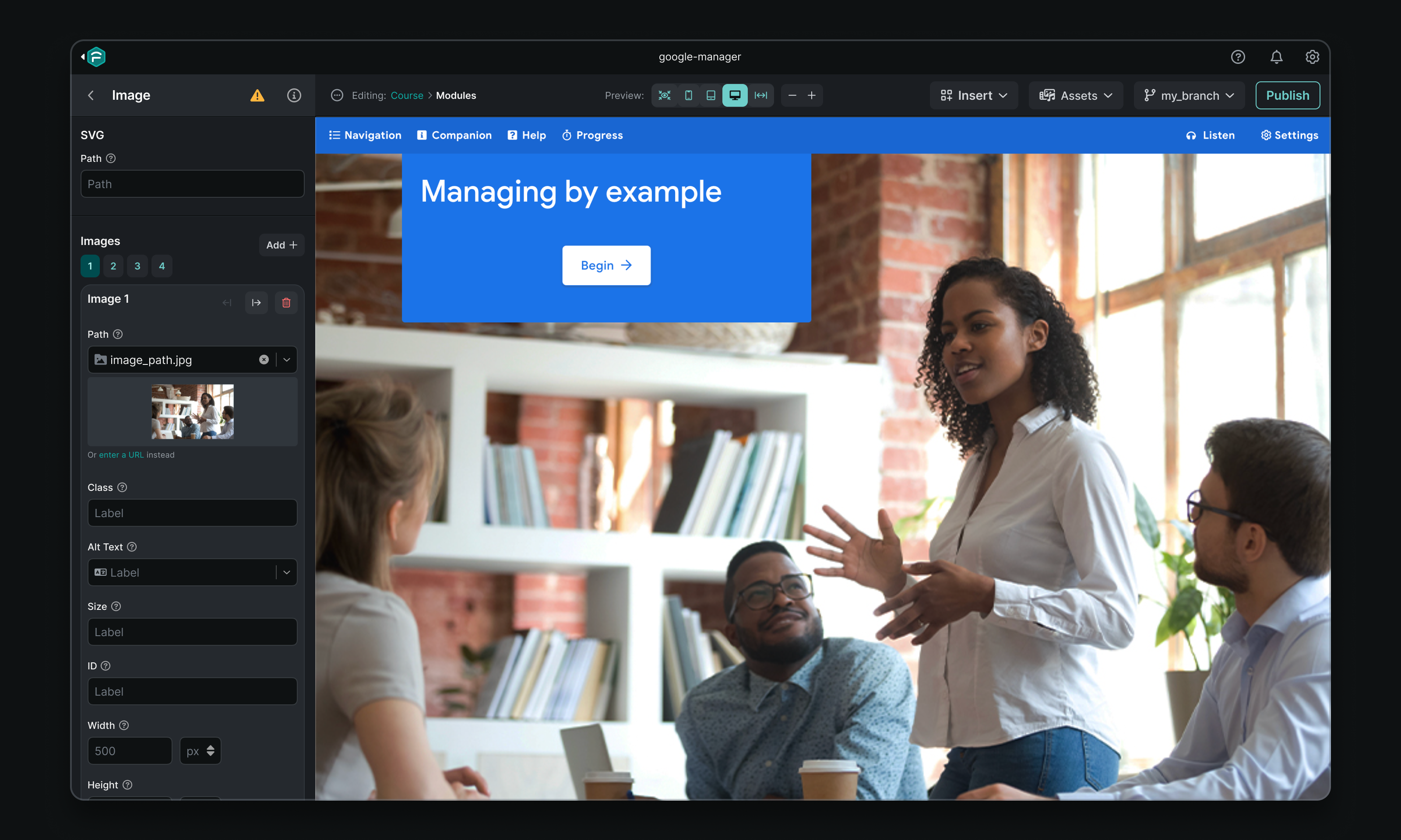
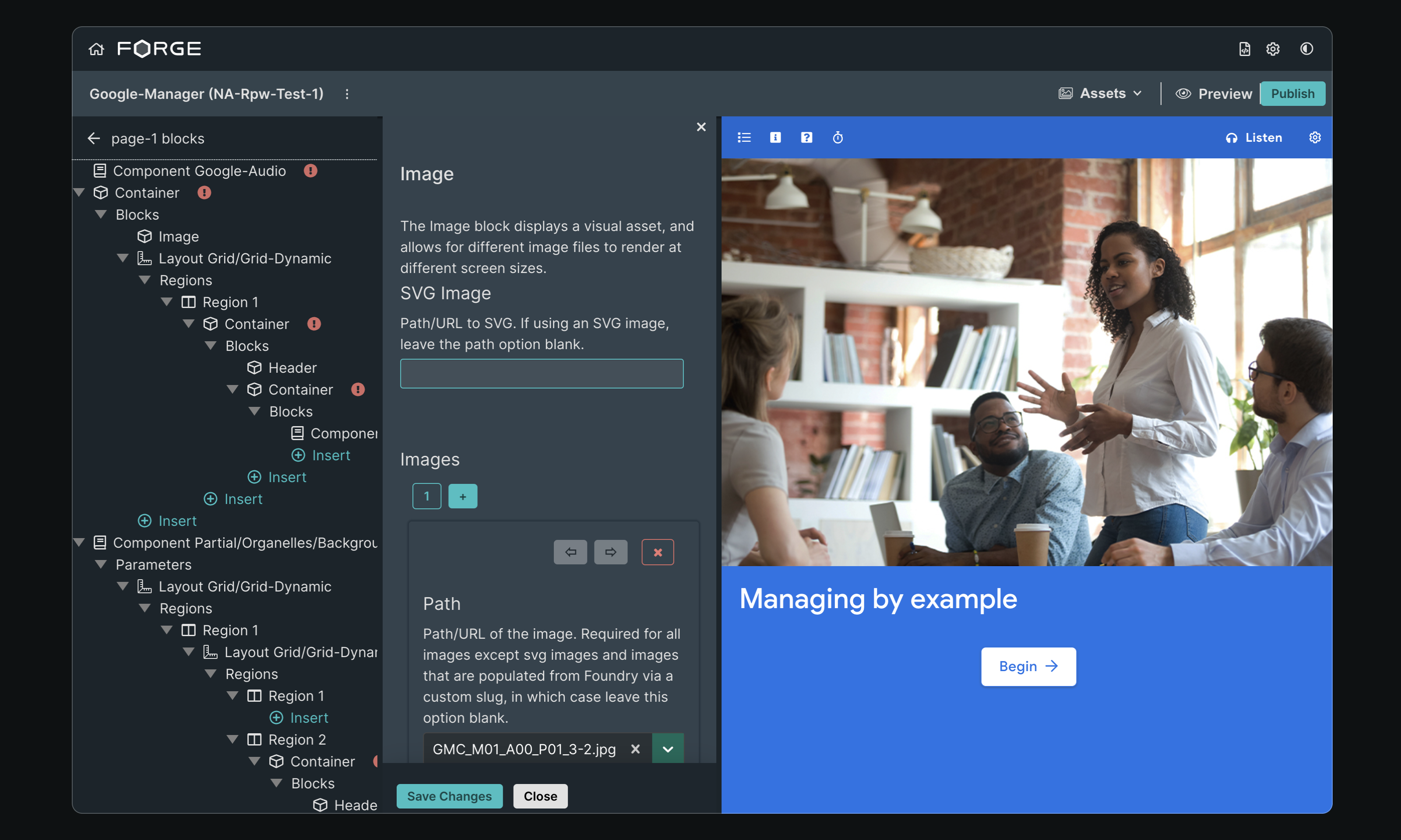
Here's a peek before we dive in:


Context
Forge is the primary tool used by EVERFI's Implementation team, who translate course designs into interactive e-learning products. It's a Git-connected Electron app that provides an interface for a local development environment. Forge leverages the EVERFI SDK and component library (aka Furnace) to allow for course creation and ongoing maintenance.
For much of its existence, Forge was largely a JSON content editing tool with a minimal interface. However, the launch of Furnace in early 2020 hastened adoption by the product team, and requests for more powerful WYSIWYG-like features quickly outpaced design capacity.
The pace of iteration left the app without polish and well-considered UX; behind the scenes, its interface was cobbled together with ad-hoc styles and a collection of one-off components.
As the team began to work more in Forge, the rough edges started to hinder productivity and quality of life. Without additional design intervention, we anticipated that Forge would become a blocker, rather than an enabler.
Areas of Focus
Color & Contrast
In lieu of shadows, increasing lightness can visually communicate a surface as having been elevated. This is especially important in Forge, given the hierarchical parent-child nature of its editor views.
Just one problem — Forge's styles included only five neutrals whose lightness topped out too quickly, making text virtually illegible after a few child views.
Additional variables that fell outside the color scale were also added to the SCSS, leading to inconsistencies like $interactive-925.

Neutrals before and after

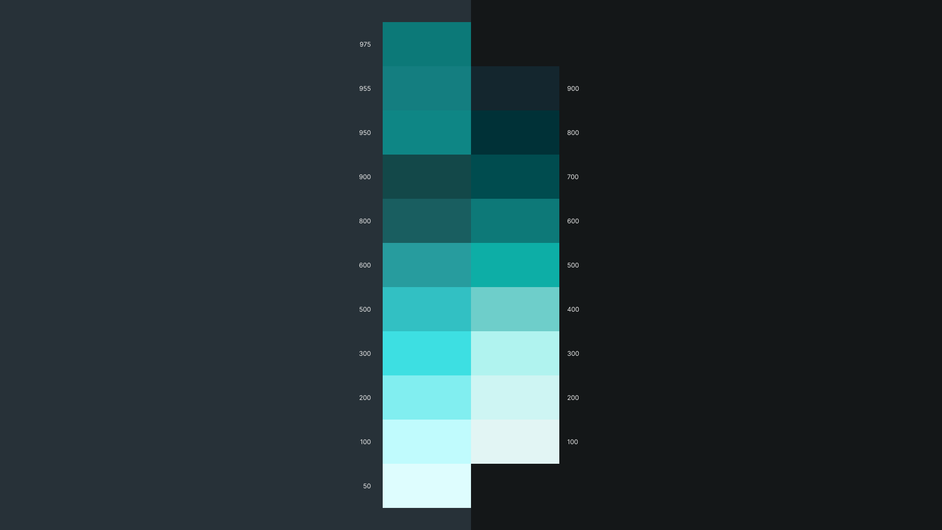
Primary colors before and after
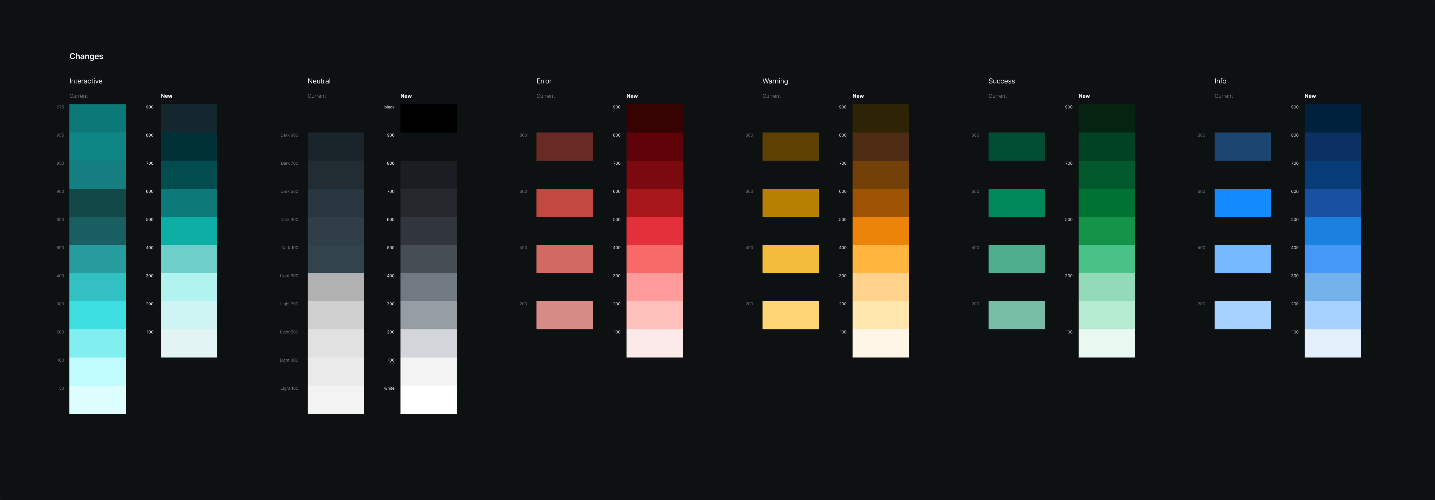
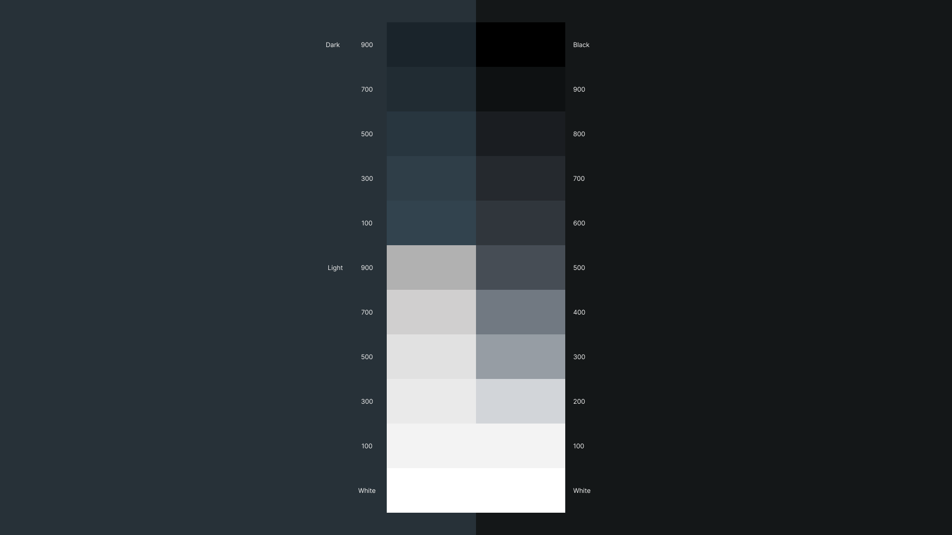
The new color scale includes values ranging from 100 to 900, plus white and black. Each value falls within a similar lightness range as its siblings, so we can apply colors from different palettes in a more predictable and accessible manner.

Full color palette updates
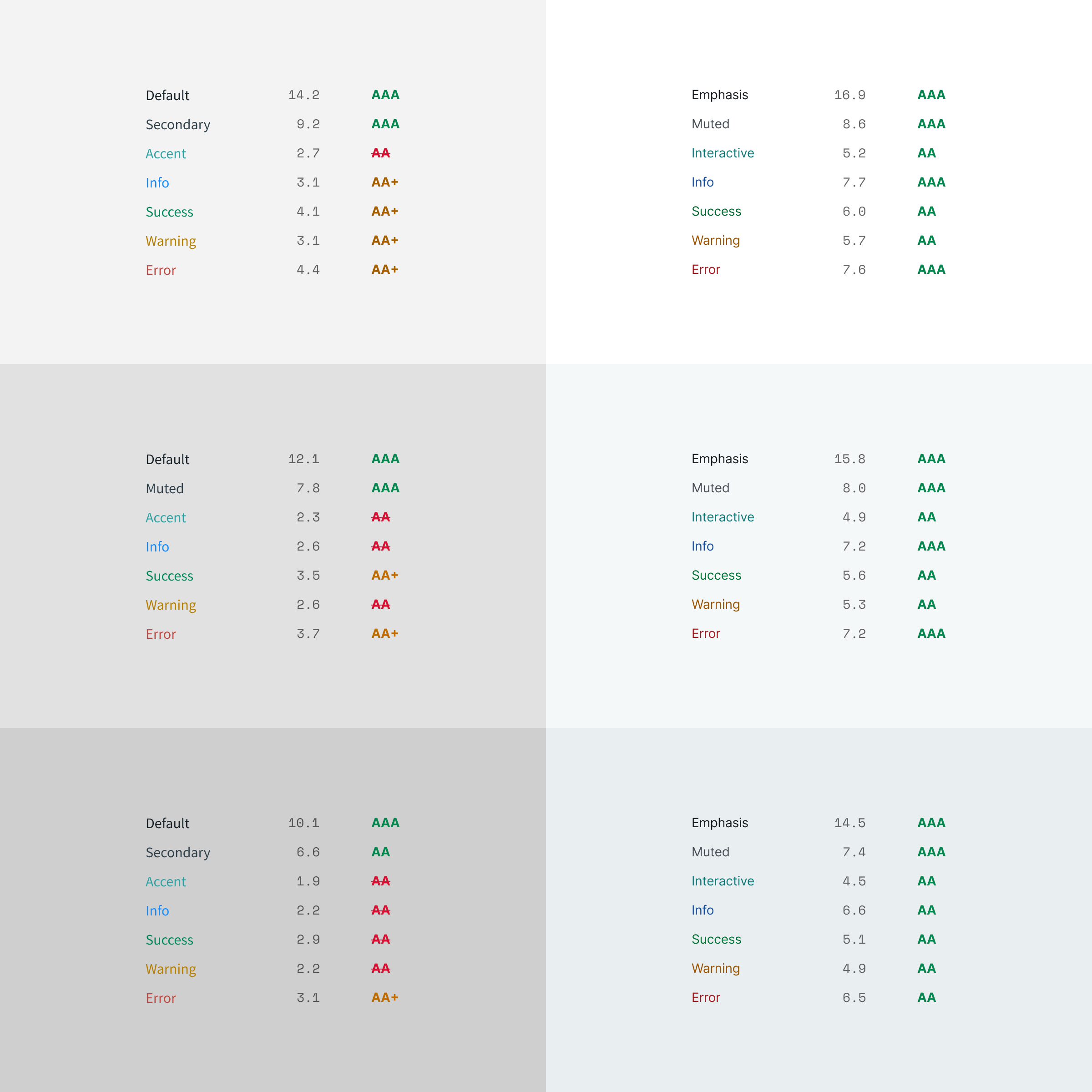
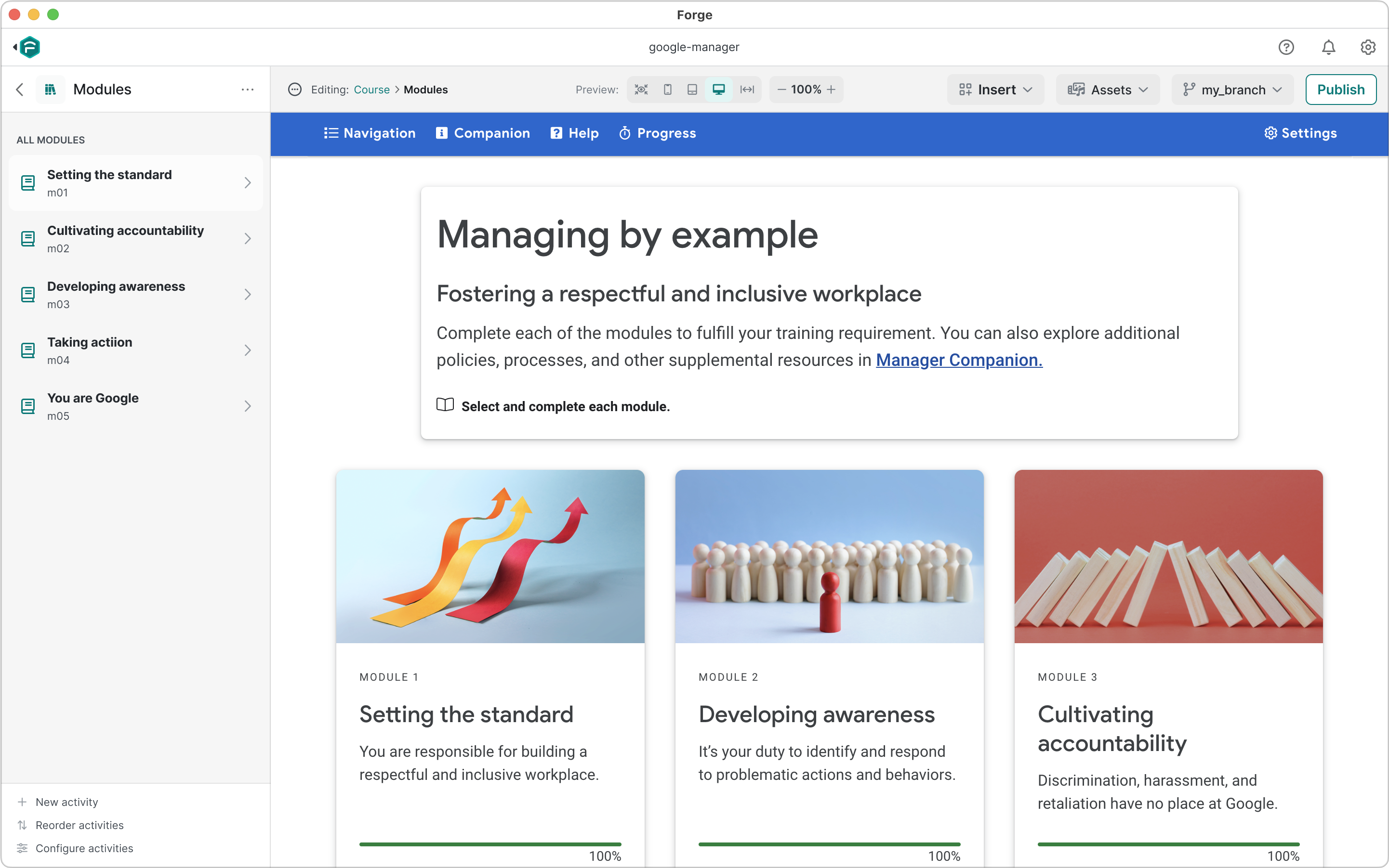
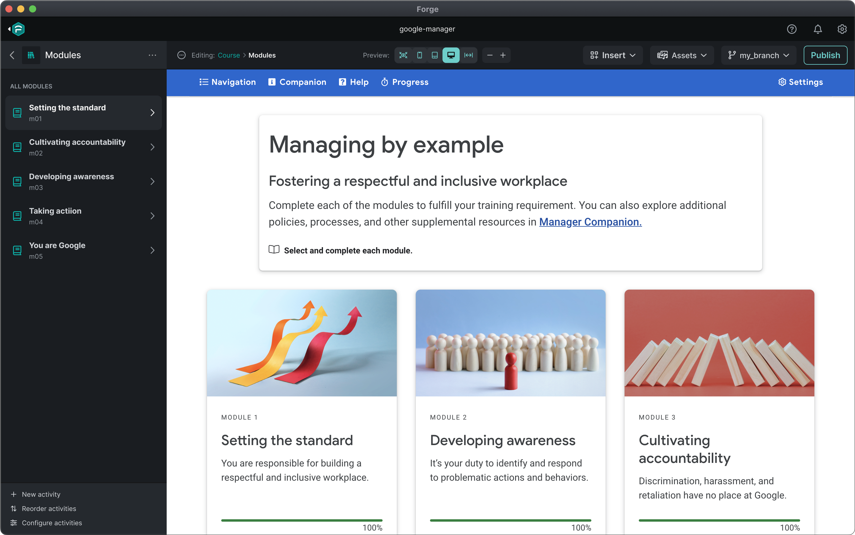
Applied to typography and surfaces, the new color palettes fully resolved any contrast concerns:
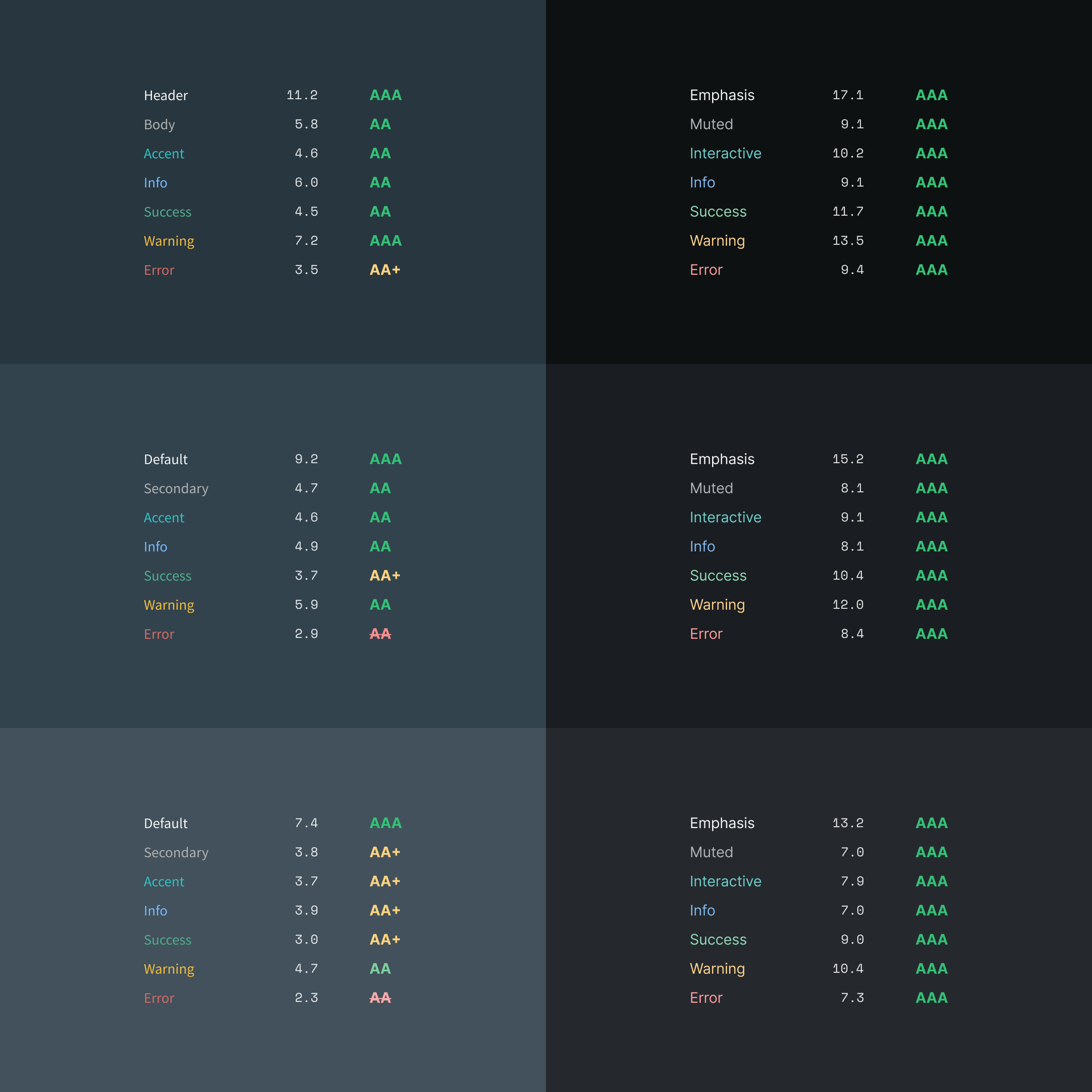
Darker darks!

Lighter lights!
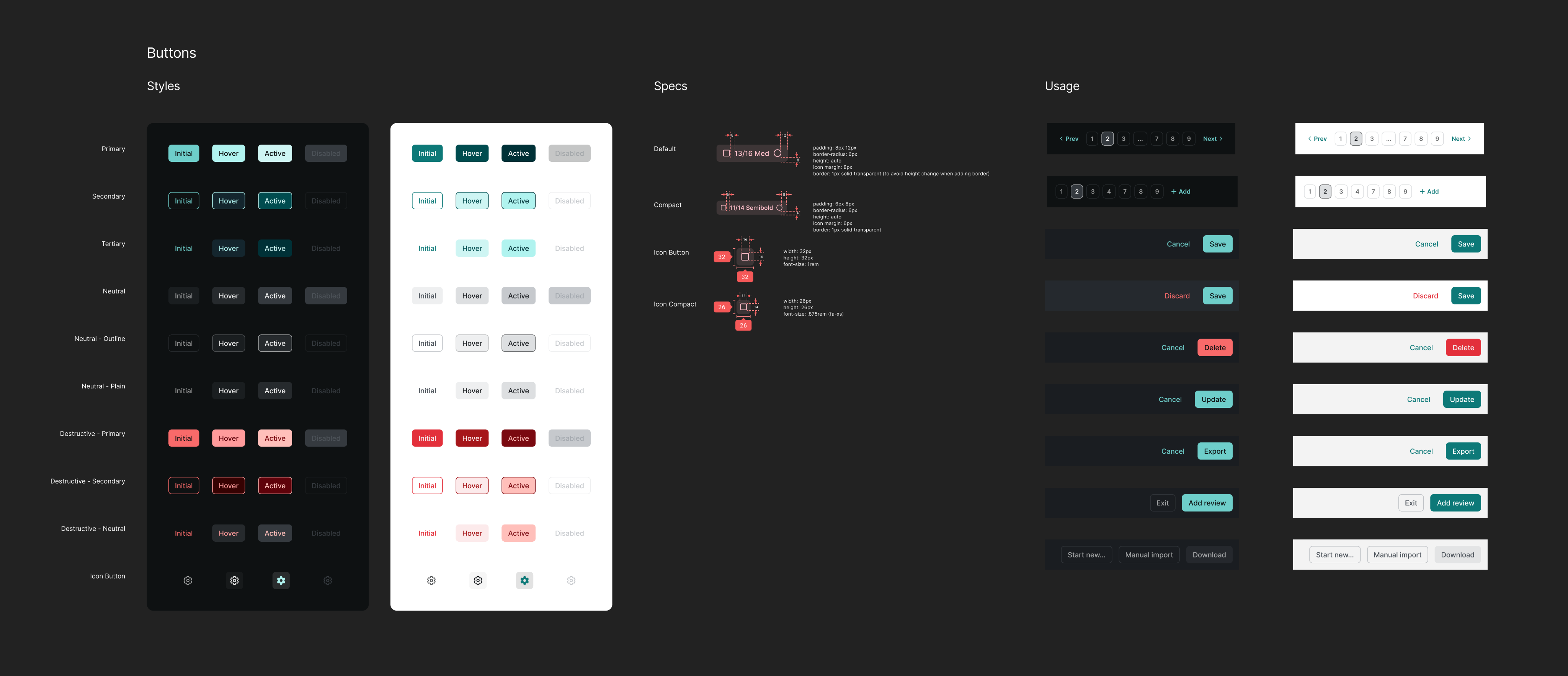
The expanded color system also allowed more nuanced styling: consistent states, additional variants, and a more distinct difference between color modes.
2. Information Density
Typography
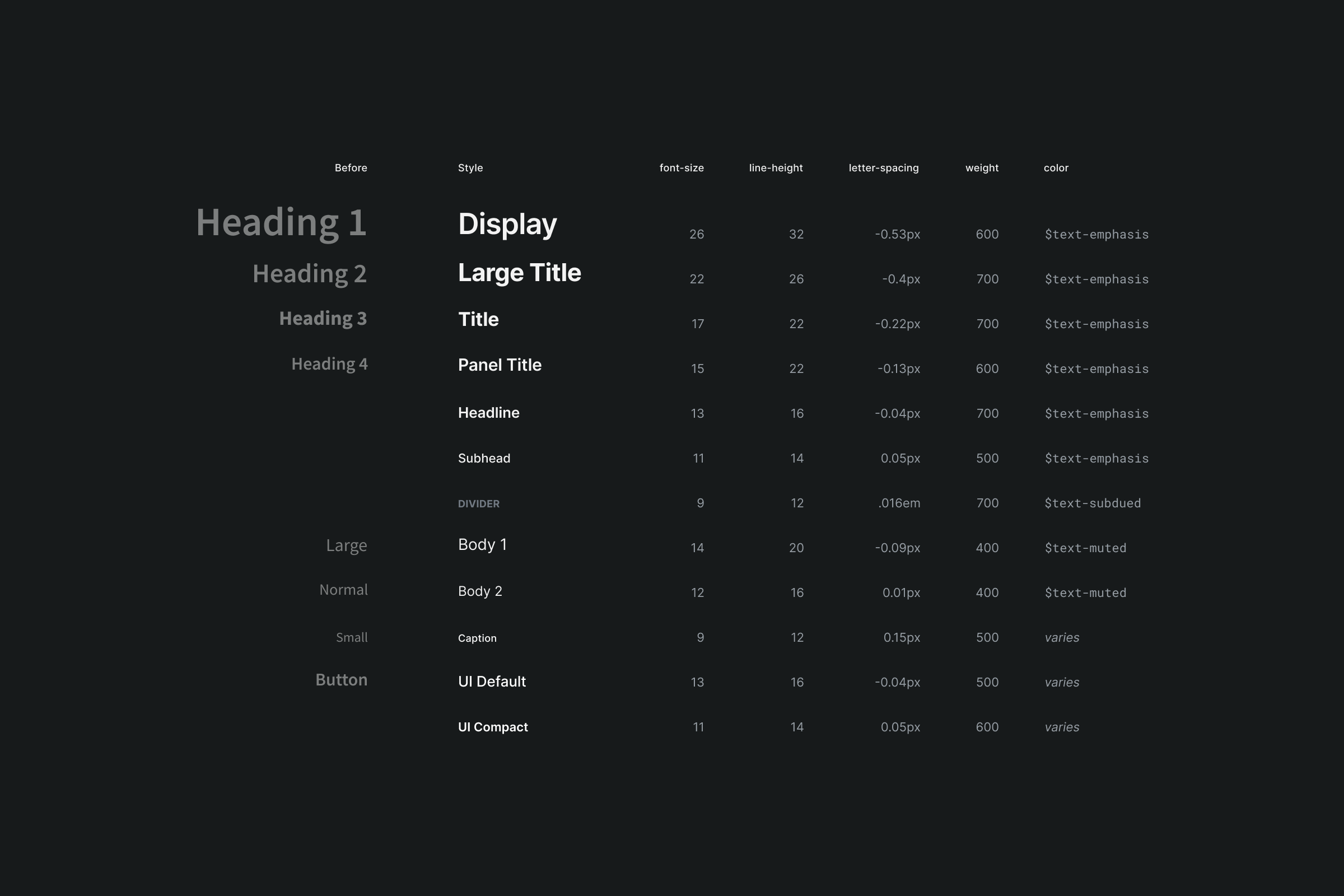
The existing type styles used Source Sans Pro, a particularly tall typeface that was neither part of our brand nor well-suited to complex desktop applications.
Starting fresh, I created a more dense type scale with Inter that offered a more native look & feel and better-supported the complex interface.

New type scale, with variable names shifted from a web-based hierarchy to a more semantic convention
Edit Forms
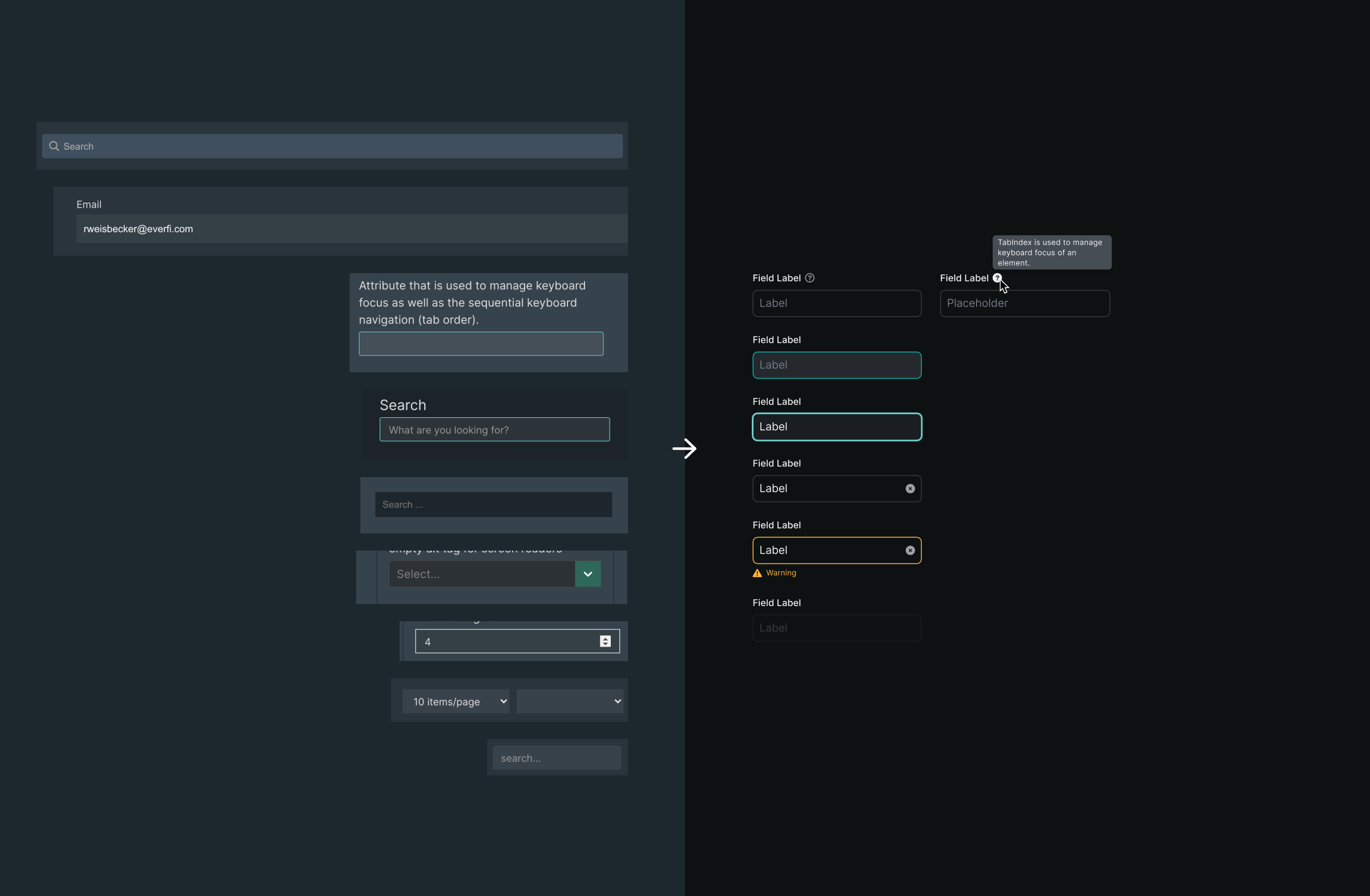
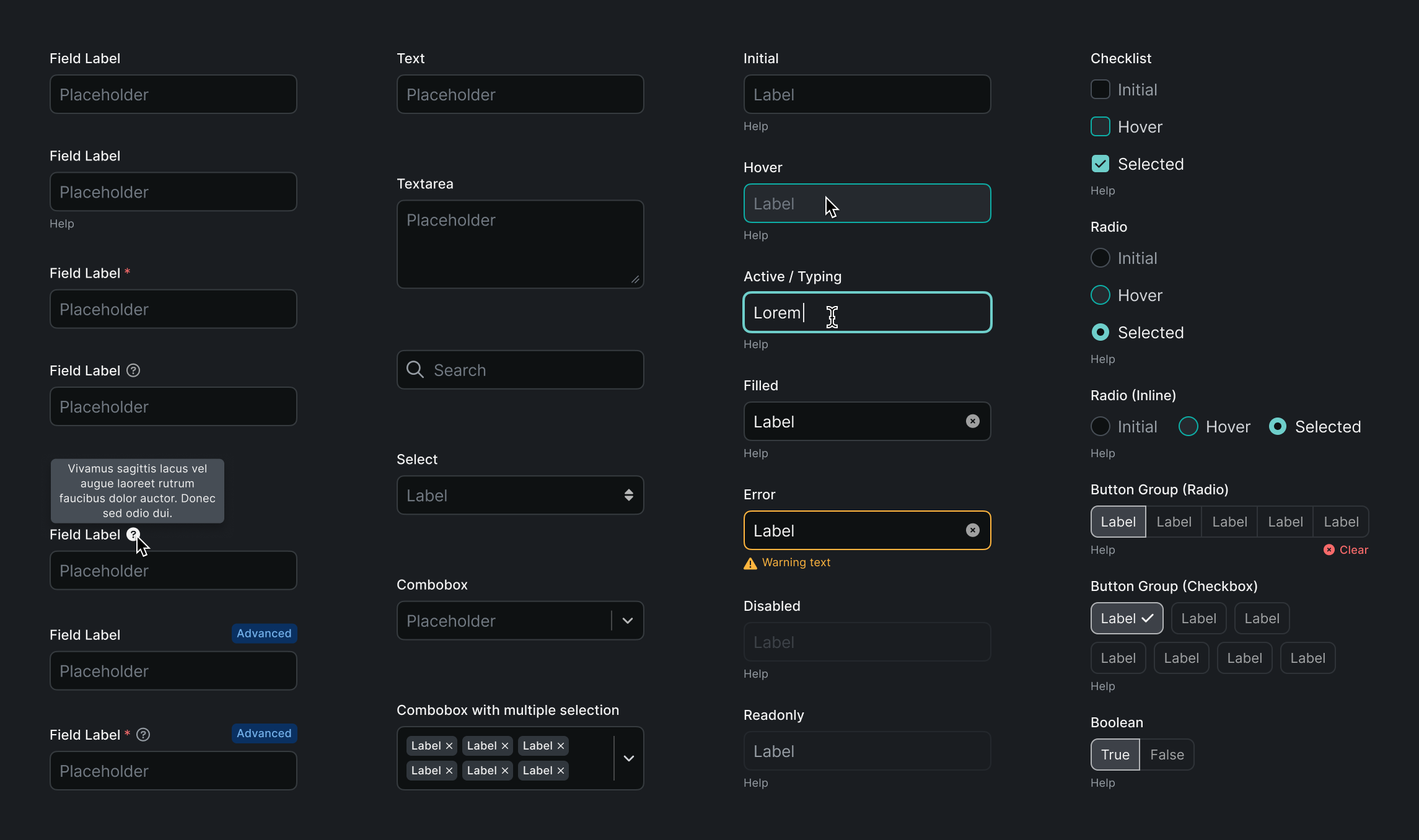
In addition to the type and its inconsistent application, form styling was a primary source of bloat. To combat this, inputs were made more compact, and help text was moved into a tooltip to improve scannability.

Dense spacing and type applied to input fields
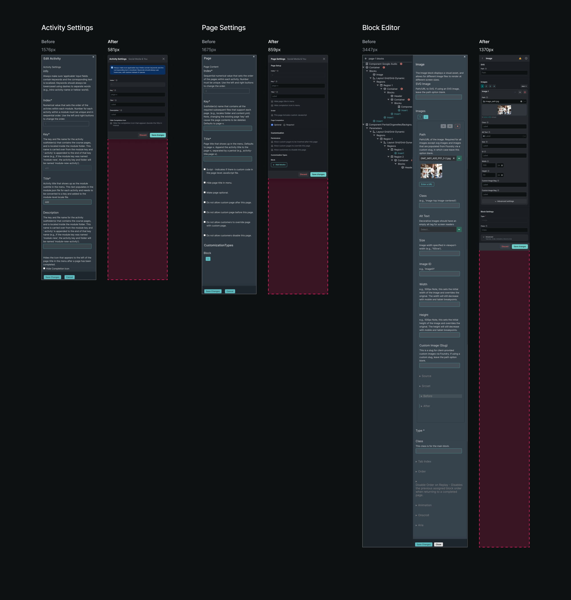
With these changes in place, the length of various editor views decreased by more than 60%.

Navigation and editor, before & after
3. Reorganization
A crucial aspect of Forge's utility derives from having its edit views auto-generated by page and component schema.
The drawback, of course, is that this doesn't always conform to a user's mental model of content hierarchy. Organization that makes sense in code doesn't always make sense in a UI.
Everything that wasn't related to editing content and parameters moved into a modal. At that point, you're editing the course itself — not the page you're looking at. Choosing to cover the course preview provided free real estate, since it's no longer relevant to the task, while simultaneously reinforcing the mental model of editing a higher-level view.


This also benefitted performance and usability, since the old edit UI always opened another panel adjacent to the navigation, causing the live preview to resize and force a refresh. This was particularly frustrating when editing a page, since the page would shift between desktop and tablet breakpoints, causing you to lose context.
Rather than opening in a panel beside the block list, the block editor would replace it to prevent resizing and remain consistent with the drilldown navigation pattern.


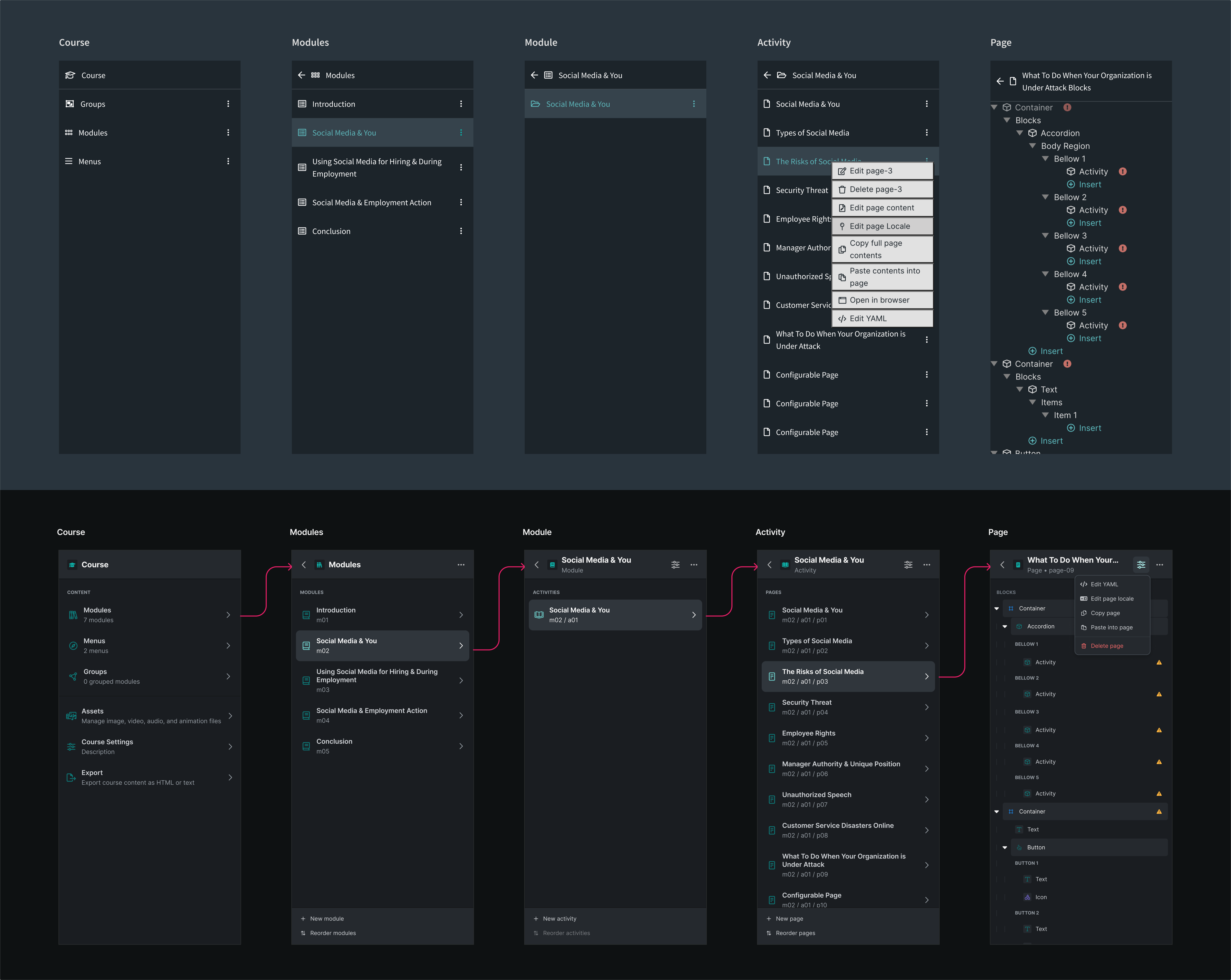
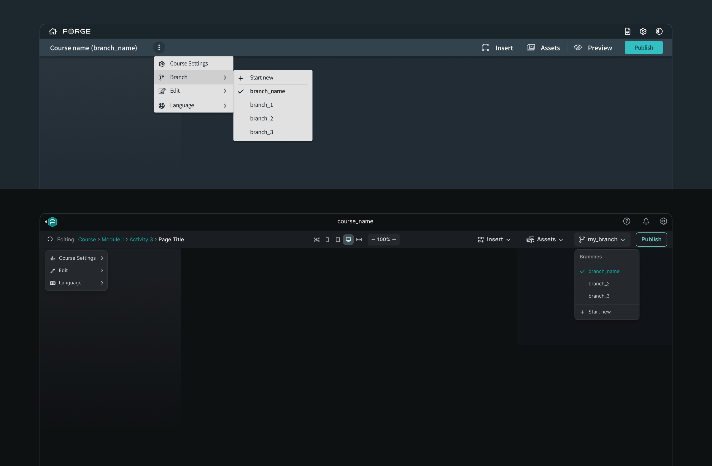
Likewise, page actions were moved from a difficult-to-discover right-click menu on their parent activities to a dedicated dropdown when viewing the page's block list. Rather than editing a page in two places, the block list became the home for all page edit features.

Before & after of menu hierarchy and actions
4. Component Standardization
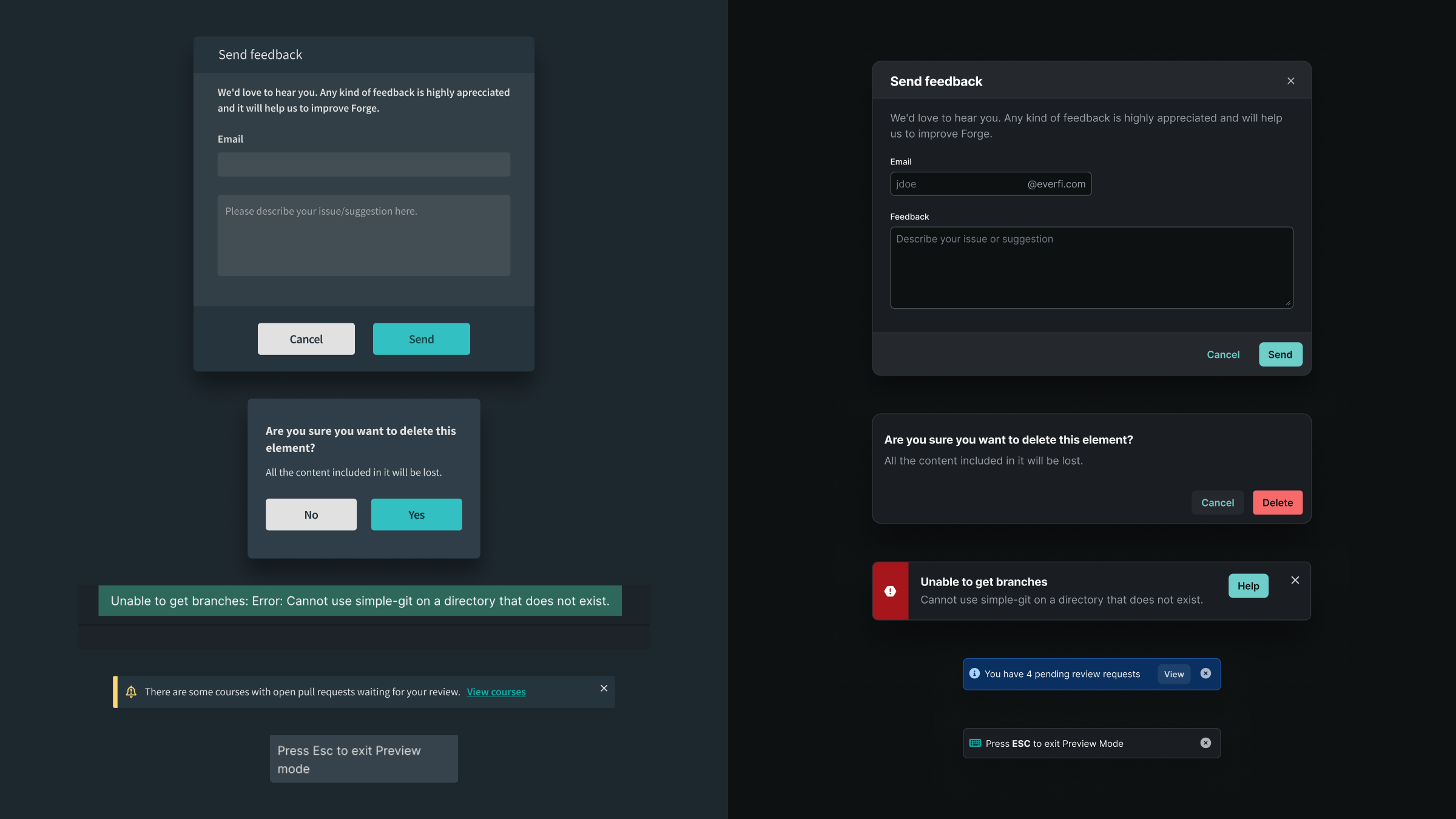
A look at some components with standardized styling:
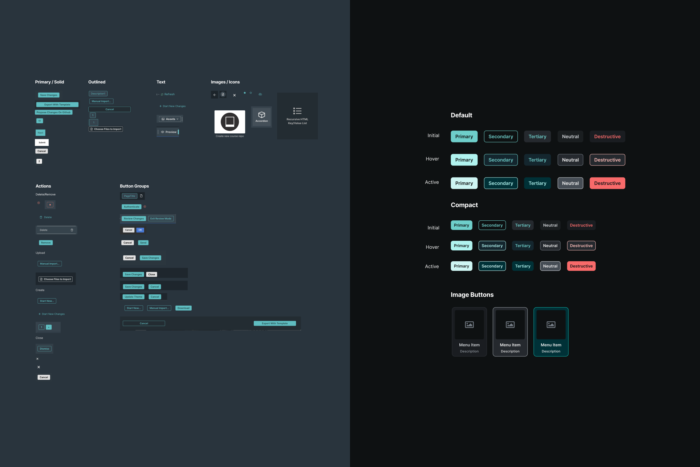
Buttons

Redesigned inputs

Toolbar

Dialogs
Forge as a design system tool
Forge had long since moved away from being a code editor — we needed to embrace it as a tool for creation using our design system. Courses rely heavily on utility classes generated from system variables in order to apply or override theme styles; forcing Forge users to memorize and apply class names manually was doing them a disservice.
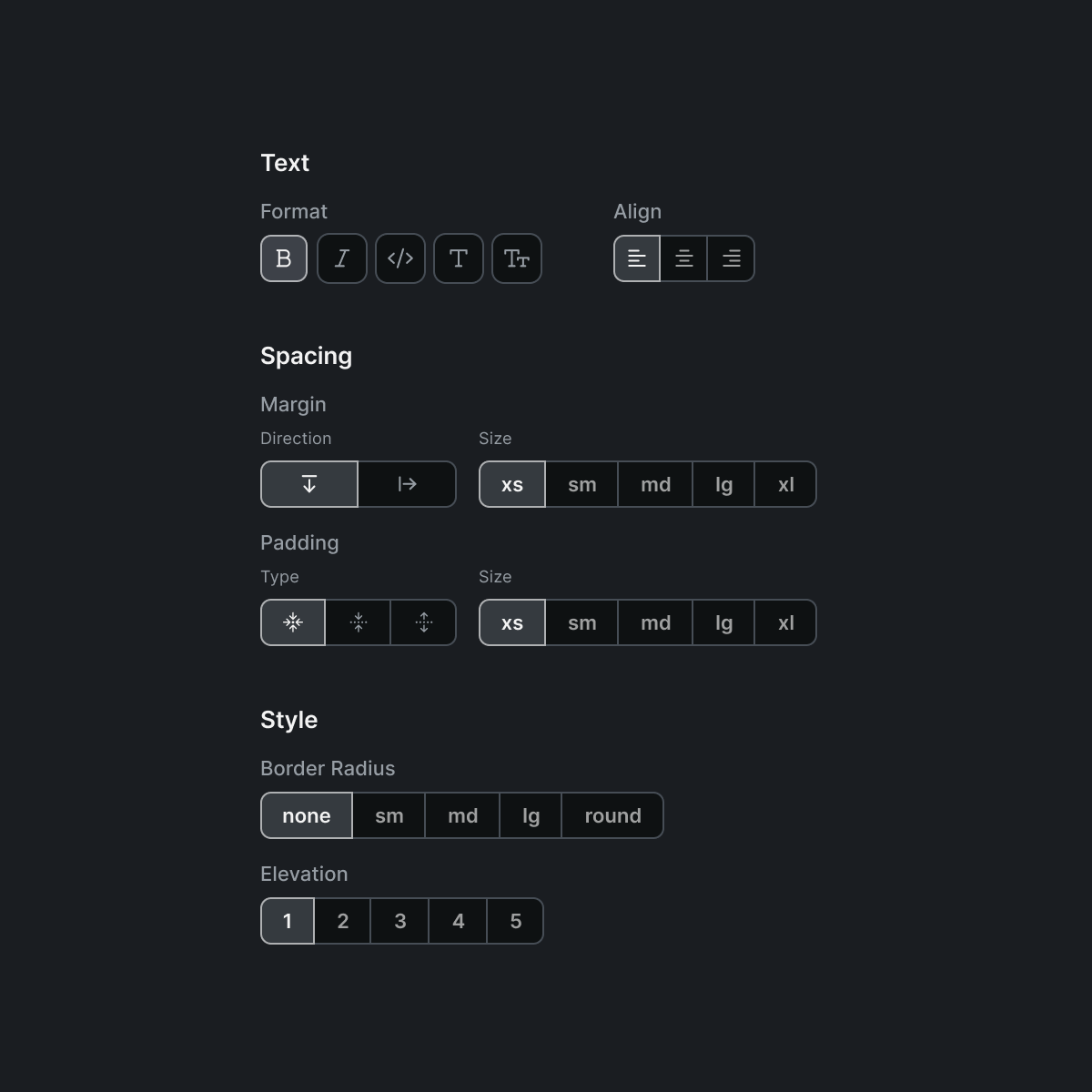
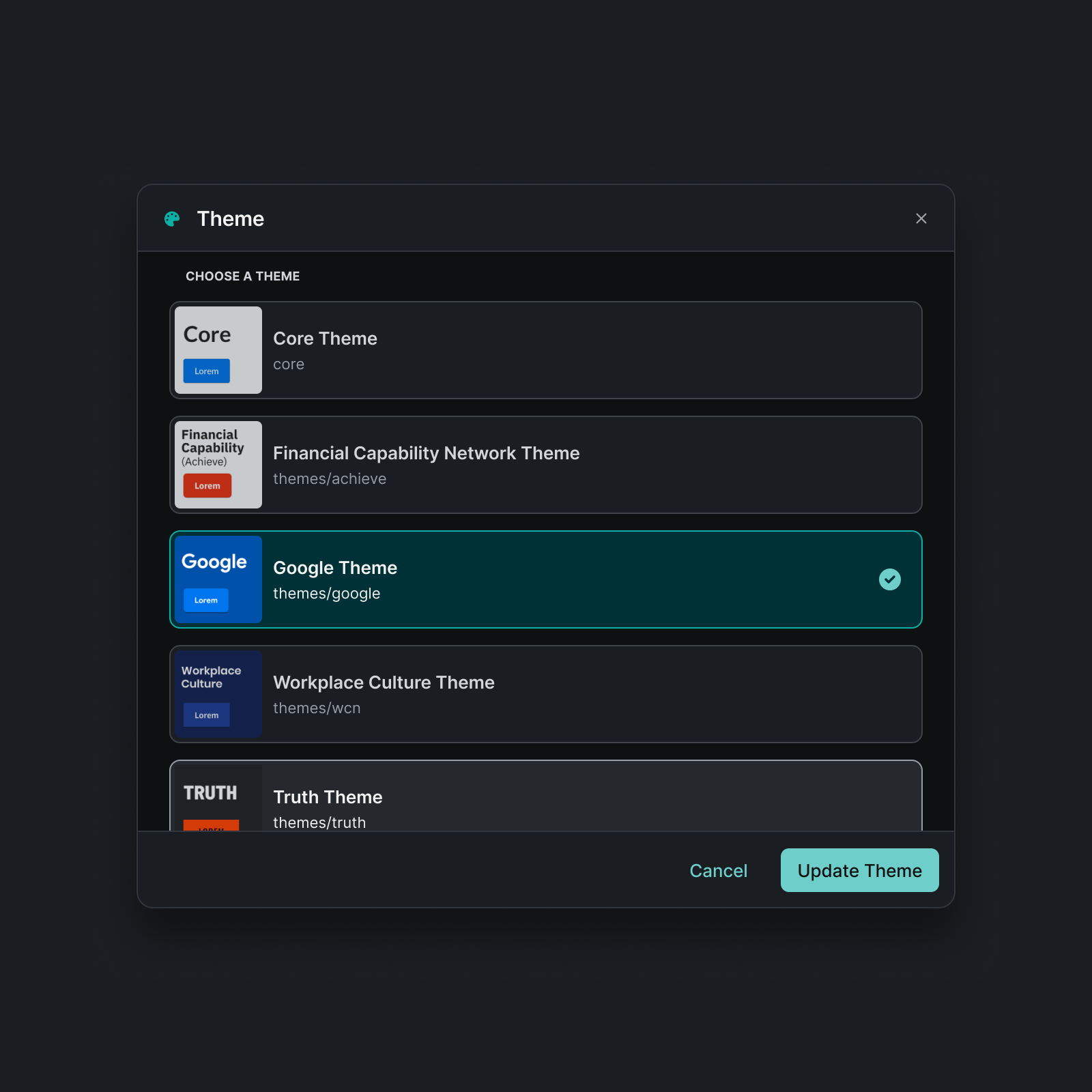
To speed up style application and better represent the properties enabled by theme primitives, I diverged from the elements provided by ReactJsonSchema (which generates Forge's edit forms) and designed a collection of custom pickers, affectionately dubbed ~widgets~ by the engineers.

Utility class widgets

Theme picker
In addition to widgets, I explored some future-looking UI for editing content and saving repeated patterns as course-level components from within the app:

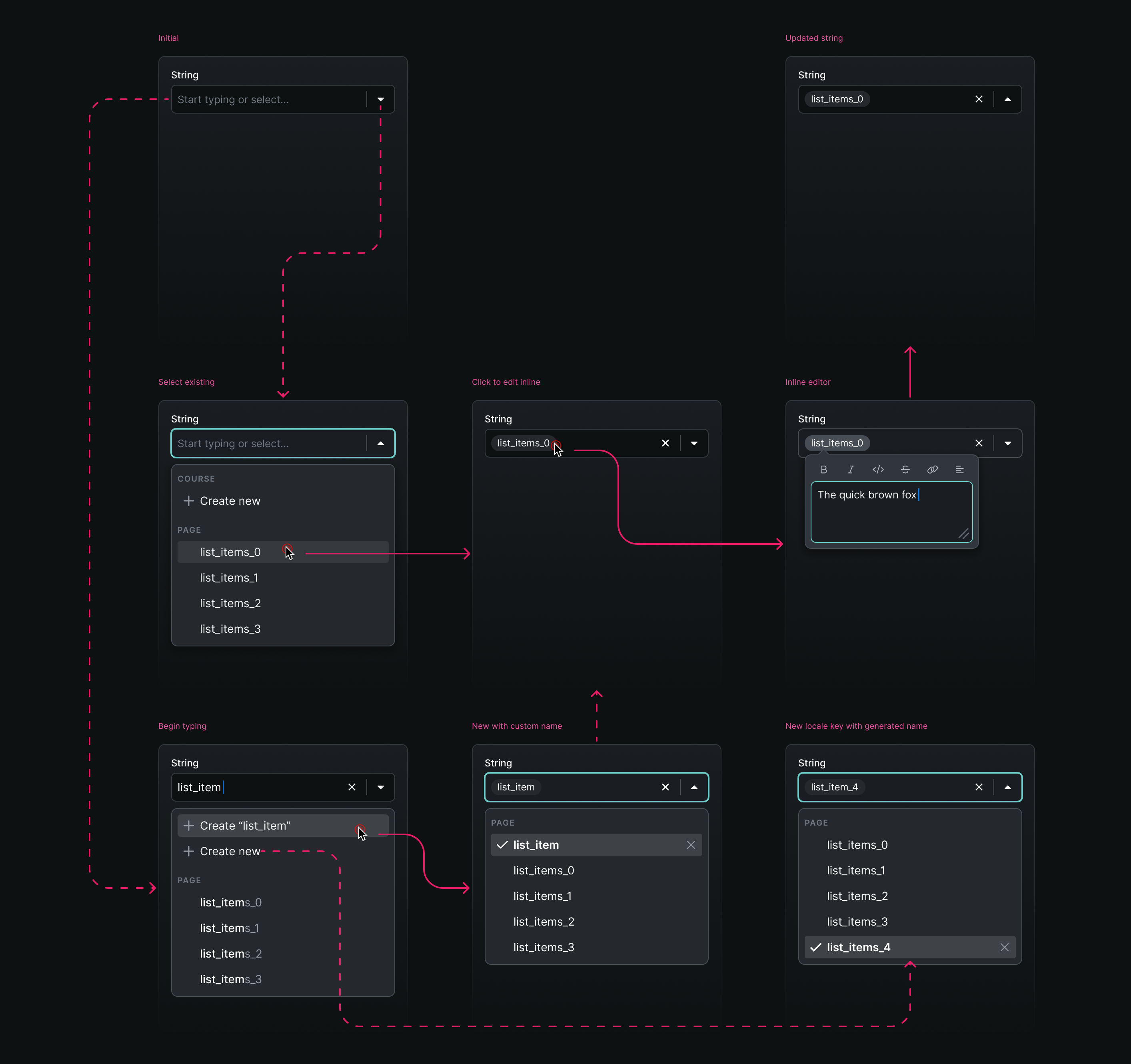
In-context locale string editing

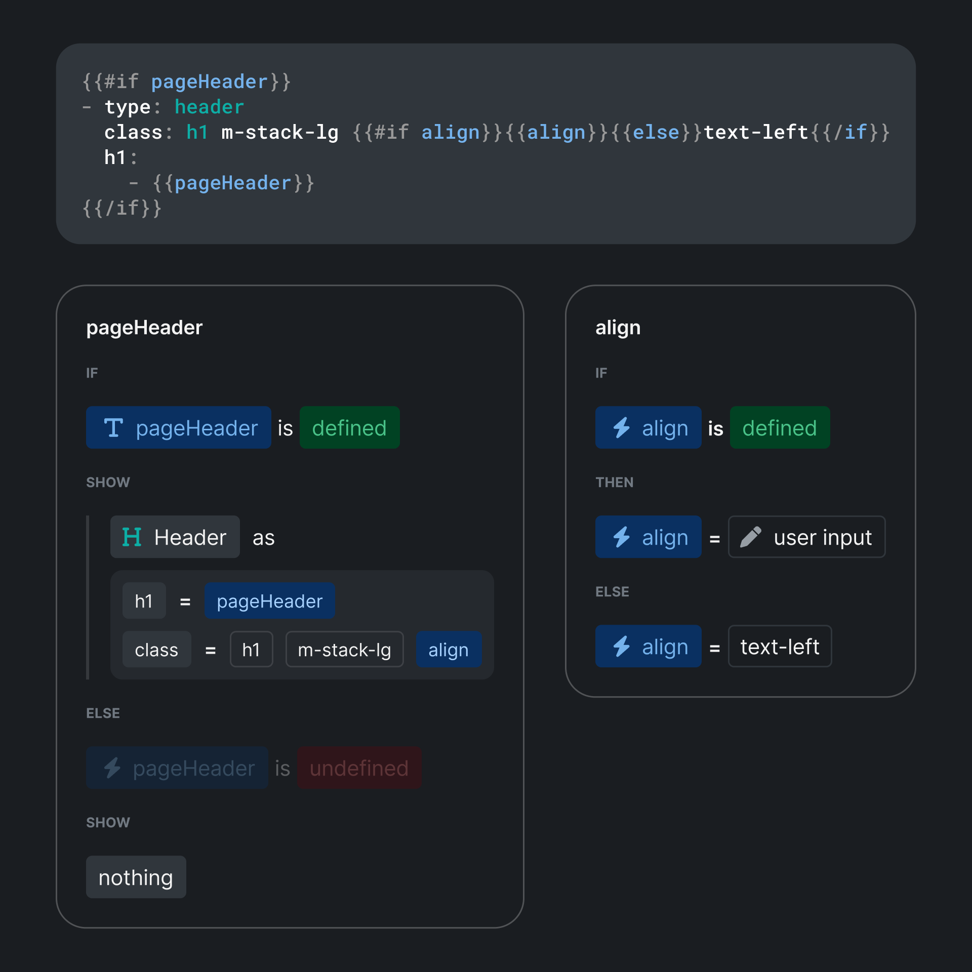
Template builder prototypes
And, for good measure, I also created icons for the production and development versions of the app: