

Background
As NPR's in-house technology research & development center, NPR Labs provides a variety of tools to assist public broadcasters nationwide, including the Mapping and Population System (MAPS), a web app that displays reception coverage maps for all public radio and television stations in the US.
NPR affiliates nationwide — member station managers, underwriters, engineers — use MAPS to inform decision-making around station planning efforts, such as improving reception or adding new services. First released in 2011, it remained largely unchanged since.
Goals
During my internship in the spring of 2017, I worked as part of a small team to build a new version of the tool from the ground up.
Our main goals for this redesign effort were to overhaul the interface for better usability and increase performance. We decided to use Vue and Mapbox, which provided additional customizability and performance in rendering the map view.
- Revamp the interface: modernize look & feel and align it with the larger NPR brand
- Enhance utility: Find opportunities to improve usability and provide more information about stations
- Strengthen reliability: Refresh data sources and optimize performance
Component-ization
At the time, NPR's mobile apps used a variation of Material Design. Since we were using Vue, we imported components from Vue Material and tailored them to our needs — re-theming them to match NPR's apps and composing them to create more complex application-specific components.

Station Cards
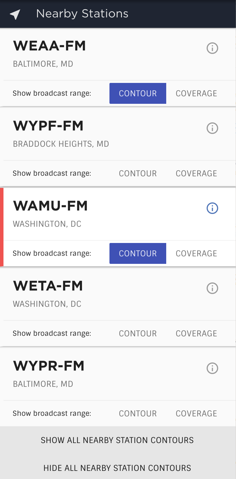
Initially, stations were listed in the sidebar with only their callsigns as identifiers.
We expanded these list items into cards that included each station's callsign, location, and logo, along with labeled controls to differentiate between coverages and contour toggles.
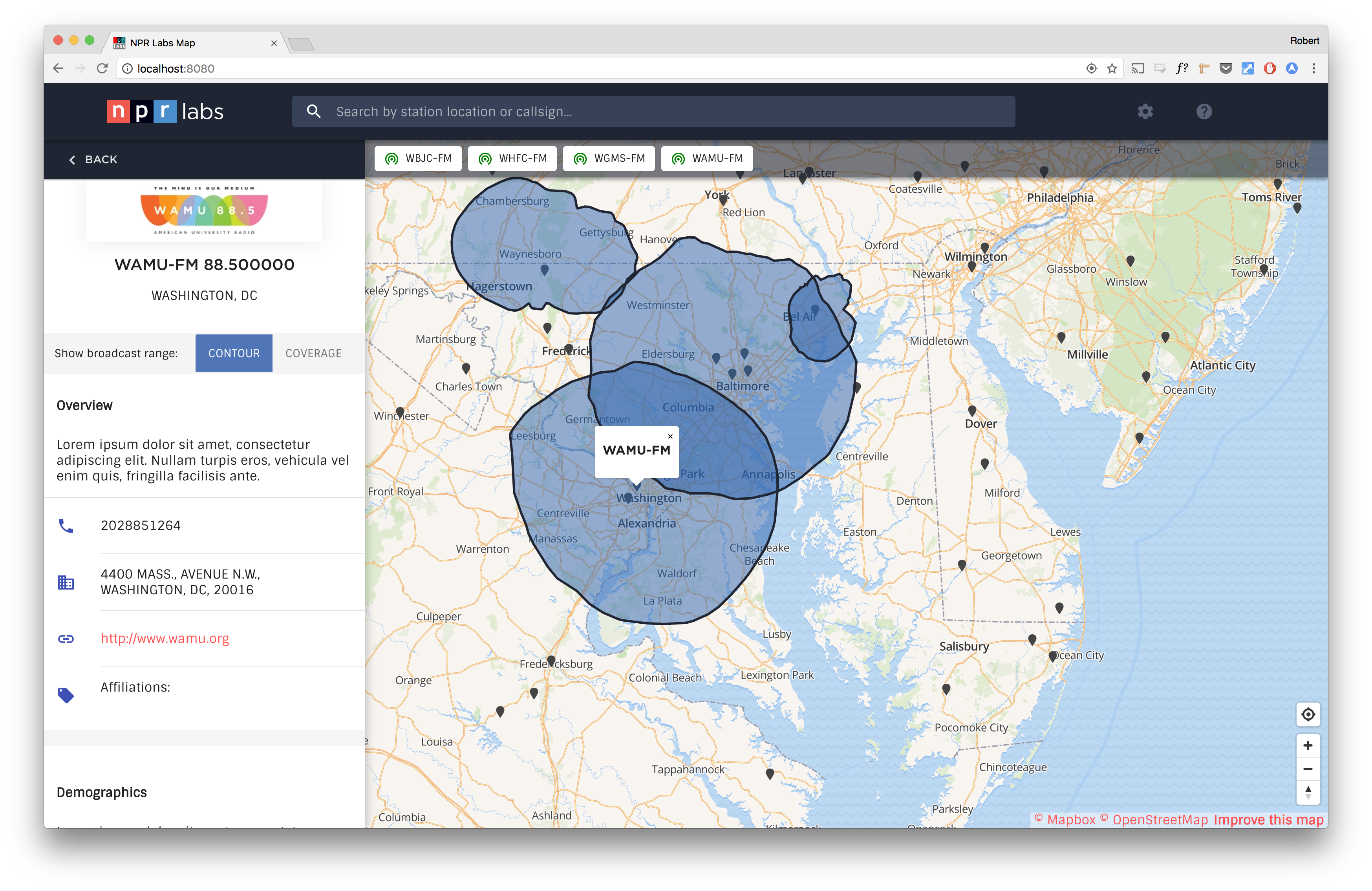
Station Detail
To accommodate the need for more in-depth station information, we added a detail view in the sidebar when users clicked on a station. Demographic information, previously located in a modal, was moved into the station detail view to provide access without navigating away from the map.
Navigation & Controls
MAPS features a search bar allowing users to search for stations by callsign, address, or location. This moved into a main navbar element that emphasized the search field, while secondary settings and filters became dropdowns.
Filtering
Stations displaying active contours or coverages were previously only discoverable via their active button state in the sidebar list. If an active station didn't appear in a user's search results, there was no way to quickly reference the active station apart from locating it on the map.
To solve this, a bar displaying active stations was overlaid on the top edge of the map, with chips representing each station. Clicking a station chip would navigate to the station and open its details in the sidebar.
Responsiveness
The most significant change was the newly-responsive design. On a phone, there simply isn't enough real estate to pan around a map and see detailed information, so we decided that modality was the best course of action.
List and map views collapse atop one another on small devices, and the search bar remains persistent for discoverability. Users can easily toggle between list and map views by tapping an icon button in the nav.
Rather than creating a new component, we were able to repurpose our new station card component, restyling them as drawers in map mode, to let users access station information without having to toggle views.
Conclusion
With this redesign effort, we managed to tackle many of the problems we were tasked with addressing. In updating the tech stack, we managed to improve performance and reduce the friction of loading large amounts of data.
The creation of responsive components allowed users to access station information and engage with the map, while also allowing us to introduce elements of NPR's brand that had evolved in the years since the tool's inception.
It also added some degree of future-proofing: by nature, components will always be more scalable and maintainable than ad-hoc features. Meanwhile, surfacing more detailed information in the sidebar offers essential information at a glance, simplifying the decision-making process for station planning efforts, and ultimately, better serving public broadcasters across the United States.