In December 2017, I completed a Master's in User Experience Design at MICA. For my thesis project, I explored how to translate immigration application paperwork into a more user-friendly format via conversational interfaces.
Problem Space
Few people enjoy filling out paperwork, and even fewer enjoy government paperwork. Forms are tedious and old-fashioned, and they often accompany a particularly byzantine process. But they surface infrequently enough that we're able to tolerate them for a few hours now and then before moving on with our lives.
Not everyone has that luxury. For immigrants applying for residency or naturalization status in the United States, incomplete or inaccurate paperwork can result in life-altering consequences. The rejection of an application can deny someone opportunity, security, or a reunion with loved ones. And until a Supreme Court ruling in 2017, inaccuracies on an immigration application, intentional or not, could be grounds for prosecution.
For my thesis project at MICA, I explored the application of usability and interaction design principles to these forms — whether emerging interaction patterns could improve the experiences of those seeking to become residents or citizens of the United States.
In the absence of fully digital and usable federal paperwork, software solutions have arisen to assist people in other bureaucratic matters, such as preparing taxes or managing a business. A similar approach ought to be applied to the immigration process, where frustration with paperwork can complicate an already-stressful process for a particularly vulnerable audience.
Research
I conducted user research by interviewing five people with firsthand experience in applying for residency or naturalization. Participants included three immigrants hailing from Cuba, Nicaragua, and India: one a naturalized citizen, the other two permanent residents by marriage. The remaining two were US citizens who assisted their spouses with their applications.
Interviews consisted of about 25 questions covering their experience with various immigration processes, their comfort with technology, and retrospection on how they might improve the process given their experiences.
Takeaways
- Applicants typically resided in the US for several years before applying for a change in status. Most had held multiple different visas before becoming permanent residents or citizens, including refugee, student, employment-based, and marriage visas. Several mentioned family members who were permanent residents that decided applying for naturalization wasn't worth the effort.
- Government is a "black box"; after submitting an application, months of uncertainty would pass before receiving further word from USCIS.
- The process was invasive, as officials often required applicants to submit personal communications with their spouses as proof of their relationship.
- Outside help is often necessary, but trust is an issue. Word of horror stories about immigration scams traveled through immigrant communities, and there was some apprehension of third-party services.
- Applicants aren't the only users — citizen spouses, lawyers, translators, and social workers often assist in filling out documents and testimonials.
- Suggested product features: Document uploading, progress tracking, reminders, remote access & multiple users/permissions, plain language, contextual definitions, less legalese
Thesis
In many cases, digital forms fail to overcome the challenges posed by paper ones. Simply creating a digital facsimile wouldn't suffice. My initial exploration & research pointed me toward conversational interfaces as a solution, since they rely upon progressive disclosure — the method of only exposing immediately relevant information to a user at a given time. This reduces cognitive load in users, making complex tasks more manageable and thereby easier to complete.
Thesis Statement
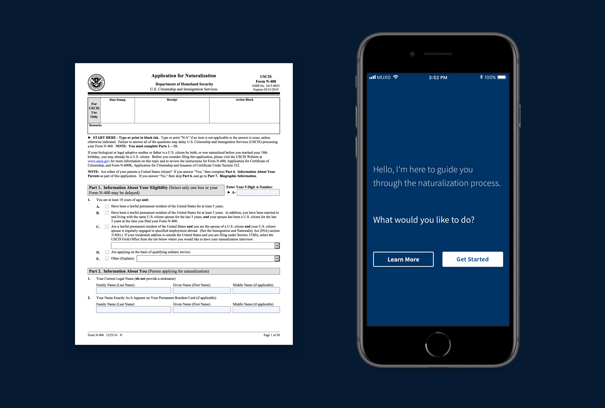
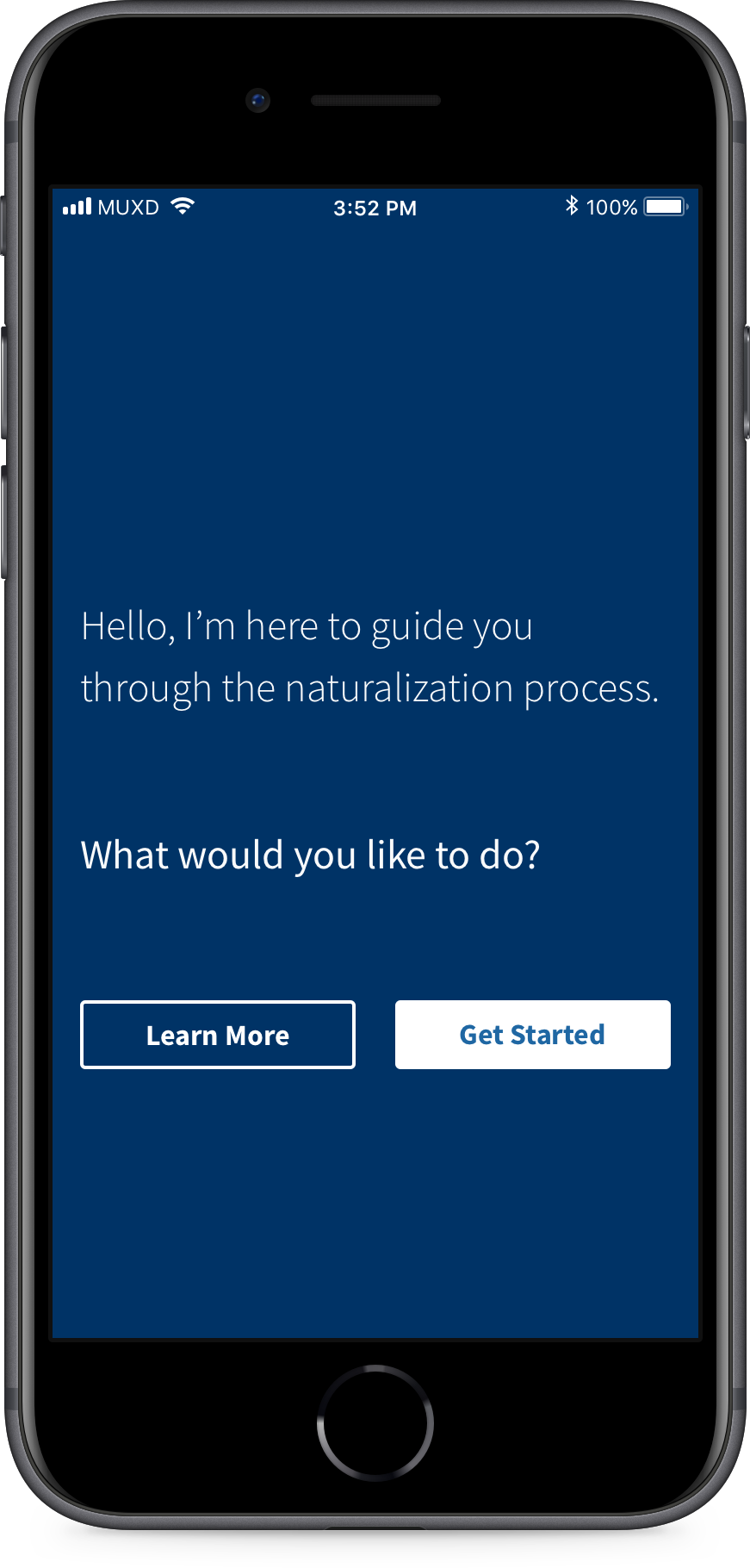
I propose an alternative to immigration paperwork in the form of a conversational interface. By re-contextualizing traditional paperwork into a question-and-answer format, we can use familiar language and interaction patterns to provide users with a personalized experience that is approachable and stress-free.
Prototypes
I next experimented with three different types of conversational UIs: chatbots, wizards, and a hybrid of the two. As a test case, I rewrote sections of the US Customs & Immigration Service's (USCIS) Naturalization Eligibility Checklist with more conversational copy and developed several prototypes.
Chatbot
Using ChatFuel, I created a Facebook Messenger chatbot that simulated human conversation by conditionally returning specific strings based on user prompts. This let me experiment with branching questions and friendly, casual language.
Wizard
I also employed Twine, an open-source tool for creating text-based narrative experiences, to mimic the step-by-step format of a wizard. The output was sparse in terms of look & feel, but Twine's branching logic and visual flow editor kept interactions on rails, unlike the chatbot, which could get stumped by unexpected or irrelevant input.
Hybrid
I also experimented with a hybrid UI that allows toggling between chat and traditional form modes. Unfortunately, its complexity proved too difficult to replicate using either design software or my limited Javascript skills. Since my explorations failed to represent the entirety of the N-400 form, I was forced to scrap it for testing. So it goes.
Testing
Next came a round of user testing pitting the Twine wizard against my Facebook messenger bot. I was looking to determine which interaction pattern enabled users to complete the task the quickest, and also gauged users' subjective attitudes toward the input methods, tone of voice, and ease of use.
Key Findings
- Faster task completion using the Twine prototype than Messenger
- Messenger chatbot was deemed more engaging & friendly. However, users reported that it felt too casual, and called it "unofficial" and "flippant"
- Users had privacy concerns using a tool hosted on Facebook
- "The chat paradox": While chat was more familiar to users, it felt unofficial and potentially risky. This was someone's entire life - could they trust this service?
Reflection
The biggest revelation from user testing was that conversational interfaces (or at least my means of reproducing them in prototypes) simply weren't advanced enough to give people the impression that completing a complex form was as easy as chatting with another person.
By forcing everything into a conversational format, I was arbitrarily limiting users. In some cases, plain old HTML inputs might be more effective than both a chatbot and a paper form, and my conversational approach had discounted them from the outset.
The inefficiencies of chat
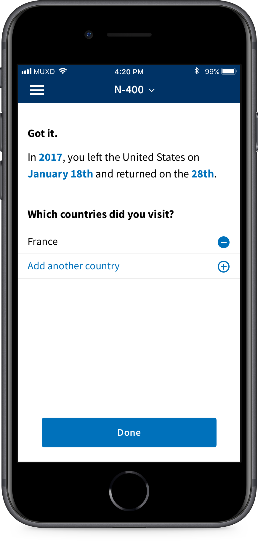
For example, a portion of the N-400 form asks applicants whether they have left the United States for an extended period in order to determine whether they can be considered permanent residents. If someone has been on multiple foreign trips, they must answer additional follow-ups.
My initial instinct was that continued questioning was natural — we were simply following the natural flow of a conversation. However, we should let content dictate the input mode:
- for entering a year on mobile, use a native numerical keyboard
- for choosing the month, use a select or support autocomplete
- for selecting a date range, use a datepicker rather than multiple fields or messages
- for birthdays or otherwise memorable dates (e.g. anniversaries), use a series of input fields (credit: GOV.UK Design System)
- yes/no questions should use radio buttons styled as buttons
Improvements
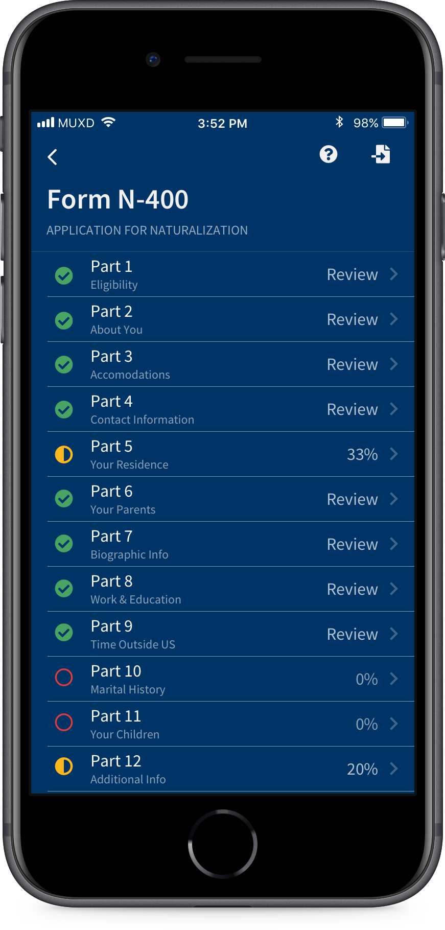
Users did, however, respond to progressive disclosure — validating the core of my hypothesis. So I then sought to create & test a hybrid UI with N-400 content that synthesized the well-received qualities of the two earlier prototypes along with some more traditional form elements.
My aim was to instill confidence by increasing the fidelity of the prototype and employing a more restrained approach to the conversational aspects, dialing up the formality and using it only when contextually appropriate. Eventually, I settled on using the US Web Design Standards to guide my visual design, as I realized matching the look & feel to federal websites could ameliorate the perceived insecurity presented by the Facebook Messenger bot.
Iteration: Natural Language Form
Key changes / benefits
- More formal tone of voice
- Use of natural language only when contextually appropriate → some standard inputs are standard for a reason; utility trumps adherence to style
- Gradual explanation, minimal instruction
- Progressive disclosure → One question per page
- Conform to users' mental models → don't rely exclusively upon chat
Addendum
In an unexpected turn of events, USCIS has introduced two tools similar to the above proposals since this project's completion in December 2017.
In 2018, they released Emma, a chatbot that assists users in navigating uscis.gov and answers questions about immigration policies and services.
In September 2021, USCIS also released the Naturalization Eligibility Tool, an interactive questionnaire that potential applicants can use to determine their eligibility criteria. And — you guessed it — the tool presents abridged versions of N-400 Eligibility Checklist questions in a wizard format.